AFAICT this is normal.
Even if inkscape is a vector program, at the very end the image should be turned into a bitmap to be displayed on a screen.
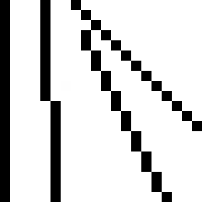
- aliasing.png (1.28 KiB) Viewed 2605 times
Inkscape (and 99% of vector program) will apply an antialiasing filter to smooth out the results.
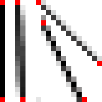
- antialiasing.png (1.76 KiB) Viewed 2605 times
Antialiasing could be avoided for horizontal and vertical.
AA works very well for some special angles (45 (=atan(1) , 26.6 (=atan(0.5)) , 18.4 (=atan(1/3)) and so on )
AA works well for angles > 20 and < 70.
AA becomes quite noticable for angle near horizontal (or vertical)
> When I zoom in, the problem does seem to go away
No, it's probably a eye/mind "illusion". Whatever the zoom factor is, inkscape will always draw the line the same way. Some pixels will be entirely in (or out of) the stroke and some will be only partly covered by the stroke. And (AFAICT) inkscape will always process the problematic pixels the same way. So why is it this doesn't feel the same when you zoom in ? I suppose this is because :
1) the stroke becomes larger.
At 1:1 your eye sees :
green,...,green
[discontinuity A spreading for x pixels]
black
[discontinuity B spreading for x pixels]
white,..., white
x pixels = length of gradient to go from green to black. It depends of angle. (0 for horizontal or vertical, 1 for 45, "infinite" (or rather length of line) for near horizontal)
But your brain sees green, dicontinuity of 2x pixels,white
At 10:1 your eye sees :
green,...,green
[discontinuity A]
black,black,black,black,black,black,black,black,black,black,
[discontinuity B]
white, ..., white
What is the length of dicontinuity A ? It is still x pixels wide and not 10x.
And your brain sees green area [discontinuity A] black area [discontinuity B] white area
I guess it hurts less to see smaller discontinuities between large areas than a large discontinuity between small areas
2) the image becomes simpler
The more you zoom on your letter, the less of it you can see. If you zoom on a peculiar leg, you'll see this leg as a green area over a white background ; the others legs won't be in the picture. So I guess your brain will see two areas and won't bother you with discontinuities in between. While those discontinuities could be interesting in the more complex shape it was at 1:1.
 . Here's what the nodes look like:
  . I've saved it as a .svg, .eps, .png and brought it to a season pro on AI and saw the problem on all 3 saves but couldn't determine why. Any help or advise would be greatly appreciated? Hope it's not my video card.
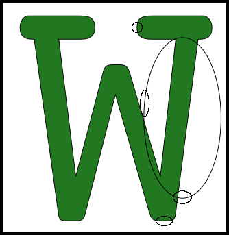


 The next test is the W at 3" high, 1" high and 1/2 high with a stroke of .5. Problem is noticeable at all heights. Next I did a test with rectangles at different angles. I think I am narrowing the problem down.
  I am only seeing the problem at positions 2,3,4,10 and 11. All other positions are clear and crisp. As the line approaches verticle or horizontal, it can't hold it's true shape of a line. Hmm. Why is that????