One of the 0.48 Inkscape logo contest entrants was my inspiration, but it was done from scratch without copying or tracing anything.
brynn wrote:Wow, very nice!
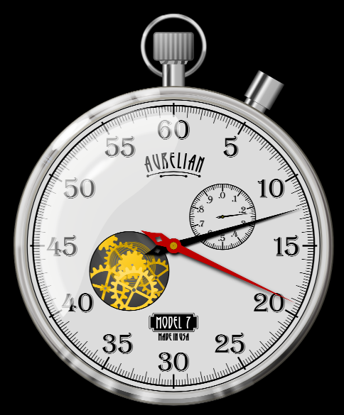
Did you use text for the numbers, or draw them each uniquely?
The only issue for me is that the red hand seems to be just lying on top. I wonder if a couple of subtle shadows either on the face or on the hand itself, or both, might enhance the depth?
But this is really just a minor thing -- I think the overall work is excellent!