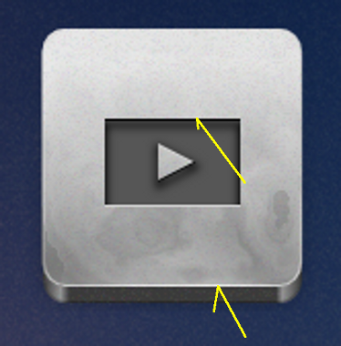
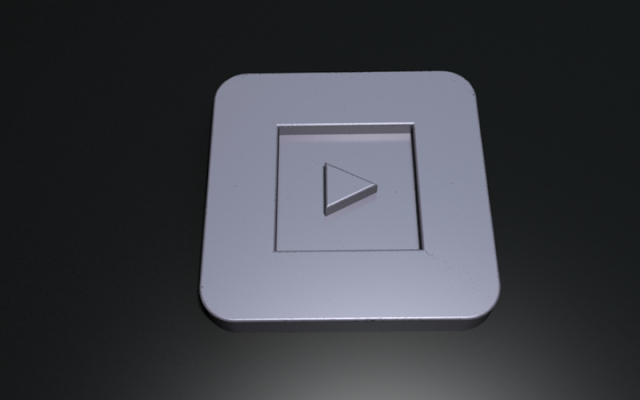
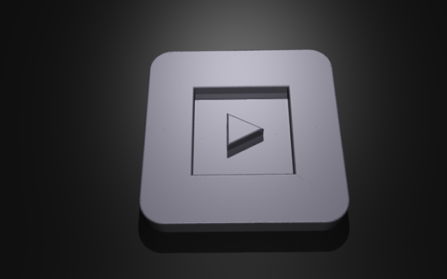
Thanks all for the suggestions - a lot of them make a lot of sense. A general point I should make is that because this is intended as an icon theme, I've made certain simplifications to make everything stand out, and to ensure the design works at a variety of resolutions against a number of background.
One such instance is the lack of highlight at the top of the 'tablet' shape: against a lighter background, the transition from grey to a lighter colour with a highlight in between simply makes the icon look blurred. This is especially the case if it has been scaled down to an awkward resolution, and is a bit blurred anyway.
To clarify on exactly what I'm *intending*: the light source is from north of the icon, and the projection is approximately orthogonal because it gives a much cleaner look at lower resolutions/on smaller screens.
First up, I've added a slight gradient to the inset, and touched up a few details - here is a typical icon at present:

It is a significant improvement IMO.
Lazur URH - the icons are meant to appear cut into the tablets. What exactly do you mean by 'illogical to the positive graphical look'? I'm wanting the icons to look as if they're cut in - do you mean that that's a bad idea or that the effect doesn't work? I've worked on a shade as you suggested in my update above, is there anything else you think needs changing? I'm not prepared to
hulf2012 - As I noted above, the pseudo-orthogonal projection is mostly for simplicity, having a clear silhouette and scaling well between resolutions. I'm not a huge fan of overly photo-realistic icons - hence the more stylized appearance of this set. The icons are meant to be cut in (embossed in the title was actually a typo... it was supposed to be 'Etched'), and I can't find any useful examples of this with the sort of light source I want.
Tylerdurden - thanks very much for the rendering and details comment. The lighting I'm going for is a very low, northerly light - I appreciate it's not a very accurate depiction of this at present. The light on the bottom edge is meant to be reflected off the surface the icon is sitting on. I believe the lighting on your rendering is coming from the south? With that in mind, do you mean that the top edge of the engraved area should have a white highlight? Or that there should be no highlight on the bottom edge?
V1nce - I was working just with a blurred outline duplicate for shadows, so AFAIK there's no easy way to do as you suggest except for very simple shapes. My current version above tries to achieve broadly what you suggest by having an additional gradient, to increase the north-south shadow effect (making the left/right weaker in comparison).

 This is a read-only archive of the inkscapeforum.com site. You can search for info here or post new questions and comments at


