Lowercase letter L is sometimes too thick

Post questions on how to use or achieve an effect in Inkscape.
Alan_uk
Posts: 6
Joined: Tue Mar 15, 2016 4:24 am

Lowercase letter L is sometimes too thick

Postby Alan_uk » Tue Mar 15, 2016 5:39 am

Hi, first post, so may I start by saying I have found Inkscape to be a powerful and quick to learn the basics program. So many thanks to all you developers.

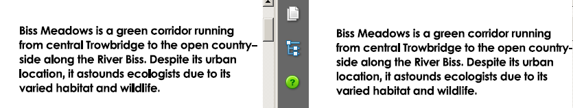
I've produced a leaflet for a community group and I just received it back from the printers. One issue was the lower-case letter Ls were too thick in 2 paragraphs:

Image

I then looked at the pdf I sent to the printers. Here is a screen shot of the same paragraphs:

Image

As you see it looks fine. This was using Foxit pdf viewer.

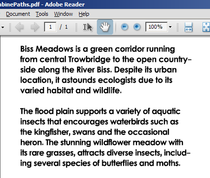
I then opened it in Adobe Acrobat Reader and generally it was OK except at magnification full size (100%) when the problem appeared:

Image

The text font is Levenim MT size 11 Bold. The paragraph letter spacing is -0.38 except some of the lowercase Ls. I found some of them too close together so I changed them to 0 spacing. For example the "il" and "li" in "wildlife" but not the "l" in "central" or in "ecologists".

However, further down the page (not shown) is white text also Levenim MT size 11 Bold and also with 0 spacing on some lowercase Ls (as in "you’ll") and these are fine. So letter spacing doesn't seem to be the issue.

The pdf was created in Inkscape using Save As and then selecting:

Restrict version to PDF 1.5
Convert text to paths - ticked
PDF+LaTek - unticked
Rasterize filter effects - ticked
Resolution 600 dpi
Use document page size - selected

I'm using Inkscape version 0.91 under Windows 7 64bit

I welcome any suggestions how to avoid this in a future print run.

Alan
UK

User avatar
brynn
Posts: 10309
Joined: Wed Sep 26, 2007 4:34 pm
Location: western USA
Contact:

Re: Lowercase letter L is sometimes too thick

Postby brynn » Tue Mar 15, 2016 7:39 am

Would you be able to show us the SVG file? And please indicate in which areas you saw the problem, and which place you didn't.

Also, is this a free font, or proprietary? If it's free, can you give us a link to download it? If it's proprietary, and we can conclude the problem might be with the font, you could try consulting the author. But at this point, it's probably too soon to think that.

Alan_uk
Posts: 6
Joined: Tue Mar 15, 2016 4:24 am

Re: Lowercase letter L is sometimes too thick

Postby Alan_uk » Tue Mar 15, 2016 9:26 am

Many thanks for a quick reply. As the original svg file is 88MB I've created a version without the images at just 77K. It is here:

SVG Image

As stated above, the problem in the printed version is all the lower case Ls in the top 2 paragraphs on the left page "About Biss Meadows".

I've also created a pdf without images here:

http://www.dropbox.com/s/6iu6iss1u3l36tu/FoBMCP%20A4%20tri-fold%20leaflet%20outside%20panels%20v2b%20Final%20w-o%20images.pdf?dl=0

Further inspection of the pdf version using Adobe Acrobat Reader shows the problem when viewed from 100% to 300% though it gets less pronounced as the magnification increases. But using Adobe Acrobat Reader the problem is visible in all paragraphs on the left page "About Biss Meadows" and the top 4 paragraphs of the middle page under "Friends of Biss Meadows". Strange, as the printed version is produced from the pdf version, not the svg, and the printed version only displays the problem on the left page, first 2 paragraphs

Re the font. Levenim MT is on in my Windows system but I cannot say when or what program installed it. I found a reference on the MS site here http://www.microsoft.com/typography/fonts/font.aspx?FMID=840 Note this is version 1 but I cannot see what version I have (the version property is blank).

Hope this is all sufficient for you. Thank you for offering to help.

Note: it is coming up to midnight in the UK so it will be tomorrow before I'm back online.

Many thanks
Alan
Last edited by Alan_uk on Tue Mar 15, 2016 8:43 pm, edited 1 time in total.

Lazur
Posts: 4717
Joined: Tue Jun 14, 2016 10:38 am

Re: Lowercase letter L is sometimes too thick

Postby Lazur » Tue Mar 15, 2016 11:10 am

Off topic: dropbox changed their image's url-s so now you only have to deal with editing the link from 0 to 1 if you want automatic download or embedding.
For example:

Code: Select all

[url=share link][svg]share link[/svg][/url]

would need something like

Code: Select all

[url=https://dl.dropbox.com/.../example.svg?dl=0][svg]https://dl.dropbox.com/.../example.svg?dl=1[/svg][/url]

tylerdurden
Posts: 2344
Joined: Sun Apr 14, 2013 12:04 pm
Location: Michigan, USA

Re: Lowercase letter L is sometimes too thick

Postby tylerdurden » Tue Mar 15, 2016 12:19 pm

I suspect the Cairo renderer is clobbering those paths. Doesn't matter what font.

I tried saving as a pdf using an older version of Inkscape and results were without distortion.

You could submit a bug report: https://bugs.launchpad.net/inkscape

Installing an earlier Inkscape version: (0.48.5) might be the best solution for now.
Last edited by tylerdurden on Tue Mar 15, 2016 12:45 pm, edited 2 times in total.
Have a nice day.

I'm using Inkscape 0.92.2 (5c3e80d, 2017-08-06), 64 bit win8.1

The Inkscape manual has lots of helpful info! http://tavmjong.free.fr/INKSCAPE/MANUAL/html/

User avatar
brynn
Posts: 10309
Joined: Wed Sep 26, 2007 4:34 pm
Location: western USA
Contact:

Re: Lowercase letter L is sometimes too thick

Postby brynn » Tue Mar 15, 2016 12:31 pm

The part that I keep getting stuck on, is that you had converted the text to paths, via the Save As PDF dialog. So there should be no kind of data attached to the font, by the time the printer gets it.

This problem has got that "bug" scent all over it! I'll search around the bug tracker, and maybe I can find something (~suv, we need you!).

I'm the slowest typer in the world! I see td posted while I was investigating. But I'll post anyway.

User avatar
brynn
Posts: 10309
Joined: Wed Sep 26, 2007 4:34 pm
Location: western USA
Contact:

Re: Lowercase letter L is sometimes too thick

Postby brynn » Tue Mar 15, 2016 12:33 pm

But tyler, how can the Cairo renderer have anything to do with this? Isn't Cairo renderer the thing that displays the Inkscape canvas? This problem doesn't turn up until after the text has been converted to path, AND saved as PDF.

User avatar
brynn
Posts: 10309
Joined: Wed Sep 26, 2007 4:34 pm
Location: western USA
Contact:

Re: Lowercase letter L is sometimes too thick

Postby brynn » Tue Mar 15, 2016 12:43 pm

This sounds like the culprit? https://bugs.launchpad.net/inkscape/+bug/501772

Since that bug still has not been diagnosed (as far as I can understand the comments) it might be helpful to post a new comment about your experience, and sharing your files. Who knows, maybe it will help developers (assuming they agree that your problem is this particular bug, and not something else).

It doesn't look like the same thing, comparing the PDF shown in the bug report, and your PDF. But to me, the written description is spot on.

User avatar
druban
Posts: 1917
Joined: Fri Nov 20, 2009 10:48 pm

Re: Lowercase letter L is sometimes too thick

Postby druban » Tue Mar 15, 2016 12:47 pm

Levenim is a font used for its Hebrew glyphs. Generally fonts that are specially designed for non Roman characters have had little attention given to their Roman letters, and this looks like the l has bad hinting and the ligature 'fi' seems damaged as well. Inconsistent rendering is the worst corruption and I am surprised that Inkscape even allowed you to use this font. If a glyph is corrupted the program rendering it will substitute the fallback font which will be bolded differently. You might try to reinstall the font but really there's nothing special about it.

If you really want to use this file just convert all text to paths, manually as a command from the menu, not the automatic PDF conversion. At that point what you see on screen is what you'll get from any printer or PDF reader. You might want to change 'due to' to 'with' (para 1), remove the comma between 'rare grasses' and 'attracts diverse' (para 2) and remove the semicolon in para 3 after 'otter' as well (since you don't have a subject in the clause that follows), all before converting to paths, because editing text becomes very difficult afterwards...
Your mind is what you think it is.

tylerdurden
Posts: 2344
Joined: Sun Apr 14, 2013 12:04 pm
Location: Michigan, USA

Re: Lowercase letter L is sometimes too thick

Postby tylerdurden » Tue Mar 15, 2016 1:06 pm

My tests included conversion to paths prior to saving as PDF, various fonts... problem was persistent. Two systems running .91

The only successful reproduction I generated was by using v0.47 on XP.
Have a nice day.

I'm using Inkscape 0.92.2 (5c3e80d, 2017-08-06), 64 bit win8.1

The Inkscape manual has lots of helpful info! http://tavmjong.free.fr/INKSCAPE/MANUAL/html/

User avatar
brynn
Posts: 10309
Joined: Wed Sep 26, 2007 4:34 pm
Location: western USA
Contact:

Re: Lowercase letter L is sometimes too thick

Postby brynn » Tue Mar 15, 2016 4:55 pm

tyler, do you think it's the bug I referenced? Or do you think it's a new bug?

User avatar
druban
Posts: 1917
Joined: Fri Nov 20, 2009 10:48 pm

Re: Lowercase letter L is sometimes too thick

Postby druban » Tue Mar 15, 2016 7:40 pm

Opened your file, I think I see the problem, don't use flowed text. Convert to text ( text menu) before exporting. As soon as you convert you will see the kerning that you put in is wrong. Remove it with the remove all manual kerns command.

From the manual:
"Flowed text was a draft SVG 1.2 specification that will not in the end be adopted. The text is not likely to be viewable by other renderers. In addition, some programs will not render any of a file with flowed text (Squiggle, for example). You can convert the flowed text to a regular text object before saving to avoid this problem. "
Your mind is what you think it is.

User avatar
brynn
Posts: 10309
Joined: Wed Sep 26, 2007 4:34 pm
Location: western USA
Contact:

Re: Lowercase letter L is sometimes too thick

Postby brynn » Tue Mar 15, 2016 9:14 pm

druban wrote:Opened your file, I think I see the problem, don't use flowed text. Convert to text ( text menu) before exporting. As soon as you convert you will see the kerning that you put in is wrong. Remove it with the remove all manual kerns command.

From the manual:
"Flowed text was a draft SVG 1.2 specification that will not in the end be adopted. The text is not likely to be viewable by other renderers. In addition, some programs will not render any of a file with flowed text (Squiggle, for example). You can convert the flowed text to a regular text object before saving to avoid this problem. "


That was my first thought as well, but according to the reported info, the text was converted to paths. That's what's so confusing, for me. That's what makes it seem like it might be the bug I referenced.

Alan_uk wrote:The pdf was created in Inkscape using Save As and then selecting:

Restrict version to PDF 1.5
Convert text to paths - ticked
PDF+LaTek - unticked
Rasterize filter effects - ticked
Resolution 600 dpi
Use document page size - selected

I'm using Inkscape version 0.91 under Windows 7 64bit

Alan_uk
Posts: 6
Joined: Tue Mar 15, 2016 4:24 am

Re: Lowercase letter L is sometimes too thick

Postby Alan_uk » Tue Mar 15, 2016 9:26 pm

Thanks guys for your investigations. As per Lazur URH I've changed the dropbox url though the in-line display is still not showing text.

Based on druban's analysis I will not raise a bug report.

I think I will look at another font and see if I can avoid kernelling but isn't it sometimes needed?

Let me give you a bit of background. This leaflet was originally designed by two college students undertaking a design degree. They used (I recall) In Design (indd files). When subsequently we needed to make some changes (the students had moved on), I couldn't find a program that imported In Design files but discovered Inkscape.

I initially copied and pasted the text from a pdf the students had also provided, into Inkscape but the text was a mess (I recall there were varying number of spaces between the letters). So I copied and pasted into Word and cleaned up the text and then copied and pasted into Inkscape. Another problem was that the students had used CenturyGothic and CenturyGothic-Bold. I did not have that font on my PC so I used Levenim MT as the nearest I had (I wish I now had found CenturyGothic).

The problem then was the text in Inkscape was taking up too much space with big gaps between the words and taking more lines than the original. Hence I resorted to kernalling to try to match the original. Here is a screen shot of part of the original leaflet using CenturyGothic:

Image

So how do I avoid spaced out words, especially on justified text? I know using a smaller font size often helps but then too small a font can be difficult to read.

PS Just went to my Inkscape file and selected the text in the 2 paras below About Biss Meadows, Converted to text (wasn't it text already?) and then Removed manual kerns. But the text still has the same spacing and the varying manual kerns (letter spacing) are still there. I'm confused! Here is screen shot of the Save As pdf file in Acrobat Reader:

Image

Problem remains.
--------
Alan
UK
Inkscape 0.91 under Windows 7 64bit

tylerdurden
Posts: 2344
Joined: Sun Apr 14, 2013 12:04 pm
Location: Michigan, USA

Re: Lowercase letter L is sometimes too thick

Postby tylerdurden » Wed Mar 16, 2016 3:08 am

Scratch what I said earlier about the Inkscape renderer.

I can get the issue with .47.

Seems related to the reader/renderer and antialiasing. The native windows pdf reader has less artifact than Adobe Reader, but still shows some disproportionate scaling.

Now comes the fun part:

I combined some of the lowercase ls with adjacent letters to see if the ls would be antialiased ... yep.
compare combined.png
left= uncombined, right=combined
compare combined.png (21.09 KiB) Viewed 4722 times
(Adobe Reader at 100%)

Observe and compare the words: location, along, ecologists and wildlife. The combined paths are aliased more consistently with the other elements. Not perfect, but much better.
Have a nice day.

I'm using Inkscape 0.92.2 (5c3e80d, 2017-08-06), 64 bit win8.1

The Inkscape manual has lots of helpful info! http://tavmjong.free.fr/INKSCAPE/MANUAL/html/

Alan_uk
Posts: 6
Joined: Tue Mar 15, 2016 4:24 am

Re: Lowercase letter L is sometimes too thick

Postby Alan_uk » Wed Mar 16, 2016 5:37 am

Great detective work tylerdurden :)

So, what is the solution for myself as a lay person?

P.S. In my last post Tue Mar 15, 2016 11:26 am I used the term kerning when referring to trying to reduce the space between letters and between words to get more words on the line to match the original In Design work and for better presentation. I actually used letter spacing and word spacing and not the Inkscape SVG Kerning.

Alan
UK
Inkscape 0.91 under Windows 7 64bit
--------
Alan
UK
Inkscape 0.91 under Windows 7 64bit

tylerdurden
Posts: 2344
Joined: Sun Apr 14, 2013 12:04 pm
Location: Michigan, USA

Re: Lowercase letter L is sometimes too thick

Postby tylerdurden » Wed Mar 16, 2016 8:19 am

You might try converting each graph or block of text to paths and then combine those paths.

(of course keep an original copy with all text intact as text for editing.)

If it looks ok at 100%, I'd send it to the printers for a proof.

Here are the first two graphs combined:
combined2graphs.png
combined2graphs.png (36.99 KiB) Viewed 4694 times

I selected the flowed-text, converted to paths, entered the resulting group and selected-all, then combined paths. Ensure all text looks correct (no filled loops etc.) Then saved copy as pdf.
Have a nice day.

I'm using Inkscape 0.92.2 (5c3e80d, 2017-08-06), 64 bit win8.1

The Inkscape manual has lots of helpful info! http://tavmjong.free.fr/INKSCAPE/MANUAL/html/

Alan_uk
Posts: 6
Joined: Tue Mar 15, 2016 4:24 am

Re: Lowercase letter L is sometimes too thick

Postby Alan_uk » Wed Mar 16, 2016 9:14 pm

Many thanks tylerdurden for your suggestion. Something to try next time but I find this hand-off to the printers stressful. In 2014 on the first print run I made a mistake with the embedded fonts and it cost me over £100 (US$140) out of my own pocket - don't tell my wife!!

As this is a community group project cost is a key factor and I ended up using an internet based provider who happens to be in Italy! They don't do proofs. They were at least half the price of local companies. But looking at their website they have (to me) an impressive range of equipment with 14 different printers and 27 finishing machines. They say small format printing is done on a Epson SurePress L-4033A or L-4033AW if that means anything to you - not to me but the picture of the equipment looks impressive and modern.

Looking back at the 1st print we did in 2014, in the end I did not use Save as Pdf (I think I missed this Save as option) but I did what I always do for pdfs and use a printer driver (e.g. PDFill). I produced a flatten bitmap image and I set the resolution at 600dpi.

Here is a photo of the two side by side (4MB), the old bit map version is on the left. If you zoom in there is no discernible difference in the print quality. Same with a magnifying glass (lens). Given the size of the embedded images within the leaflet, then the resulting pdf file size is little different (front side size was 26MB with the bitmap and 21MB with the paths version). At least with bitmap pdfs I know what I am sending is what I am getting (except for the colour translation to CMYK, but that is another issue I've got to get to grips with).

Image
--------
Alan
UK
Inkscape 0.91 under Windows 7 64bit

Polygon
Posts: 393
Joined: Thu Dec 19, 2013 3:27 am

Re: Lowercase letter L is sometimes too thick

Postby Polygon » Wed Mar 16, 2016 9:28 pm

For this kind of work I´d use Scribus - especially when it comes to CMYK output.

Cheers
P..

Alan_uk
Posts: 6
Joined: Tue Mar 15, 2016 4:24 am

Re: Lowercase letter L is sometimes too thick

Postby Alan_uk » Wed Mar 16, 2016 10:10 pm

thanks polygon

I did install Scribus to convert the Inkscape into CYMK but Scribus said my file had some unsupported features and then made a hash of importing the SVG.

Image

should be

Image

Next time we print I could, given sufficient lead time, manually rebuild in Scribus, but I'm not convinced I wont hit other svg/pdf/fonts/colour/rendering issues ;)
--------
Alan
UK
Inkscape 0.91 under Windows 7 64bit

User avatar
brynn
Posts: 10309
Joined: Wed Sep 26, 2007 4:34 pm
Location: western USA
Contact:

Re: Lowercase letter L is sometimes too thick

Postby brynn » Wed Mar 16, 2016 10:57 pm

tylerdurden wrote:I selected the flowed-text, converted to paths, entered the resulting group and selected-all, then combined paths. Ensure all text looks correct (no filled loops etc.) Then saved copy as pdf.


But how is that different from his first try, when he allowed the Save As PDF dialog to do the conversion of text to path?

tylerdurden
Posts: 2344
Joined: Sun Apr 14, 2013 12:04 pm
Location: Michigan, USA

Re: Lowercase letter L is sometimes too thick

Postby tylerdurden » Thu Mar 17, 2016 9:41 pm

Hi Brynn,

The bugs mentioned in your link refer to a difference between converting to path before saving as pdf, so I just went that direction for WISYWYG.

I still don't know the root of the issue, but I believe it is related to antialiasing and/or pixel-snapping. It's unfortunate to convert the entire drawing to raster for output to pdf... it defeats the benefits of end-to-end vector production.
Have a nice day.

I'm using Inkscape 0.92.2 (5c3e80d, 2017-08-06), 64 bit win8.1

The Inkscape manual has lots of helpful info! http://tavmjong.free.fr/INKSCAPE/MANUAL/html/

tylerdurden
Posts: 2344
Joined: Sun Apr 14, 2013 12:04 pm
Location: Michigan, USA

Re: Lowercase letter L is sometimes too thick

Postby tylerdurden » Thu Mar 17, 2016 9:44 pm

PS:

I was surprised to see the issue in a print, considering the issue is not visible in greater magnification.
Have a nice day.

I'm using Inkscape 0.92.2 (5c3e80d, 2017-08-06), 64 bit win8.1

The Inkscape manual has lots of helpful info! http://tavmjong.free.fr/INKSCAPE/MANUAL/html/


Return to “Help with using Inkscape”