designing a font

Post unfinished work here for feedback and advise.
Lazur
Posts: 4717
Joined: Tue Jun 14, 2016 10:38 am

designing a font

Postby Lazur » Sat Dec 08, 2018 11:56 pm

Here is a "new" one. Seeing the latest work in progress topic was lettering design (8 months ago...) thought I'd share my learning process of how to start off with font designing.

It is related to the technical drawing templates extravaganza topic.
Trying to produce a public domain font up with the ISO3098 requirements -the standardised font for technical drawings.


Now you may ask why?

For technical drawings it is advised to follow some standards. Not that there aren't better suited fonts for your like and drafting works, but to keep a common ground. It is conventional to use one font to communicate the information in the clearest form.

This font is specified by a proprietary standard. You can buy a pricy copy of it to know what to follow.
The standard is distributed by ISO - International Organization for Standardization. Here is a link for one of their stores.
There are some pirate copies surfacing the interwebs here and there. Could find parts in North-Korean language or Italian but as they are illegal they are probably temporary "leaks".

That's much about it.
Since they are proprietary, and are not offering a font but a directive, there is not much to work with.


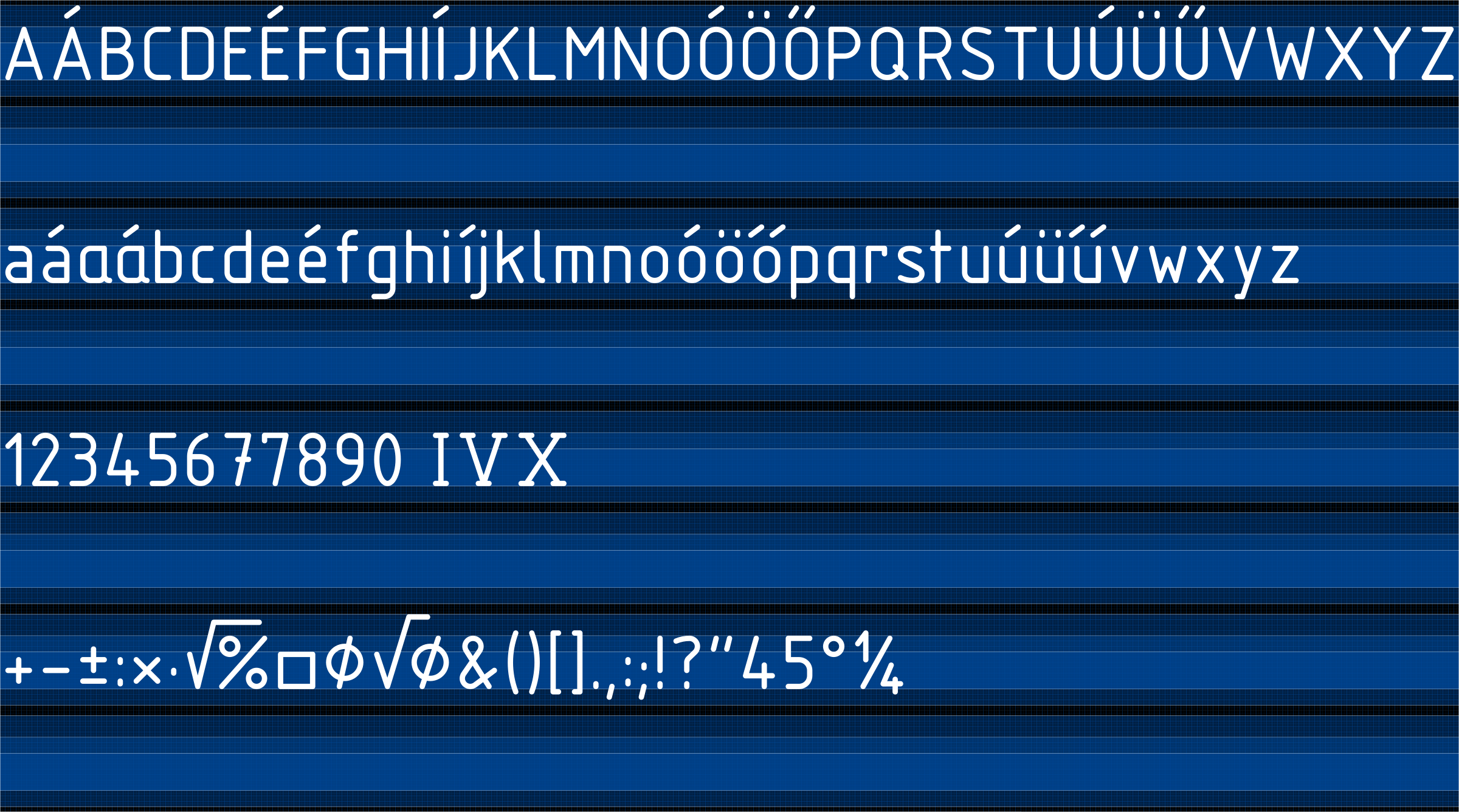
First, there are a few font versions already available however they are not "free" as they could be, nor complete or precise in a pedantic way.

The most commonly suggested equivalent is isocpeur.
In its font info it says
Copyright 1997,1998 Autodesk Inc. All rights reserved.

An autodesk developed font to be used in autocad -and similarly it spread on.

Another equivalent is osifont
That font has a bit more description embedded in:
Created by
Zefram Cochrane,
hikikomori82 at G-mail.com,
with FontForge 2.0 (http://fontforge.sf.net)

Project hosted on:
http://code.google.com/p/osifont/

Distributed under GNU GPL licence version 3 with GPL font exception:

As a special exception, if you create a document which uses this font, and embed this font or unaltered portions of this font into the document, this font does not by itself cause the resulting document to be covered by the GNU General Public License. This exception does not however invalidate any other reasons why the document might be covered by the GNU General Public License. If you modify this font, you may extend this exception to your version of the font, but you are not obligated to do so. If you do not wish to do so, delete this exception statement from your version.


So it offers a way better licensing yet still there are some technical problems with it.


Other font I could find online was isonorm3098.
Copr.1993 Robert Kirchner


Then again, there is this svg at wikimedia commons -iso 3098 svg offered to the public domain.


So the basics are all there.


What is the problem with isocpeur and the rest?
They are good on the screen but not "perfect".
The standard specifies the letters as build up from strokes drawn with a technical pen on an imaginary grid.
That is, all end caps are rounded as opposed to the fonts where no circular arcs are used, probably for a better hinting.

In a cad software anti-aliasing is usually switched off by default so hinting should hardly be a requirement.
A centerline font option would be the best to have. May suv drop in with her addition to an inkscape extension, rendering text in iso3098 typefaces, like the Hershey text extension.
(Could not link the corresponding part of the manual here although it was embedded quite while...)


General intention is to have a most complete version that anyone can contribute to, wich suits drafting needs the best.

Lazur
Posts: 4717
Joined: Tue Jun 14, 2016 10:38 am

Re: designing a font

Postby Lazur » Sun Dec 09, 2018 12:47 am

My weapon of choice -out of lack of knowledge about other open font design softwares up for the job- is fontforge.
Planning to share the font at some point at fontlibrary.
Thought to get some help from typophile however their new webpage is quite a bummer. Loads ever so slow, cannot log in nor find the information on what resources to look up.

Fontlibrary suggested going full fontforge. So it's time to learn the basics first right?

Preferred font output should be opentype font.
But what kind of Béziers to be used?
Inkscape uses cubic Béziers instead of quadratic by default.
However the mentioned above osifont and isocpeur were designed both with quadratic splines. But why?
I'm not much interested in file size but the output quality. Cubic seems easier to be handled if inkscape is also taking part of the project.

Started drawing the outlines in a cad program and have some progress.
However there one can draw circular arcs for fill object opposed to inksape's Bézier only interface. As far as I know inkscape can display circular path arcs but has no gui for drawing those. I assume fontforge or font renderers have no possibility to keep circular arcs as circular and trick the eye with Béziers.
That means I'll have to rebuild the typeset to match a Bézier implementation.
In inkscape that means some more extra nodes and whatnot.

Here comes the problem of scaling, size as well.
Fontforge claims to prefer integer coordinates between -2^15 and 2^15, while keeping the em size at 2048.
Have yet to figure out what it means.
The iso3098 specifies four types of the standardised lettering. The mentioned fonts only provide one of those -yet another reason to start off-.
Each of them claims the X height to be 10 times the stroke width they are drawn with (if I'm not mistaken with the narrow versions; will check it later).
Then again, the stroke widths are standardised too, therefore some specific lettering sizes are highly preferred.

Those stroke widths are either 0,13; 0,25; 0,5; 1; 2 or 0,18; 0,35; 0,7; 1,4; 2,8 mm in a drawing.
It sounds reasonable to make one of these the basic of the font size.


But how?

Need a way to figure how to import a dxf file into inkscape, right in scale to be exported as an svg font for fontforge, while making sure inkscape won't add in any rounding errors to have all integers inside fontforge.
Have to figure out the right measures to draw in so a "7" tall font will be rendered to a 7 mm X height in the cad software.
Sounds almost impossible. Inkscape's flipped coordinate system doesn't help much either I guess.

User avatar
brynn
Posts: 10309
Joined: Wed Sep 26, 2007 4:34 pm
Location: western USA
Contact:

Re: designing a font

Postby brynn » Sun Dec 09, 2018 6:00 am

Most of this is over my head. But good luck!

Lazur
Posts: 4717
Joined: Tue Jun 14, 2016 10:38 am

Re: designing a font

Postby Lazur » Sun Dec 09, 2018 9:11 pm

Yesterday skipped through the fontforge "manual".
Downloaded this site as a local pdf: design with fontforge.

Most of that is about designing a font from scratch or using fontforge's tools to draw vectorgraphics.
Only a few sections explaining the technical aspects that is mandatory to grasp for this project.

First, there is the em square.
Too bad the material there is confusing or rather misLEADing.

The EM Square
— Also called the ‘em size’ or ‘UPM’.
In a font, each character is fitted into its own space container. In traditional metal type this container was the actual metal block of each character. The height of each character piece was uniform, allowing the characters to be set neatly into rows and blocks (see below).


Image

Have no idea why did they mirror that photograph since even their icon shows the typefaces as they should be. You need a mirrored version of the actual print:
SVG Image

The height of the type piece is known as the ‘em’, and it originates from the width of the uppercase ‘M’ character; it was made so that the proportions of this letter would be square (hence the ‘em square’ denomination).
The em size is what the point size of metal type is calculated upon. So, a 10 points type has a 10 points em (see below).


SVG Image

Ok, so the em square is the height of the container. Why is that image has its container starting from the baseline of the letter instead of its descender?


And later they present the baseline correctly:
Image


In digital type, the em is a digitally-defined amount of space. In an OpenType font, the UPM — or em size is usually set at 1000 units. In TrueType fonts, the UPM is by convention a power of two, generally set to 1024 or 2048.

When the font is used to set type, the em is scaled to the desired point size. This means that for 10 pt type, the 1000 units for instance get scaled to 10 pt.

So if your uppercase ‘H’ is 700 units high, it will be 7 pt high on a 10 pt type.


In some later chapters it is written that the coordinates are integers between -2^15 and 2^15. Meaning, that you must place every node and handle upon an imaginary unit grid you set up at the start.
That's quite some issue as I'd like to keep rounded stroke caps and circular arcs as close as possible.
My guess is that the em square could use a higher number of units to be split into. Wondering if those extra digits would increase the file size dramatically and make the use of the font practically impossible.

On the other hand, the em size is what's scaled when using a font to the desired size. It'd be best if by the given 3,5 or 7 size the text would appear in right scale, however it seems that pt is the default when dealing with texts.
The cad software I'm using doesn't display a measure next to the font size, and guessing no other cad softwares would do differently.

Have to run a few tests.

Lazur
Posts: 4717
Joined: Tue Jun 14, 2016 10:38 am

Re: designing a font

Postby Lazur » Mon Dec 10, 2018 8:46 am

Checked again, the cad software measures the text in the document's measure units.
Then again, checked the ISO3098 specs too. It says the minimal text line distance should be 18 times the stroke width.
Weird. 3098-5 says the character box is 19 times the stroke width size (for the non-narrow version).

Image

That means theoretically, the 19 mm tall text should have a 10 mm X height.
Needless to say isocpeur scaled to 10 mm character height on canvas is 43.9799594879 (mm?) tall, while osifont is 38.4460544586.
And the same text typed with the two don't match in character spacing.

Also, that the em square is better set to 1900 or better yet 19000 units for the start? Needs to check fontforge's settings.
And how exporting from inkscape works... still lacking some courage to delve into the realm of type design. Just a small step at a time.


Edit:
Fontforge doesn't accept 19000 units for em size.
Ascent and Descent must be positive and their sum less than 16384

-that's 2^14 only not 2^15 or 2*2^15 if counting +- coordinates as a possibility...

Next try with 9500 units per em square.


Edit 2:
Something is fishy. Created a new font with 7500 ascent and 2000 descent size adding up a 9500 em square.
Saved an svg with a 9500/9500 px size and imported it into fontforge, added it to a character space.
Exported the font, reloaded inkscape.
Yay! Behold my first font, it appears in the list.
However the scaling is way off. Setting the text with that single character within to be 19 mm high, the font size is 53.8582649231. Not good.
Maybe the text size displayed is not in the default display units set but in pt?
Oh yes, too bad.
19 mm = 19/25,4*72=53,858267716535433070866141732283 pt. Maybe it's corrected in the current stabile? (Still running 0.92.2)


Edit 3:
The cad software struggles with rendering the font, maybe if there were no double edges and just a flattened design... still, it's messed up big time.
Crawling, textbox is off, scale is off.
So saved the test into a dxf from cad, opened it in inkscape. The text got substituted with an arial font. If changed the font back the text size got almost perfect: 18,997 mm.
By that, it's hard to tell why it's not an exact match since 0,003 mm is just... not close related to mm or pt.
Yet, it's still a 0,016% error.

Funny thing is if I make a text in inkscape with the font being set to 19 mm, saved as pdf with embedding the font, imported that in cad, the text appears right in scale. Would the rendering issue come from the em not set a power of two?
Practically I'd go by 9500 since that could go well with the ISO3098 grid of 19, resulting the coordinates aligned on the grid will end up in place after converting to a font.

Lazur
Posts: 4717
Joined: Tue Jun 14, 2016 10:38 am

Re: designing a font

Postby Lazur » Mon Dec 10, 2018 5:27 pm

Ok, corrected the character and extended the character set.
53,858267716535433070866141732283 pt hight text displays fine in inkscape, right on scale.
The cad program now zooms perfectly but is still off scale. Trying to connect with the developers.

Attaching the test font and a test svg.
Attachments
abctest.zip
(25.26 KiB) Downloaded 283 times

tylerdurden
Posts: 2344
Joined: Sun Apr 14, 2013 12:04 pm
Location: Michigan, USA

Re: designing a font

Postby tylerdurden » Mon Dec 10, 2018 11:21 pm

I seem to get similar results.

Maybe some rounding errors involved as Inkscape writes text sizes explicitly in px?
Have a nice day.

I'm using Inkscape 0.92.2 (5c3e80d, 2017-08-06), 64 bit win8.1

The Inkscape manual has lots of helpful info! http://tavmjong.free.fr/INKSCAPE/MANUAL/html/

Lazur
Posts: 4717
Joined: Tue Jun 14, 2016 10:38 am

Re: designing a font

Postby Lazur » Tue Dec 11, 2018 5:34 pm

Thank you for the clarification!

Got checked by others in a newer version of the cad softver too and it seems working as it is supposed.


Also looked at the character set. By default only latin-1 is available? Opening arial it takes ages to scroll through all of them so guessing one can add in new ones.

On a related problem, I'd need to extract all of the glypths from isocpeur/osifont/isonorm 3098, for comparing. There are some chinese characters inside which are not specified by ISO 3098.
Also need to check how to avoid my os rendering a fallback font (and what would that be anyway?) for glypths not defined.

Lazur
Posts: 4717
Joined: Tue Jun 14, 2016 10:38 am

Re: designing a font

Postby Lazur » Thu Dec 20, 2018 10:06 am

Still struggling with setting up a template file well.

The 9500 px/9500 px document size achieved with inkscape results the svg to have a viewBox="0 0 9500 9499.999999999995" in the codes.
Also it'd be the best if those stored 9500 in the codes would be displayed with 19 mm the best; 190 mm or 1900 mm as optional. Who knows those rounding error values, the bigger the substitute/display unit values the better?

Oh wait... there is the scale factor I never used before; this should come handy!

[qoute]scale user units per mm [/quote]

Should be vice versa. Wanting the 19.. mm to be scaled to 9500 px.
Let's see if I can get some documentation on this.

This page suggests setting up the viewbox as well.

related reading


Edit:
So it seems the viewbox defines the stored values in px, while the document size can be whatever you want the image to be scaled to.
Ideally in my case it would be
viewBox="0 0 9500 9500"
height="19000mm"
width="19000mm"


However this setup displays everything fine in mm units, switching the display values to px messes up big time.

Made this bug report on the matter.

Since then I learned that the document size setup is "outside svg" units, sort of to be scaled in real word and that the viewbox is what defines the document size in user units (px).

Then, the problem is the height/width of objects are displayed in px based on the conversation of the "outside svg" given units at 96 dpi, and not displaying the real user units -as requested&defined with the apropriate document width/height and viewbox ratio.

Maybe a pxxuu or simply uu (userunit) would be a nice add to the dropdown list of the measure units for more convenience.


Tl;dr: can't even trust the height/width values displayed in px units, they are NOT the actual userunits.
They are calculated based upon the display units (outside the svg) at 96 dpi.

Lazur
Posts: 4717
Joined: Tue Jun 14, 2016 10:38 am

Re: designing a font

Postby Lazur » Thu Dec 20, 2018 12:54 pm

Another issues about accuracy.

First inkscape adds in 9500.000233968096 instead of 9500 to the viewbox upon resaving. Not sure where that error comes or how it can be avoided.

Then, when the font is generated, the nodes AND the node handles are snapped to the emsquare's grid -9500/9500 this case- in fontforge, to avoid float values the font files (?) can't handle.
Which then, typed in to a text object in inkscape, converted to a path turns some of the supposedly smooth nodes into cusps.
The error is quite large, 0,11° some cases. Interestingly those previously smooth nodes had their tangents snapped to a different axis upon the conversation? How could that happen? On the test glypth that occured on 8 out of 72 nodes.


Some more problems.
Besides fontforge being too slow to function. Zooming, panning, navigating.
The font is generated with quadratic Bézier splines? Even though svg-s were imported to the char set? That's a bummer. Need to fix that soon.
It was changed upon generating the font from fontforge. Seriously, why is there a seting up in the ff file when it leaves no chances making that info into the font file.

Lazur
Posts: 4717
Joined: Tue Jun 14, 2016 10:38 am

Re: designing a font

Postby Lazur » Sat Dec 22, 2018 1:36 pm

Turns out it was me with the Bézier changing from cubic to quadratic.
Will have to keep in mind to generate the font as an opentype font and not as truetype. Latter doesn't support cubic Béziers.

Made this image from the base template, thought it could work as a thumbnail for the project -or for a collection of characters at openclipart.
(Too bad that it's a reupload and openclipart has the hickups using it as it is supposed.)

Image

Also tried out that extension but have yet to figure out how to overlap the objects correctly.

User avatar
flamingolady
Posts: 687
Joined: Wed Jun 10, 2009 1:40 pm

Re: designing a font

Postby flamingolady » Fri Apr 26, 2019 2:55 am

Lazur, how's the font coming along? I started playing with it about 1 1/2 yrs ago, wow, there's so much involved. I've forgotten more than I learned unfortunately, lol. I ended up using Inkscape to make a font, then uploaded it to FF to run it through their tests to work the bugs out. One day, when I want to go crazy again, I'll pick it up and continue. I did get a test font done (called plain font, very, very, very basic!). but I was delighted to get anything that works. In the process I learned that you have to use a diff file mgr in order to delete the test fonts, that issue in and of itself about did me in, lol.
Anyway, I just can't imagine creating a font on CAD! I'm impressed! keep us posted. Much of what you said went way over my head, but I do have an interest in font making.

Lazur
Posts: 4717
Joined: Tue Jun 14, 2016 10:38 am

Re: designing a font

Postby Lazur » Fri Apr 26, 2019 6:00 am

Thank you for your interest!

Currently got stuck with almost anything but everything.
My plan was to save each glypth as a separate svg and share them on openclipart, once reaching my magical 3000th upload.
Openclipart is down at the moment -due to some spring cleaning maybe? Surely it lacked development.
Maybe it's time for finding a more reliable way on online hosting.
But then again, my ssd is running low on storage space and my laptop has a few dents too. So it's not just online but offline database to re-build with a well organised structure.
In addition, abandoned most of my "spare time" projects because of the realm at my job needs some extra time to fix the chaos.
Fun fact this font design idea came from making a cad template -which we couldn't afford the time to make from the start yet losing way more time out of having no office standards.
We'll seriously need to make a reliable cad file on the fly. Will try to make that happen soon.
And then get back on track.


Edit:
-some notes to self on organising-

8 is the number after one can't get away from the concept of repetition.
Therefore a base folder structure needs to have either less than 8 -preferably 6 the most- subfolders of equally important content OR start labeling those subfolders with numbers and make a separate spreadsheet or cherrytree file listing the content description of each subfolder.
I find unnecessary numbering also confusing, like with 3 folders -yet.
However given the fact if each folder is numbered, one could note a path directory easily by a longer number. "04-03-69" for example.
Can recall how hard it was to follow a teacher of mine sharing the lectures in a folder structure where there were more folders than files shared.
Definitely want to avoid that. Attempting to keep the level of subfolders low.

Also folders need to help the organisation. If the folder's purpose is to hold subfolders, don't save other files inside. Make their own folder as a subfolder of the parent.

User avatar
flamingolady
Posts: 687
Joined: Wed Jun 10, 2009 1:40 pm

Re: designing a font

Postby flamingolady » Mon Apr 29, 2019 9:46 am

whoa, that's a lot of 'stuff'! Good idea to make each glyph a separate file, but why not just share one font file from inkscape?
I would go crazy if I didn't name my many subfolders by description vs number. Numbers would mean nothing to me. But then again, I have that typical female thing where for instance I need a landmark for directions vs telling me to go north 4 blocks and turn east. shoot, I can't even do reverse directions, my hubs has to rewrite them or I get lost coming out of someone's driveway, lol.
Keep us posted!

Lazur
Posts: 4717
Joined: Tue Jun 14, 2016 10:38 am

Re: designing a font

Postby Lazur » Sun Jul 28, 2019 8:56 am

flamingolady wrote:Keep us posted!


This is a bit off topic then to those fonts but here it goes.

Mentioned in another thread my struggle with free disc space so now I'm in the process of archiving and organising recent and older material.
Just connected in a fresh 1 TB external hdd to my beat up pc out of its box.
So far this is the file structure I'll use:

01 logs
--->subfolders with date stamps as names
The subfolders containing a list of the added items in the related arciving process.
Also preferably a list of the pc's data the files were saved from.
handy programs: -cherrytree (for taking manual notes)
-notepad++ (for editing.html

User avatar
flamingolady
Posts: 687
Joined: Wed Jun 10, 2009 1:40 pm

Re: designing a font

Postby flamingolady » Tue Jul 30, 2019 1:51 am

wow, you've put a LOT of thought into this process, kudos to that.
I think given the nature of technology these days, it would be nice if there was a class taught in elementary school on this, so right off the bat, the youngins' would have their 'life' set up at the get go, before it gets to the complicated stage that basically most of us are it - why did I file that?
I remember when the windows op sys and so many changes hit in the 90's - and I thought to myself - how will I ever remember where I file things. With organization, it's easy to end p with duplicates too. I often can't remember if I filed a design element in a folder called design element, texture, floral or whatever, and end up doing a system wide search vs an inkscape search. And what about files that have been manipulated with Gimp, and also inkscape, I lose those all the time! lol
Kudos on doing so well and really digging it, keep it up!

Moini
Posts: 3381
Joined: Mon Oct 05, 2015 10:44 am

Re: designing a font

Postby Moini » Tue Jul 30, 2019 9:48 am

There are library / asset managing tools available for that kind of thing (reusable elements, not finished designs).
Something doesn't work? - Keeping an eye on the status bar can save you a lot of time!

Inkscape FAQ - Learning Resources - Website with tutorials (German and English)

Lazur
Posts: 4717
Joined: Tue Jun 14, 2016 10:38 am

Re: designing a font

Postby Lazur » Tue Jul 30, 2019 5:13 pm

Moini wrote:There are library / asset managing tools available for that kind of thing (reusable elements, not finished designs).


Will have to look into more DAM.


Return to “Work in progress”