Logo design for balka/reggae band

Post unfinished work here for feedback and advise.
irie
Posts: 5
Joined: Wed May 15, 2013 10:33 pm

Logo design for balka/reggae band

Postby irie » Thu May 16, 2013 3:20 am

Hey there,

I just recently discovered the magic of vector-based design, I´m still a total Noob, but I hope I can improve my stills with a little help ;)

Did this band-logo for my reggae/balkan band, but I´m not shure if it´s too much for a cover. I´m not going for simplicity, even though it´s what you allways hear from designers :D

Can you give me some feedback on how you like the logo in general and if you think it fits together with the bands music, which is laidback and chilled(the reggae part) but in the future also will be more with the power and heat from the balkan universe.

Hope you know what I mean? :)

https://www.box.com/s/0scqs9y211hlnk1u7gqy

Greeting , Irie

Lazur
Posts: 4717
Joined: Tue Jun 14, 2016 10:38 am

Re: Logo design for balka/reggae band

Postby Lazur » Thu May 16, 2013 5:27 pm

That's right, less is more.
It is said because if you use as less elements as possible, you will have to make decisions,
what is more important of the things you want to show, making the visual concept cleaner,
not looking as an overblown nonsense.
I'm not much into that kind of music. Did you search for reference images?
Some designers prefer to make even a moodboard before designing.
The concept behind that logo seems to be mixed up, also the graphical look.
The drum's and the devil tails details are too small compared to the trees or even to that fountain.
It looks it was put together from different parts, but it didn't come together.

irie
Posts: 5
Joined: Wed May 15, 2013 10:33 pm

Re: Logo design for balka/reggae band

Postby irie » Thu May 16, 2013 5:41 pm

Cool, thanks for the quick response.

Yeah, I think you´re right. I´m going for something of a dilemma, even so the music is generally happy it´s also melancholic, and I wanted the image to express both feelings.
The green and brown background I think might express the organic nature of the music, since we mostly use acoustic instruments.

I´ve done a little changes, and tried to simplyfy it :)

Image

irie
Posts: 5
Joined: Wed May 15, 2013 10:33 pm

Re: Logo design for balka/reggae band

Postby irie » Thu May 16, 2013 6:45 pm

Thanks for your time. Yeah I guess you´re right!

I wanted the picture to express both happiness and melancholy, like reggae and balkan, but maybe I did too much.

I tried to make it more simple:

Image

User avatar
Maestral
Posts: 982
Joined: Sat Aug 27, 2011 7:10 am

Re: Logo design for balka/reggae band

Postby Maestral » Thu May 16, 2013 7:22 pm

Might be good for you to find a difference between a logo and illustration. This looks more like a poster to me, rather than a logo.
If it helps, try to imagine this as a poster and then find a place for a logo on it. Would it be the inscription? Something else?
Logo should state clearly for what (whom) it stands for. It`s like when you meet somebody and when asked for a name, instead of name and surname, you hear something like - Pablo Diego José Francisco de Paula Juan Nepomuceno María de los Remedios Cipriano de la Santísima Trinidad Martyr Patricio Clito Ruíz y Picasso. ,)
:tool_zoom: <<< click! - but, those with a cheaper tickets should go this way >>> :!:

irie
Posts: 5
Joined: Wed May 15, 2013 10:33 pm

Re: Logo design for balka/reggae band

Postby irie » Fri May 17, 2013 7:26 pm

Think I´ll use this one for album/poster cover and make a new logo, which is just very simple:) Thanks guys

User avatar
brynn
Posts: 10309
Joined: Wed Sep 26, 2007 4:34 pm
Location: western USA
Contact:

Re: Logo design for balka/reggae band

Postby brynn » Fri May 17, 2013 9:54 pm

I think the original, with a few tweaks, would be great for an album/cd cover. Details are great for covers! But it's WAY too much detail for a logo. For a logo, maybe just the ribbon with "piotr" on it. Or a simplified horn, or simplified tree.

I think the dancer idea, from Lazur URH, would be great, if you're primarily a dance band. Although I think that image depicts a certain religious sect which literally spin their bodies around, for hours on end, to achieve some higher meditative/spiritual state. I can't remember what it's called at the moment. Edit - just thought of it - dervish. Or I guess it might work, if you're more of an artsy band and/or spiritual band, it could work. (Note the small image halfway down this page: http://www.thefreedictionary.com/dervish)

irie
Posts: 5
Joined: Wed May 15, 2013 10:33 pm

Re: Logo design for balka/reggae band

Postby irie » Sat May 18, 2013 12:04 am

Cool, yeah I thought the dervish might represent arabic mystery and since balkan music is connected with arabia, this would represent the sound quite well.

But ok, more simplicity....it´s very diffecult because I want the logo to represent both balkan and reggae. Roots reggae, for me always has something to do with nature, and balkan with brass or gypsys. The music isn´t religious, but philosophy I guess plays a certain role. Some of the music is happy, dance-able, but some is quite chilled.

maybe some of this this might work??

Image
Image
Image

User avatar
Johannski
Posts: 65
Joined: Wed May 05, 2010 3:13 am
Location: Austria
Contact:

Re: Logo design for balka/reggae band

Postby Johannski » Sat May 18, 2013 1:11 am

You are still a Noob? For that you're really fast at creating content. ^^

I like the first Logo with the tree and the green dot. The only problem I sse is, that if I wouldn't know that this logo should be for a band I would neither think that it is from a band nor would I be able to tell what kind of music they make. I don't know.
You're for sure on the right track :)
Image

Lazur
Posts: 4717
Joined: Tue Jun 14, 2016 10:38 am

Re: Logo design for balka/reggae band

Postby Lazur » Sat May 18, 2013 1:14 am

The detail level is not balanced.
You want the logo to be remembered, yet you put in too much details onto a "decorating" element.
That, is not emblematic enough.

Logo designing in general is very scale-sensitive.
The best example to give to customers is if they want their logo to be printed to a pen, it still has to be legible.
For band logos it is a bit different, but considering black and white printing is a must.

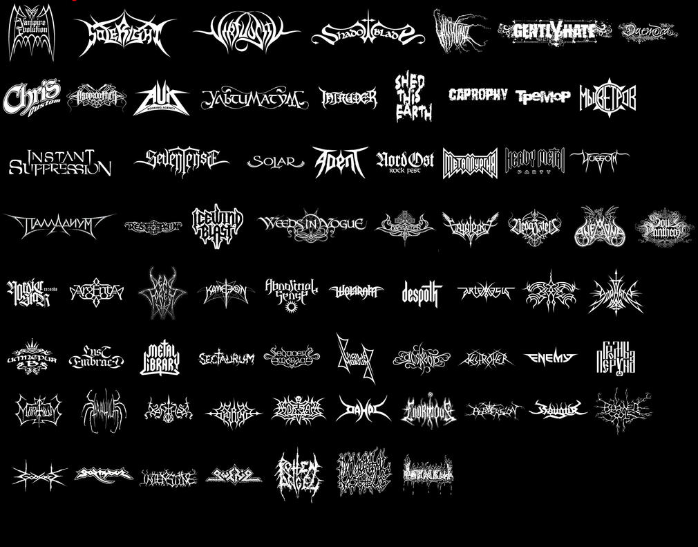
Bands from the same genre follow similarities in their logos as well.
I could find an example on black metal only:
Image
Such poster could be done from famous dj-s as well, like Hardwell, David Guetta, Tiesto, Nicky Romeo, deadmou5, and so on.
All have the same detail level next to eachother.

I would say you would be fine with only a good logotype.
There are not much bands that use pictorial elements in their logo -like deadmou5 or Tiesto.


Return to “Work in progress”