a new era ( type)

Post unfinished work here for feedback and advise.
User avatar
RM.
Posts: 249
Joined: Mon Jan 05, 2009 10:33 am
Location: Italy, Sardegna

a new era ( type)

Postby RM. » Sun Jan 03, 2010 3:48 pm

Hello :P This time a new challenge, make a type!
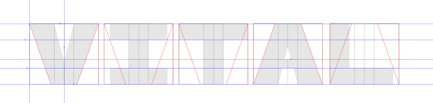
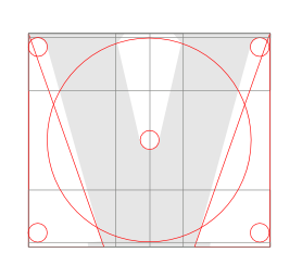
This is what i got now.

[Updating picture]

To do: f, g, t, v, x. ( i'm not happy with the i )
What you think? Some help would be appreciated!
Last edited by RM. on Wed Mar 25, 2015 10:12 pm, edited 1 time in total.
I'm just someone who likes to create.

Logopond - CGsociety

User avatar
openmind
Posts: 13
Joined: Tue Jan 05, 2010 9:35 am

Re: a new era ( type)

Postby openmind » Thu Jan 07, 2010 3:50 am

Very cool, mind stickin in the file? lol
Openmind vector Agency.
-------------------------------
Thank-s Firefox

User avatar
prkos
Posts: 1625
Joined: Tue Nov 06, 2007 8:45 am
Location: Croatia

Re: a new era ( type)

Postby prkos » Thu Jan 07, 2010 4:34 am

very kewl! classy futuristic techno :)
just hand over the chocolate and nobody gets hurt

Inkscape Manual on Floss
Inkscape FAQ
very comprehensive Inkscape guide
Inkscape 0.48 Illustrator's Cookbook - 109 recipes to learn and explore Inkscape - with SVG examples to download

User avatar
RM.
Posts: 249
Joined: Mon Jan 05, 2009 10:33 am
Location: Italy, Sardegna

Re: a new era ( type)

Postby RM. » Mon Jan 11, 2010 11:59 am

eheh thanks :) openmind, i will share it when it's finished.
I'm just someone who likes to create.

Logopond - CGsociety

User avatar
RM.
Posts: 249
Joined: Mon Jan 05, 2009 10:33 am
Location: Italy, Sardegna

Re: a new era ( type)

Postby RM. » Wed Jun 29, 2011 8:30 am

A little update.. K and X are missing here. Need more work.

[Picture removed]
Last edited by RM. on Wed Mar 25, 2015 10:14 pm, edited 1 time in total.
I'm just someone who likes to create.

Logopond - CGsociety

User avatar
VitalBodies
Posts: 112
Joined: Wed Feb 03, 2010 6:47 pm

Re: a new era ( type)

Postby VitalBodies » Wed Jun 29, 2011 6:41 pm

All in all, very nice. The whole overall ambiance that this font creates is very pleasing and an easy read both.
For suggestions I would say the J and Z challenge my eye and would even more so, if they were not in context.
I like the style but would not know what letter they are with out a glitch or two in thought processing of the letter.
In the image you posted at the top of the thread, the font is really "shown off" well and looks great.
It is all subjective, but to me it seems pleasing, approachable yet with overt and hidden style.
Seems awesome, I would psyched if I had created such a font.

User avatar
RM.
Posts: 249
Joined: Mon Jan 05, 2009 10:33 am
Location: Italy, Sardegna

Re: a new era ( type)

Postby RM. » Thu Jun 30, 2011 2:21 pm

Glad you like it. (:
VitalBodies wrote:All in all, very nice. The whole overall ambiance that this font creates is very pleasing and an easy read both.
For suggestions I would say the J and Z challenge my eye and would even more so, if they were not in context.
I like the style but would not know what letter they are with out a glitch or two in thought processing of the letter.

As you notice, there's still work to do! If you look careful, some letters are the same, reflected or rotated.
I.e. m = w, a = e, j = r, b = d = p = q etc. That's because i want it to be something fun to play with, specially for logo and other type of design. It is not intended for long reads.

VitalBodies wrote:Seems awesome, I would psyched if I had created such a font.

I'm also happy because this was meant to be for a logo contest. Unfortunately, the entry was rejected immediately. Well, at least it served for something.. :D
I'm just someone who likes to create.

Logopond - CGsociety

User avatar
VitalBodies
Posts: 112
Joined: Wed Feb 03, 2010 6:47 pm

Re: a new era ( type)

Postby VitalBodies » Thu Jun 30, 2011 5:33 pm

One can not always tell what is done with intention or just copy and paste (or copy paste and flip. : )
Will you do a the font in CAPS also?
Any special thoughts for special characters?

User avatar
RM.
Posts: 249
Joined: Mon Jan 05, 2009 10:33 am
Location: Italy, Sardegna

Re: a new era ( type)

Postby RM. » Fri Jul 01, 2011 7:06 am

Caps will probably come. Not sure about numbers and special characters! Will see.. :D
I'm just someone who likes to create.

Logopond - CGsociety

User avatar
RM.
Posts: 249
Joined: Mon Jan 05, 2009 10:33 am
Location: Italy, Sardegna

Re: a new era ( type)

Postby RM. » Tue Jul 05, 2011 7:58 am

Here is a preview of a few caps..

[Picture removed]

------

Unfortunately, yesterday, i noticed that some letters, specially on the first row, are similar to other fonts.
And obviously i don't want people to think i'm copying or something like that...
I would really need advices from an expert. However, where to find it?
Last edited by RM. on Wed Mar 25, 2015 10:14 pm, edited 1 time in total.
I'm just someone who likes to create.

Logopond - CGsociety

User avatar
VitalBodies
Posts: 112
Joined: Wed Feb 03, 2010 6:47 pm

Re: a new era ( type)

Postby VitalBodies » Tue Jul 05, 2011 8:49 am

Seems like it comes down to defining what makes the font your font.
A letter is a letter but what makes this your design of a font?
Perhaps a ratio, or certain curve or a specific weight...
Seems like you are attempting a specific out come rather than coping anyone.

User avatar
VitalBodies
Posts: 112
Joined: Wed Feb 03, 2010 6:47 pm

Re: a new era ( type)

Postby VitalBodies » Fri Jul 15, 2011 6:20 pm

Rereading what I wrote above, I realize one could take what was written a number of ways.
My thoughts were intended to be positive and supportive.

Here is something I posted some time back:
Image
Image
Image

You can tell by the guide lines that the font is my font and that there are ratios and methods I have used to create the font from scratch.
I think if you post that kind of detail then it is a much clearer demonstration that you are not copying a font but creating one.
This is a way of "defining what makes the font your font" and shows you used "Perhaps a ratio, or certain curve or a specific weight..."
I am not saying I want you to do that or not do that, but it is a suggestion you could consider if you are looking for ideas on how to show you created the font.
This, however might not apply to you at all, as you might be using a totally different method of creating your fonts.
Just trying to help : )

User avatar
RM.
Posts: 249
Joined: Mon Jan 05, 2009 10:33 am
Location: Italy, Sardegna

Re: a new era ( type)

Postby RM. » Sat Jul 16, 2011 9:18 am

Sorry for the late reply. I will do that, thanks! :)
Behance has great examples on how to show a finished font. I absolutely love the FontFabric ones!
I'm preparing a .pdf with some illustrations that shows how to use it and how it was made. Seems fun! :)
Now that i think of it, i don't even know how to release it. .svg or .ttf?
Releasing a .svg would be the easiest way. On the other side, for the .ttf i should learn to use FontForge,
and it's not too friendly.
I'm just someone who likes to create.

Logopond - CGsociety

User avatar
VitalBodies
Posts: 112
Joined: Wed Feb 03, 2010 6:47 pm

Re: a new era ( type)

Postby VitalBodies » Sun Jul 17, 2011 2:53 pm

Fontforge is deep...
There are some other Open Source font programs also. Or well, maybe Fontforge is all there is...

chriswww
Posts: 383
Joined: Fri Nov 19, 2010 3:04 pm

Re: a new era ( type)

Postby chriswww » Mon Jul 25, 2011 11:44 am

VitalBodies...is that forest font done in inkscape?..and if so, how did you do the circular (guides?) and aligning to the guides? Just a general idea if you don't mind being asked.

User avatar
VitalBodies
Posts: 112
Joined: Wed Feb 03, 2010 6:47 pm

Re: a new era ( type)

Postby VitalBodies » Mon Jul 25, 2011 1:10 pm

"Guides" is a term in Inkscape that means something exacting and I used the word not so exacting.
I did use Inkscape.
I made my own "guides" (not technically guides as in guide lines) simply by making shapes (circles and lines and rectangles and polygons etc) for me to reference off of.
They start on the layer of the main lettering then can be moved to their own layer if needed.
I also had inkscape "guide lines" setup as you can see.
You can use your own self made guides as "snap to" objects or use them just for visual reference.
Once your guides are made you can duplicate them and Ctrl drag them horizontally to make the next letter.
If you choose this route of lettering I suggest you make them sort of basic (to start with) to begin building your master guide/pattern.

Draw first the letters that define all the other similar letters like O defines/patterns/templates the Q and C for example and X does the same for the Z.
You will end up with a master guide that has within it all the sub guides (the guides for each defining letter).
That master guide then gives you vast visual reference to make each letter creatively yet enough the same to all be the same "font" and be your font.
At that point you can leave the more basic level of making letters as your master guide will be complete.
It will take roughing out a number of defining letters to build your master guide - each letter helps refine/define the master guide.
If you look at my guide you can see I can make O and Q and the like and letters like V and I and others.

Once you have your master guide built the fun starts!

The images I posted further up in this thread show you a process.
I made a V to start my master pattern and that helps for the A which came later.
Then I made an I (and that helps for a whole bunch of letters) then a T (which is based on the I) then I flipped the V pattern to make an A etc.
I was trying the make the word VITAL but if I was doing a whole font I would do roughly the same but more strategically (X, I, E, O, B, M etc) like I said above.

The Forest V was for fun to demonstrate the process (for a thread on this forum) but does not show the completed process or final master pattern - just the concepts.

Once you have your master guide/pattern/template you can make letters. You can also scale the guide/pattern/template so it is more narrow or wide for a new and different font or change some of the ratios within the guide/pattern/template.
Last edited by VitalBodies on Tue Jul 26, 2011 4:47 am, edited 1 time in total.

chriswww
Posts: 383
Joined: Fri Nov 19, 2010 3:04 pm

Re: a new era ( type)

Postby chriswww » Mon Jul 25, 2011 10:30 pm

thanks heaps for the reply VitalBodies

User avatar
VitalBodies
Posts: 112
Joined: Wed Feb 03, 2010 6:47 pm

Re: a new era ( type)

Postby VitalBodies » Tue Jul 26, 2011 6:16 pm

It will be fun to see if you care to share. : )

chriswww
Posts: 383
Joined: Fri Nov 19, 2010 3:04 pm

Re: a new era ( type)

Postby chriswww » Tue Jul 26, 2011 6:31 pm

i've never really designed a full font face from scratch. however i have a keen interest in typography. had a quick try at using spirograph tool to create some writing and found it good but somewhat limiting. maybe it's time to make at least a logo type.

User avatar
brynn
Posts: 10309
Joined: Wed Sep 26, 2007 4:34 pm
Location: western USA
Contact:

Re: a new era ( type)

Postby brynn » Tue Jul 26, 2011 8:09 pm

How could the Spirograph extension create a font? Or are you talking about so-called 'wing ding' or 'ding bat' type of font?

chriswww
Posts: 383
Joined: Fri Nov 19, 2010 3:04 pm

Re: a new era ( type)

Postby chriswww » Wed Jul 27, 2011 8:05 am

using the pen tool in spirograph mode. not the spirograph extension itself. although that's an idea.

User avatar
VitalBodies
Posts: 112
Joined: Wed Feb 03, 2010 6:47 pm

Re: a new era ( type)

Postby VitalBodies » Wed Jul 27, 2011 5:47 pm

What I liked about this method is the process is so so organic. In a sense you make something to make something, but you do not have all the details to at the start so the whole process evolves with each step.
Each new letter you create in order to build your master guide/patten/template changes and evolves the template and in a way the artist.
Step by step the pattern evolves and the pattern itself evolves each letter which in turn evolves the pattern.
It is really interesting.

That is why I said to start out pretty basic on creating letters as in the end (once the master guide is built) you might throw them all out - or use them as the tool they were, to learn from.
From that point on the master guide will help shape the letters, once again, in an organic evolving art form.
In the end, the font created will truly be "a work of art" and a one of a kind.
But more important than that is the process, and how it evolves you.

You do not need a style for the font when you start, but let the process create that for you.
At least that is how it is for me...

chriswww
Posts: 383
Joined: Fri Nov 19, 2010 3:04 pm

Re: a new era ( type)

Postby chriswww » Wed Jul 27, 2011 7:19 pm

sigh..spent some of today again fighting woeful win xp fonts....in ms word that is. slim pickings for a good heading font.
anyway...see how it goes designing a font.


Return to “Work in progress”