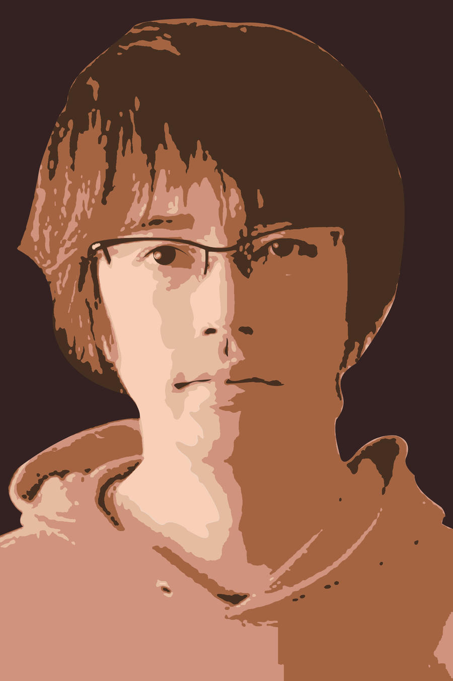
http://postimg.org/image/pjn39jfwl/full
I need additional details. Self Portrait of Me. WIP
I need additional details. Self Portrait of Me. WIP
still WIP. i need your comment and additional details for this. Inkscape user for 1 week.. thanks guys..
http://postimg.org/image/pjn39jfwl/full
http://postimg.org/image/pjn39jfwl/full
Re: I need additional details. Self Portrait of Me. WIP
Hello,
I think You are doing a good job, but i think it's far away of photo realism (if that is the result that you want). You are not trying a cartoon style, because the detail used with the face. So, in order to give a better feedback. Which style of illustration are you trying to achieve? could you give an example?.
Do you want something like this vector photorealism?:
http://media02.hongkiat.com/photorealis ... rest-1.jpg
or like this:
http://media-cache-ak0.pinimg.com/236x/ ... dfe559.jpg
or like this:
http://fc00.deviantart.net/fs71/i/2012/ ... 4tn8kn.jpg
or like this:
http://static.freepik.com/free-photo/mi ... _97914.jpg
or like this:
http://1.bp.blogspot.com/-IYjKrAb2eek/T ... ime-12.jpg
What i can say is that it seems that your portrait seems like it was done with too much light. There is too much white in there. It's not balanced. The lips seems plain. They have to follow the shape of the face. Also, my personal opinion, to have blured shapes and sharp shapes confuses and bothers me.
P.D.: It's better to make a portrait in 3/4 view. It's considered more natural that a front view portrait, like yours.
On the other hand, all my opinions are just of a digital art lover. Just a wanabee maybe...
If you have problems:
1.- Post a sample (or samples) of your file please.
2.- Please check here:
http://tavmjong.free.fr/INKSCAPE/MANUAL/html/index.html
3.- If you manage to solve your problem, please post here your solution.
1.- Post a sample (or samples) of your file please.
2.- Please check here:
http://tavmjong.free.fr/INKSCAPE/MANUAL/html/index.html
3.- If you manage to solve your problem, please post here your solution.