While these are goofy and information poor, and business people should never be allowed to use the word "cloud," I don't think doughnuts are the easy answer. (Unless of course, you use doughnuts to bribe the chart maker into developing an infographic instead.)
as long as you don't use the a-word. "Automatically".
That would be why you don't allow business people around charts. Automagical over simplifications shouldn't be made pretty with gradients.
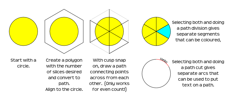
It could be done with circles of varying sizes, one atop the other. Of course you can grab the segment handle of the circle tool and create pie slices. Interesting that description does not disclose degrees of the segment. Control+Drag constrains the arc, but again the degree of arc isn't readily shown. I suppose it is one of those quaint unix-command-line deals for precision control.
But to keep it easy, you'd do a full circle on the bottom. Then a 5/6ths arc of the next color atop that. Then 4/6ths and so on -- one atop the other -- counter intuitive, but much easier than aligning six pie shapes of the exact size. They'll look like doughnuts when a small "pie" is placed over a larger one. Lots of overlap, but who cares? The point is making the task easy. And it will be anything but trying to align shapes that don't overlap.
Where's the chart explaining you shouldn't use doughnut charts?