Postby brynn » Tue Sep 04, 2018 1:01 am
Ooh, I love your theme color. I might have to copy it!
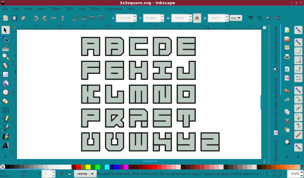
For the font design, to me, some things are not consistent. I don't understand why the B and D have little lines at the bottom. The sort of "serifs" on the U and V don't seem to consistent with the rest. I don't understand the long line at the top of the R, instead of a short line, like in the P. I also wouldn't use the short line on the R, in the lower right. However, those short lines on the X do seem necessary.
But I generally like the style. Are you going to make an SVG font, or just a regular font?