Help With Shadows/Shading

Post unfinished work here for feedback and advise.
Vanessa

Help With Shadows/Shading

Postby Vanessa » Tue May 05, 2009 12:22 pm

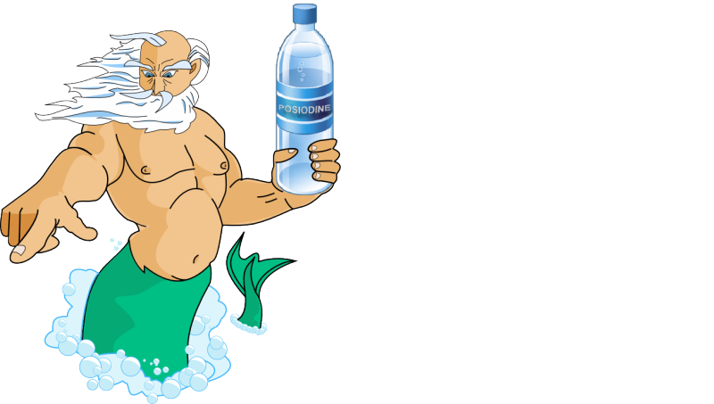
I sort of traced an image, so I didn't trace it directly everywhere but it is very similar. I am definitely not advanced in Inkscape and I have done my best to make it look professional but there is something missing. I am not that artistic and I don't know the little things about shading or doing eyes and hands and I know my picture could be really good if some one just tweaks it a little.

I was hoping some one would be willing to look over my image and make it look a bit more professional. I've seen some of the work people have done on here and it is AMAZING! It is for a Biology project and we are developing a product called Posiodine, so it is Poseidone holding a water bottle that says Posiodine (it purifies water using iodine).

Here is what I have so far:
Image

Here is the picture I copied from:
http://www.istockphoto.com/file_thumbvi ... he-sea.jpg

If you are willing to help please post here or email me at vanessaforney@gmail.com. I would really appreciate it!

Thank you,
Vanessa

User avatar
brynn
Posts: 10309
Joined: Wed Sep 26, 2007 4:34 pm
Location: western USA
Contact:

Re: Help With Shadows/Shading

Postby brynn » Tue May 05, 2009 8:42 pm

I am not that artistic and I don't know the little things about shading or doing eyes and hands and I know my picture could be really good if some one just tweaks it a little.

Well I don't know, the water, or iodine bottle looks fantastic. If you did the water bottle, I'd say you should be able to handle the litte bit of tweaking that the rest of the image might need, without too much trouble!

User avatar
prkos
Posts: 1625
Joined: Tue Nov 06, 2007 8:45 am
Location: Croatia

Re: Help With Shadows/Shading

Postby prkos » Tue May 05, 2009 9:28 pm

The Poseidon looks less realistic than the bottle, isn't that the look you're after?

If you want Poseidon to look realistic you have to turn it away from caricature, which means removing the black outlines and adding many blurred objects that will serve as highlights and shadows. Maybe you should find a photo of a oiled tanned hunk and trace him :mrgreen: :lol: The point is you should look at a photo and not caricature if you want realistic effect.

The bottle seems a bit wider at the bottom, you should shrink it, or shrink the whole bottle so it fits in his hand nicely (now his fingers seem very thin). You should also make the bottle partly transparent so we see his hand behind it, you may have to darken the colors after you increase transparency to maintain the same color. You can use Pattern along path effect to make the name wrap around bottle nicely. You can find an example in the Inkscape guide (Split pea soup example I think).
just hand over the chocolate and nobody gets hurt

Inkscape Manual on Floss
Inkscape FAQ
very comprehensive Inkscape guide
Inkscape 0.48 Illustrator's Cookbook - 109 recipes to learn and explore Inkscape - with SVG examples to download

llogg
Posts: 443
Joined: Tue Mar 11, 2008 7:30 am

Re: Help With Shadows/Shading

Postby llogg » Tue May 05, 2009 9:47 pm

Also feels like the angle of the hand would make the bottle tilt away from the viewer in perspective.

Vanessa

Re: Help With Shadows/Shading

Postby Vanessa » Tue May 05, 2009 11:52 pm

I do want him to look like a caricature and I want the black lines. There is just something wrong with his eyes and I wasn't sure how to do the shading on his beard.

I did NOT do the water bottle. I searched on google for it and my friend added the words. I also have to keep it that size because they need to see the words on the bottle. I know it looks a little funny but it was the best I could do.

User avatar
EarlyBlake
Posts: 302
Joined: Tue Jun 03, 2008 5:42 pm

Re: Help With Shadows/Shading

Postby EarlyBlake » Wed May 06, 2009 2:44 pm

His is little cross eye in the original but since the vector is larger it's more obvious in the vector. Making the eyes look like the are focus on the right point is the hardest part in cartoons. You can either go fine a "how-to" type site and see how the do guides to make the eyes line up. Or just tweet around the left pupil and iris until it looks right. His beard is the only thing in the original that has 3 tones middle tone highlight and low light. If you don't want to do all three drop the low light -- just use the middle and highlights. You might want to do the water bottle. Water is easily down in vectors.

Cedworth

Re: Help With Shadows/Shading

Postby Cedworth » Sat Jun 13, 2009 2:08 pm

try to line up the iris/pupils to the same corner of their respective eyes (not mirrored unless he is looking exactly straight forward). Put both in the bottom left corner (this isn't exactly anatomically correct, but it will work for most cartoony type stuff.)

He's holding the bottle really awkwardly. Pick up a bottle in real life. The bottom of the bottle will be below the palm. This will make it look much better. Try to line up the fingers about where the label starts (this will also make more contrast and bring a bit more focus to the label. The words should also be bent to the same degree as the rest of the label.

Also, the thumb on the bottle hand needs to be thicker, the portion that is on the left of the bottle specifically. It looks like the bottle just clips the thumb instead of being held by it.

I actually like the shadows on the beard, it gives it kind of a seawave sort of feel which works for poseidon.


Return to “Work in progress”