Hi Friends,
Persuant to the discussion in this topic viewtopic.php?f=18&t=11402 in which someone takes offense at the image shown on the page you see on the index page if you aren't logged in, microUgly (forum admin) has agreed to have a competition for a new image to take it's place. I'm thinking it should be 100% Inkscape, and represent what Inkscape can do, and maybe even the personality of this forum. Although micro has not set any requirements, at least not yet.
He says he'll give it a few weeks for submissions, and then choose one. So I would say, upload images to the host of your choice, and then insert them in a reply to this topic.
Actually micro, if you wouldn't mind setting some guidelines? Especially I'm thinking, any size restrictions?
new image for visitor index page, competition
new image for visitor index page, competition
Basics - Help menu > Tutorials
Manual - Inkscape: Guide to a Vector Drawing Program
Inkscape Community - Inkscape FAQ - Gallery
Inkscape for Cutting Design
Manual - Inkscape: Guide to a Vector Drawing Program
Inkscape Community - Inkscape FAQ - Gallery
Inkscape for Cutting Design
Re: new image for visitor index page, competition
... this just reminded me of a Corel Draw version a few years back, I don't know how it was found out but the artist Corel hired to do the graphics for the packaging did the whole thing in Illustrator and PhotoShop ...
kinda makes you wonder
kinda makes you wonder

Re: new image for visitor index page, competition
There are no strict guidelines, but here's some general advise:
I may choose an image that is not posted in this thread, if the artist allows it.
The winner will have the image hyperlinked to a thread where the artist is given full credit and includes links to their own site/s.
- It needs to scale down well - as small as, or smaller than 200px.
- Can be any ratio
- Does not need to have any particular theme or include the Inkscape logo - just needs to look good and be representative of what can be achieved with Inkscape.
- Should have a transparent background
- Does not need to be an original creation, but it must be your own work
I may choose an image that is not posted in this thread, if the artist allows it.
The winner will have the image hyperlinked to a thread where the artist is given full credit and includes links to their own site/s.
-
spaventapasseri
- Posts: 98
- Joined: Fri Jan 28, 2011 8:50 pm
Re: new image for visitor index page, competition
Nice contest, and for sure a lots of artist they can draw something.
But I have just one idea, why don`t put the screenshot for the current Inkscape version on the index?We had a competition on deviantart about it and think is the most representative pic for Inkscape.
Every time will be change(probably with the 0.49) we can change either at the forum.
Also can be linked with the inkscape.org straight for download the software(just my opinion )
)
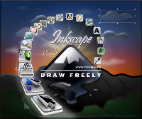
But I have just one idea, why don`t put the screenshot for the current Inkscape version on the index?We had a competition on deviantart about it and think is the most representative pic for Inkscape.
Every time will be change(probably with the 0.49) we can change either at the forum.
Also can be linked with the inkscape.org straight for download the software(just my opinion

Re: new image for visitor index page, competition
I second Spaventapasseri's idea. We could also make an icon that show inkscape interface with the last tool added. Here's something.. It needs work though.
[Picture removed]
[Picture removed]
Off topic:
( Anyway.. i don't mind the actual picture. I can't even understand how someone could find it offensive. )
Last edited by RM. on Wed Mar 25, 2015 11:18 pm, edited 1 time in total.
Re: new image for visitor index page, competition
I'm not against using a splash page, but I hope others will take the opportunity post something a little less... obvious and a little more "out of the box". Personally I'd prefer something that doesn't mention Inkscape but illustrates the fun that can be had with Inkscape.
-
Dillerkind

- Posts: 386
- Joined: Tue May 10, 2011 10:22 pm
- Location: Germany
- Contact:
Re: new image for visitor index page, competition
I'd also go for the current version's official screenshot or logo or whatever. This or maybe something really really simple like... maybe just the word Inkscape in a neat font and very few surrounding elements like sketch/guide lines or something. Might be even better than a more complex image, if we're talking about this rather smallish image next to the login box. Just an idea...
... My blog ... << Come visit me :) >> ... My thread ...
Re: new image for visitor index page, competition
I think I understand what Micro is saying, The image visitors see when they arrive at the forum should not seem to them like it's just an advertisement for Inkscape.
It Should be attractive, unique to us, and should encourage new, or potential Inkscape users by showing them that Inkscape can be used to make something
wonderful, or be lots of fun. I love the Inkscape splash, but I can see several reasons why it wouldn't be the best choice for a welcome image on the Index page a forum visitor sees.

Re: new image for visitor index page, competition
I`ve completely forgot about Inkscape`s screenshot and I`ll join to those who think that it does represent capabilities of Inkscape in a good fashion. Not that I`m against the current one, but screenshot could also give a bit more appropriate/accurate representation to the forum. Since those who would come for a first time are most likely looking for some more info, click on the splash image (in the same size as current one or if possible in size of the one posted by spaventapasseri) could lead to the enlarged image. An image speaks 1000 words.
@Inkspots
Mind to share some of those several reasons?
@Inkspots
Mind to share some of those several reasons?
 <<< click! - but, those with a cheaper tickets should go this way >>>
Re: new image for visitor index page, competition
Hi Friends,
Ok, I'm summoning up all my courage and submitting the Inkscape Dictionary image I made a while back. My best attempt at realism or photorealism to date.

Actually I guess it doesn't have a transparent background, which micro mentioned. Here, let me scale a 200 px wide version, to see how it looks at that size (I really have no idea at the moment)..... Ok, interesting..... It's 1000 px wide, so scaling to 200 px is a really significant change. And there's so very much tiny detail in the book, the smaller size did not look very good at all. But recently I've been trying to understand dpi, and learned that you can change the dpi on export to make the image smaller. So that's what I did! 1000 px wide, exported at 18 dpi, results in a 200 px wide version, that actually looks a lot better than when I simply scaled it! So here's that result:

Hhhhm, not nearly as effective at that size..... I have several other images (most with transparent background) that are nice enough to share, and might look ok at that smaller size. But I need to narrow down my choices, because at the moment, there are 6 or 8 possibilities.
Is there any limit on how many we could submit?
Edit
Actually, taking the size limit into account, I really may have only one or 2 that might look ok. I tend to draw images that fit the computer screen (~1000 x ~700) and have loads of details. Most, like the books above, aren't looking very well at 200px.
Here's one. It doesn't really show off very much of what Inkscape can do. But it does show the basics and some intermediate stuff. Unravelled spirogram:

Edit 2
micro, I just wanted to offer this -- if you could show me how, I could handle all the maintainence that a system of rotating images (for that page) would require. I just keep thinking how hard it's going to be to find one single image that tells the whole Inkscape story. I learn pretty fast, so it would just take some initial investment of time from you, then I could take over. Just a thought and a friendly offer
Edit 3
For some reason there was a background on my last image, when I intended it to be transparent. So I've replaced the image with the transparent one.
I'm not sure what the problem was. The Inkscape doc's background is transparent (default). I used Page setting for Export Bitmap, and that has always given me the transparent background in the PNG, in the past. But for some reason, it was giving me a white background. I had to use the Drawing setting for the export, to get the transparent backgroudn.
Ok, I'm summoning up all my courage and submitting the Inkscape Dictionary image I made a while back. My best attempt at realism or photorealism to date.
Actually I guess it doesn't have a transparent background, which micro mentioned. Here, let me scale a 200 px wide version, to see how it looks at that size (I really have no idea at the moment)..... Ok, interesting..... It's 1000 px wide, so scaling to 200 px is a really significant change. And there's so very much tiny detail in the book, the smaller size did not look very good at all. But recently I've been trying to understand dpi, and learned that you can change the dpi on export to make the image smaller. So that's what I did! 1000 px wide, exported at 18 dpi, results in a 200 px wide version, that actually looks a lot better than when I simply scaled it! So here's that result:
Hhhhm, not nearly as effective at that size..... I have several other images (most with transparent background) that are nice enough to share, and might look ok at that smaller size. But I need to narrow down my choices, because at the moment, there are 6 or 8 possibilities.
Is there any limit on how many we could submit?
Edit
Actually, taking the size limit into account, I really may have only one or 2 that might look ok. I tend to draw images that fit the computer screen (~1000 x ~700) and have loads of details. Most, like the books above, aren't looking very well at 200px.
Here's one. It doesn't really show off very much of what Inkscape can do. But it does show the basics and some intermediate stuff. Unravelled spirogram:
Edit 2
micro, I just wanted to offer this -- if you could show me how, I could handle all the maintainence that a system of rotating images (for that page) would require. I just keep thinking how hard it's going to be to find one single image that tells the whole Inkscape story. I learn pretty fast, so it would just take some initial investment of time from you, then I could take over. Just a thought and a friendly offer
Edit 3
For some reason there was a background on my last image, when I intended it to be transparent. So I've replaced the image with the transparent one.
I'm not sure what the problem was. The Inkscape doc's background is transparent (default). I used Page setting for Export Bitmap, and that has always given me the transparent background in the PNG, in the past. But for some reason, it was giving me a white background. I had to use the Drawing setting for the export, to get the transparent backgroudn.
Last edited by brynn on Wed Feb 15, 2012 1:33 am, edited 1 time in total.
Reason: replace image
Reason: replace image
Basics - Help menu > Tutorials
Manual - Inkscape: Guide to a Vector Drawing Program
Inkscape Community - Inkscape FAQ - Gallery
Inkscape for Cutting Design
Manual - Inkscape: Guide to a Vector Drawing Program
Inkscape Community - Inkscape FAQ - Gallery
Inkscape for Cutting Design
-
flamingolady

- Posts: 687
- Joined: Wed Jun 10, 2009 1:40 pm
Re: new image for visitor index page, competition
Brynne, love your drawings! Just so we're all on the same page, could you possible edit your first post and place a link to the splash page that we are to use (what you consider the splash page might be different than what someone else thinks it is), just so there's no confusion. thx
I like all ideas, so torn between them, I like the screenshot that deviantart has, but I think the idea to show people what they can do with Inkscape will be more intriquing to people, maybe some master artist can combine both, lol. I'm busy working on tax stuff - haven't done my business stuff at all from last yr, so too busy a time for me to draw this time of yr, unless I get done soon! draw on everyone! this looks like fun.
dee
Re: new image for visitor index page, competition
Just so we're all on the same page, could you possible edit your first post and place a link to the splash page that we are to use (what you consider the splash page might be different than what someone else thinks it is), just so there's no confusion. thx
What I consider a splash page, Inkscape doesn't even have one. You know how when you open some programs, a small or medium size window flashes (splashes) up on the screen, usually quite briefly, before the program itself opens? (my ESET security and Spybot S&D have splash screens, just for example) But Inkscape doesn't have one, and I'm not sure what you might be referring to? I've re-read this topic several times, all the way through, but don't seen any requirements, or even suggestions for using a splash page in any way....except for microUgly's comments.
I think that the Help menu > About Inkscape window, was mentioned as a possible choice for the new image. And I guess it's sort of like a splash page.....
 . Each new stable version release gets a new About page image. And I think there's a contest for that new image with each new stable release too. I'm not sure where it's held or organized. spaventapasseri posted the image itself for the current version, a few messages above this.
And then microUgly posted guidelines for this new image, I think it's the 3rd message in the thread, or something close to that. So I think everyone should be on the same page.
What splash page do you mean? Or link to what page? Or what is it that's confusing, or that you think someone else might not understand?
Basics - Help menu > Tutorials
Manual - Inkscape: Guide to a Vector Drawing Program
Inkscape Community - Inkscape FAQ - Gallery
Inkscape for Cutting Design
Manual - Inkscape: Guide to a Vector Drawing Program
Inkscape Community - Inkscape FAQ - Gallery
Inkscape for Cutting Design
-
flamingolady
- Posts: 687
- Joined: Wed Jun 10, 2009 1:40 pm
Re: new image for visitor index page, competition
Brynne,
Basically, can you put up a link to show people the page where the new pic is going to be on? Thought I saw someone call it a splash page, but forget that term, maybe it's a home page? Please don't worry about terms, just need the link of where the drawing is going.
thanks!
dee
Basically, can you put up a link to show people the page where the new pic is going to be on? Thought I saw someone call it a splash page, but forget that term, maybe it's a home page? Please don't worry about terms, just need the link of where the drawing is going.
thanks!
dee
Re: new image for visitor index page, competition
brynn wrote:Actually I guess it doesn't have a transparent background, which micro mentioned.
It's only a guideline, not a requirement. So don't let the guidelines restrict what you think will look good.
Is there any limit on how many we could submit?
there is no, limit. It's not really a competition. Submit anything and everything you genuinely feel could work well.
if you could show me how, I could handle all the maintainence that a system of rotating images (for that page) would require.
It would have to be coded. I'd rather not mess with it. Plus, I find rotating images to be a little gimmicky
flamingolady wrote:can you put up a link to show people the page where the new pic is going to be on?
Here you go...
You only see it when you are not logged in. People who register are already familiar with Inkscape, so I didn't want to rub it in their faces when it's the forum they are most interested in.
Re: new image for visitor index page, competition
Hi again,
I found another one that should work ok at the 200 px size. I made these cupcakes for the forum's 1st anniversary. I would isolate just one of them and either scale or reduce dpi to the proper size:

Ok, and here's another one. It's really nothing very special, and doesn't show more than the very basics of what Inkscape can do. But the colors happen to be close to the color of the forum header, and it's kind of a nice design (imo). It's actually smaller than 200 px, so I could scale it up if it were chosen.

I think I might have one more.....not sure, but I'll post it if I find it.
I found another one that should work ok at the 200 px size. I made these cupcakes for the forum's 1st anniversary. I would isolate just one of them and either scale or reduce dpi to the proper size:
Ok, and here's another one. It's really nothing very special, and doesn't show more than the very basics of what Inkscape can do. But the colors happen to be close to the color of the forum header, and it's kind of a nice design (imo). It's actually smaller than 200 px, so I could scale it up if it were chosen.
I think I might have one more.....not sure, but I'll post it if I find it.
Basics - Help menu > Tutorials
Manual - Inkscape: Guide to a Vector Drawing Program
Inkscape Community - Inkscape FAQ - Gallery
Inkscape for Cutting Design
Manual - Inkscape: Guide to a Vector Drawing Program
Inkscape Community - Inkscape FAQ - Gallery
Inkscape for Cutting Design
-
flamingolady
- Posts: 687
- Joined: Wed Jun 10, 2009 1:40 pm
Re: new image for visitor index page, competition
Thanks MicroUgly for putting up the link, so everyone knows exactly what page we're dealing with - I didn't realize that registered people see the page differently.
Brynne - I really like your last image. You know, in thinking, there are a lot of guys on this page (as well as us ladies), and I think that last image would be something that everyone would find interesting. oh, there's going to be so many good designs on here, can't wait to see them. Hope I can get my taxes done, so I can throw a few into the pile.
Brynne - I really like your last image. You know, in thinking, there are a lot of guys on this page (as well as us ladies), and I think that last image would be something that everyone would find interesting. oh, there's going to be so many good designs on here, can't wait to see them. Hope I can get my taxes done, so I can throw a few into the pile.
Re: new image for visitor index page, competition
Had some time to think about this "competition" and here`s a few thoughts...


* I took a liberty to rearrange spacing of the text box and the image`s space.
Still, I had no clear idea what might come out of the horizon but I think it would be nice if that part could be somehow more related to vectors (text, pattern... etc).
Would like to hear if you have some ideas.
* I took a liberty to rearrange spacing of the text box and the image`s space.
Still, I had no clear idea what might come out of the horizon but I think it would be nice if that part could be somehow more related to vectors (text, pattern... etc).
Would like to hear if you have some ideas.
<<< click! - but, those with a cheaper tickets should go this way >>> 
Re: new image for visitor index page, competition
Off topic:
BTW, Microugly I vote for the Elektra that I think you colored using inkscape. It showed off some very impressive shading technique!http://microugly.deviantart.com/art/Plump-Elektra-Colours-160175850
Your mind is what you think it is.
Re: new image for visitor index page, competition
<<< click! - but, those with a cheaper tickets should go this way >>> Re: new image for visitor index page, competition
druban wrote::lol: This guy is clearly underageand not wearing any pants
What will people visiting the forum think!

Basics - Help menu > Tutorials
Manual - Inkscape: Guide to a Vector Drawing Program
Inkscape Community - Inkscape FAQ - Gallery
Inkscape for Cutting Design
Manual - Inkscape: Guide to a Vector Drawing Program
Inkscape Community - Inkscape FAQ - Gallery
Inkscape for Cutting Design
Re: new image for visitor index page, competition

it's a forum
it's about inkscape
we're friendly (some of us are)
Re: new image for visitor index page, competition
Nice, v1nce!
PS - sorry I misunderstood dee
PS - sorry I misunderstood dee
Basics - Help menu > Tutorials
Manual - Inkscape: Guide to a Vector Drawing Program
Inkscape Community - Inkscape FAQ - Gallery
Inkscape for Cutting Design
Manual - Inkscape: Guide to a Vector Drawing Program
Inkscape Community - Inkscape FAQ - Gallery
Inkscape for Cutting Design