My army dude - recommend how to improve
I have this guy I made. He's my first ever face so it's bad. How the pros recommend I made him look cool like the following image:
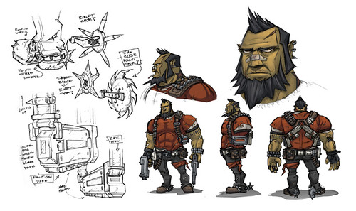
From my first glance, I can see I need to make it more jagged(bone structure) and add more lines and detail.
I though the shading could be maybe a layer with transparency for the darkness and then add lines with a dark grey 30% alpha transparency.
For the eye I thought of cloning the the eye shape and adding a slight dark tan transparency for the shape.
For these ideas correct? Any tips, comments, constructive criticisms are welcome. I'm a programmer trying to do my own art for my games.
Oh yeah, how do I made the hair look better like the army dude from street fighter?
Re: My army dude - recommend how to improve
I'm not good at characters so can only suggest some basic things to start with.
The second image you posted for a style reference you want to pull out doesn't seem to be vector.
That is, most probably a result from a raster program and a tablet.
This kind of graphics can be created with that technic the best.
Meaning of, it's the fastest, easiest, simplest way, and the result can fit the needs.
Consider if you really want to go vectors, as it can take more time with that detail level,
and it is not always necessary to print out to a poster.
Another thing is, that this image was made by a professional,
who can actually make character sketches with a ball point pen, with no effort.
You could improve your work by the knowledge of some graphical tricks and commonly used rules,
by better knowing of the program you use, but in the end it will all come to
if you can't draw a good sketch, the result won't look good.
So I would suggest to draw as much as you can on paper, before you invest too much time into the digital reworking.
Re: My army dude - recommend how to improve
Ok, so I took what you had to say and analyzed what I have to offer. I used to be a good artist until my car wreck and I had an IV in my right hand which basically took me 4 years pf physical therapy and playing the guitar to get good movement back. While my hand was a good sketcher and I could draw very well, that is done for good.
So, i'm really just trying to make some cool prototypes for my game. I can pay a real artist later. Using some techniques in other tutorials and my experience with 3d studio/maya I constructed lines and squares and broke them into paths. here's what I have now.
I think it's not a bad start. I reason I need vector is to be able to resize and animate the character for a mobile iphone game.
Re: My army dude - recommend how to improve
Not sure if vector is the esiest way to animate.
But if animated, less details would be better for rendering I guess.
Thinking of a style like of the cartoon character samurai Jack.
But if animated, less details would be better for rendering I guess.
Thinking of a style like of the cartoon character samurai Jack.
- Attachments
-
- jck.zip
- (2.41 KiB) Downloaded 281 times
Re: My army dude - recommend how to improve
Lazur URH wrote:Not sure if vector is the esiest way to animate.
But if animated, less details would be better for rendering I guess.
Thinking of a style like of the cartoon character samurai Jack.
OMG, that is just awesome.
Can you please tell me what objects you used? I assume you started with a rectangle and manipulated the points from there. How did you create that mask, created from multiple objects? I'm still learning vector drawing.
Thanks,
Nick
Re: My army dude - recommend how to improve
Used only the pen tool to trace that image (Shift+F6).
Drew each part, then used the node editor tool (F2) to adjust things a bit.
Changed the z order of the objects by pressing Pgup and Pgdown when selected, and set the fill
at the fill and stroke panel (Shift+Ctrl+F).
No masking is necessary to draw such.
Just realised that I made a mistake with the nose, here it is corrected.
With 3D experience you can model such head in 3D, for reference images from more angles.
But for the actual 2D vectors, it's easier to work only with inkscape.
- Attachments
-
- jck.zip
- (2.37 KiB) Downloaded 285 times
Re: My army dude - recommend how to improve
See this recent topic, some good info may come: http://www.inkscapeforum.com/viewtopic.php?f=6&t=15414&p=57590#p57590