Another Illustrator spill-over.
In Illustrator you just use a tool called 'Knife' and once you cut the wavy line, the effect is done.
In Inkscape its a bit more complex, but fun none the less.
.
funky texteffects with gradients
-
Espermaschine

- Posts: 892
- Joined: Thu Jun 05, 2014 9:10 pm
funky texteffects with gradients
- Attachments
-

- Wavywaves.png (22.35 KiB) Viewed 5491 times
Last edited by Espermaschine on Sat Apr 23, 2016 11:45 am, edited 2 times in total.
-
Espermaschine
- Posts: 892
- Joined: Thu Jun 05, 2014 9:10 pm
Re: wavy
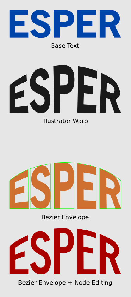
This started when i compared arched text made in Illustrator to something similar in Inkscape.
Tried Envelope Distortion LPE at first, but that distorted the text too much. So i split the text into individual letters, transformed each one with the Bezier Envelope Extension and then node edited the text for hours, lol.
The text effect was inspired by an Illustrator video-tut for "awesome" text, and after a while it got very complicated and even after i cleaned up the canvas with 10 layers it was very tedious to do.
Selecting individual parts of the texteffect is very tedious. Hopefully that will be fixed in some future version of Inkscape.
- Attachments
-

- wavy_arched_text.png (152.92 KiB) Viewed 5438 times
-
Espermaschine
- Posts: 892
- Joined: Thu Jun 05, 2014 9:10 pm
Re: wavy
slightly improved version with Brilliance filter on top
- Attachments
-

- VersionII.png (155.13 KiB) Viewed 5422 times

Re: wavy
Whoa you uploaded the svg this time too. Nice!
Some general notes.
Avoid masking, it doesn't transfer right to pdf-s.
Avoid double edges above eachother. Anti-aliasing doesn't just produce the rendering gaps but the lower object's edges show through the one above.
Like, that wavy fill would be much finer if it was clipped and not masked, AND
more importantly two gradient filled objects above eachother were grouped together -the current masking object gradient filled basically- and clipped with the lettering -resulting in only one "edge".
Might not render as it should through chrome, but in inkscape that is the only way avoiding anti-aliasing artifacts.
Same goes with those highlights and outer shadows.
Removed some double and triple nodes here and there, and changed the frame so now it's made up of one path filtered
(although this causes the right bottom edge to look off).
Keep up the good work!
-
Espermaschine
- Posts: 892
- Joined: Thu Jun 05, 2014 9:10 pm
Re: wavy
z3z wrote:Nice work on these
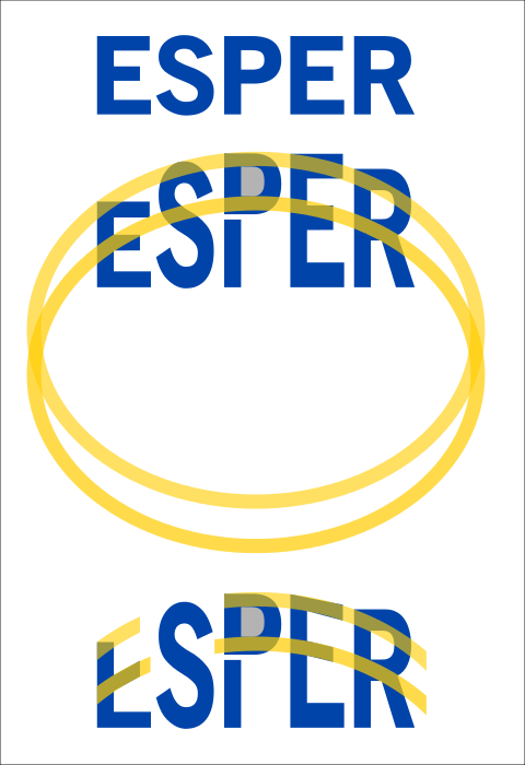
Thank you ! Not satisfied with the second version. I think the colors are just inverted and there are problems with the bevel.
If you look at the inside of the P for example, its wrong.
Here is a little image that compares the differences in warp. As you can see, the Illustrator warp effect (black) looks quite similar to the Bezier Envelope performed on individual letters (orange). I guess you can only avoid distortion if you node edit, as i did in the final (red) version.
- Attachments
-
- Ill vs IS Arched Text.png (64.58 KiB) Viewed 5402 times
-
Espermaschine
- Posts: 892
- Joined: Thu Jun 05, 2014 9:10 pm
Re: wavy
Lazur URH wrote:Whoa you uploaded the svg this time too. Nice!
Its the only way !
Avoid masking, it doesn't transfer right to pdf-s.
Im never quite sure if this is a must. One can print from png as well, right ?!
Avoid double edges above eachother. Anit-aliasing doesn't just produce the rendering gaps but the lower object's edges show through the one above.
Yeah i know, its quite ugly. Tried to fix it, but didnt work with my masking technique.
Will study your svg next !
This is another one of those unplanned texteffects. Its just spontaneous and fun.
Well supposedly. Inkscape is not that well developed yet, to make it fun, because you have to fight with so many (unnecessary thing).
Layers should make things easier, not more difficult.
So the effects i layered on top of each other are not planned, just going with the flow, thats why its a bit of a random mess, and tbh. I'd hate to put so much thought into each and every action,just because the program doesnt support me 100% (yet). But i guess there is no other way at the moment.
Re: wavy wave & archy arch
I guess you can only avoid distortion if you node edit
There was no distortion. You add it in the red version
I guess by distortion you mean the fact that "horizontal" line don't have the same height. This is "by design". The projection algorithm is "simple"
AFAICT What you did is far more complex and artistic. You used a constant height for all (previously) horizontal lines.
How do you choose these height ? Looks like you chose the smallest height (extreme left or extreme right character), why didn't you use the height of central char ? What if there was even more character ? Would you still use the height of extreme char (very very tiny) or the central one (big). or a medium value ? In any case at the very end you'll ruin (mathematically) the ratio of height of "filled horizontal" vs "empty horizontal".But it could look more pleasing to the eye.
You could think that what you want is obvious (it could be for a human brain) but if you tried a less "geometric" font (with serif and with vaying width) and if you used an arch with more extreme values (very high and narrow for exemple) then the advantage of your projection will become less obvious and it'll hard to say where you should move the point.
I can't think of any simple algorithm to do what you want (maybe some morphology and grid-fitting) but I'm not a projection specialist. There are a least 30 well known projection to map the earth on a map so I guess there should be some too to map a map on a arched surface. With some working better depending on what one could consider important.
Anyway you shouldn't expect any "fix" anytime soon. After all it ain't broken.
Looks like you'll do node editing for some time yet.
-
Espermaschine
- Posts: 892
- Joined: Thu Jun 05, 2014 9:10 pm
Re: wavy wave & archy arch
v1nce wrote:Anyway you shouldn't expect any "fix" anytime soon. After all it ain't broken.
I wasnt implying its broken, and in retrospect im not even sure the node editing i did was such a good idea.
I still dislike the too thick looking middlepart of the S, but all the other letters arent that bad.
Especially, once you all dress it up in effects, it gets kind of drowned.
What needs improvement programwise, imo, is the layers, and i think some kind of mask-editor would be good.
EDIT: i think what i expected, and what you called "artistic" (because thats how i would draw this on paper with a pencil), is something like this:
.
- Attachments
-
- arched_expectations.png (51.02 KiB) Viewed 5298 times
Last edited by Espermaschine on Wed Apr 20, 2016 1:26 pm, edited 4 times in total.
-
Espermaschine
- Posts: 892
- Joined: Thu Jun 05, 2014 9:10 pm
Re: wavy wave & archy arch
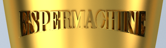
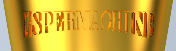
More of a simple "stretch" and node editing method - cut off all the serif feet and gave them new ones, made from an elliptical stroke.
Struggled with the colors. Will try to improve later.
.
Struggled with the colors. Will try to improve later.
.
- Attachments
-

- The Bridge.png (83.28 KiB) Viewed 5342 times
Last edited by Espermaschine on Thu Apr 21, 2016 12:49 am, edited 1 time in total.
-
Espermaschine
- Posts: 892
- Joined: Thu Jun 05, 2014 9:10 pm

Re: wavy wave & archy arch
Blender combo.
- Attachments
-
- br6.png (204.14 KiB) Viewed 5212 times
-
- br2.png (189.74 KiB) Viewed 5254 times
-
Espermaschine
- Posts: 892
- Joined: Thu Jun 05, 2014 9:10 pm
-
Espermaschine
- Posts: 892
- Joined: Thu Jun 05, 2014 9:10 pm
Re: wavy wave & archy arch
BTW, all these warped texteffects were very popular in the sixties. There is this great blog with tons of this stuff:
http://psychedelic-sixties.tumblr.com/
Loads of that stuff is very artistic, yes, and often, almost unreadable
We really got it easy today with programs doing everything clean and acurate.
Im not even sure thats a good thing.


http://psychedelic-sixties.tumblr.com/
Loads of that stuff is very artistic, yes, and often, almost unreadable
We really got it easy today with programs doing everything clean and acurate.
Im not even sure thats a good thing.
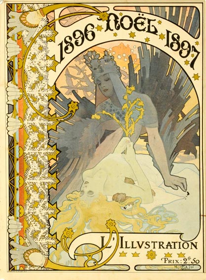
Re: wavy wave & archy arch
And some 70 years earlier:


-
Espermaschine
- Posts: 892
- Joined: Thu Jun 05, 2014 9:10 pm
Re: wavy wave & archy arch
^
stunning !
Okay, i had another look at your svg. Here are some questions:
1. what is the reasoning you used clones of the text-path, for clipping, etc. ?
2. so you used filters instead of layers/layermodes, right ? Why ? Because you can or some other reason ?
And a final question about masking. So you are saying i should avoid masking whenever possible ? And clipping is the better alternative. Or is that just in companion with masked gradients ?
stunning !
Lazur URH wrote:Some general notes.
Avoid masking, it doesn't transfer right to pdf-s.
Avoid double edges above eachother. Anti-aliasing doesn't just produce the rendering gaps but the lower object's edges show through the one above.
Like, that wavy fill would be much finer if it was clipped and not masked, AND
more importantly two gradient filled objects above eachother were grouped together -the current masking object gradient filled basically- and clipped with the lettering -resulting in only one "edge".
Might not render as it should through chrome, but in inkscape that is the only way avoiding anti-aliasing artifacts.
Same goes with those highlights and outer shadows.
Okay, i had another look at your svg. Here are some questions:
1. what is the reasoning you used clones of the text-path, for clipping, etc. ?
2. so you used filters instead of layers/layermodes, right ? Why ? Because you can or some other reason ?
And a final question about masking. So you are saying i should avoid masking whenever possible ? And clipping is the better alternative. Or is that just in companion with masked gradients ?
Re: wavy wave & archy arch
- Because those were identical shapes and had to edit out double&triple nodes; modifying one after another on the same shapes would have taken three times more and they wouldn't end up the exact same.
- Because of avoiding double edges, had to move objects in one group and clip them at once. The different layer blending modes couldn't be preserved otherwise.
- Yes, I would suggest that. Masking can't be avoided at some fancy fading effects, but most cases it is unnecessary.
-
Espermaschine
- Posts: 892
- Joined: Thu Jun 05, 2014 9:10 pm
-
Espermaschine
- Posts: 892
- Joined: Thu Jun 05, 2014 9:10 pm
Re: wavy wave & archy arch
R.I.P. Prince 
.
.
- Attachments
-

- Funk II.png (27.95 KiB) Viewed 5127 times
-

- Funk I.png (30.31 KiB) Viewed 5133 times
-
Espermaschine
- Posts: 892
- Joined: Thu Jun 05, 2014 9:10 pm
Re: wavy wave & archy arch
Im having a bit of a problem with the gradients here. Although im basically using just one for the bevel, i have multiple copies in my gradients editor.
How do i get rid of all the other ones ??
.
How do i get rid of all the other ones ??
.
- Attachments
-

- sunburstFunk.png (74.49 KiB) Viewed 5104 times
Re: wavy wave & archy arch
Clean up document?
-
Espermaschine
- Posts: 892
- Joined: Thu Jun 05, 2014 9:10 pm
Re: wavy wave & archy arch
z3z wrote:Clean up document?
Tried that, but i guess they are all in use.
I started applying a gradient to each bevel side, then later added a node, and changed the position, that must have applied a new gradient to each :\
Re: wavy wave & archy arch
There is a padlock icon in the gradien tool's settings. If it's untoggled then there will be a new gradient def saved with each modification.
-
Espermaschine
- Posts: 892
- Joined: Thu Jun 05, 2014 9:10 pm
Re: wavy wave & archy arch
Lazur URH wrote:There is a padlock icon in the gradien tool's settings. If it's untoggled then there will be a new gradient def saved with each modification.
There is no padlock in my Pref....
Or do you mean 'Prevent sharing of gradient definitions' ?