Retheming the 7 Wonders Boardgame

Post unfinished work here for feedback and advise.
Dictum Mortuum
Posts: 11
Joined: Fri Oct 05, 2012 2:17 am

Retheming the 7 Wonders Boardgame

Postby Dictum Mortuum » Fri Oct 05, 2012 4:14 am

So, I haven't really used other programs like inkscape before besides ms paint :p

I want to create a project as a surprise for my girlfriend and I could really need some help and some pointers as I am a complete novice.

The game is about resources and the 7 Wonders of the ancient world. I'm planning to do a retheme adapting the "seven" element to the 7 deadly sins. I've made my research and I found out that there is a related planet to each sin, so a

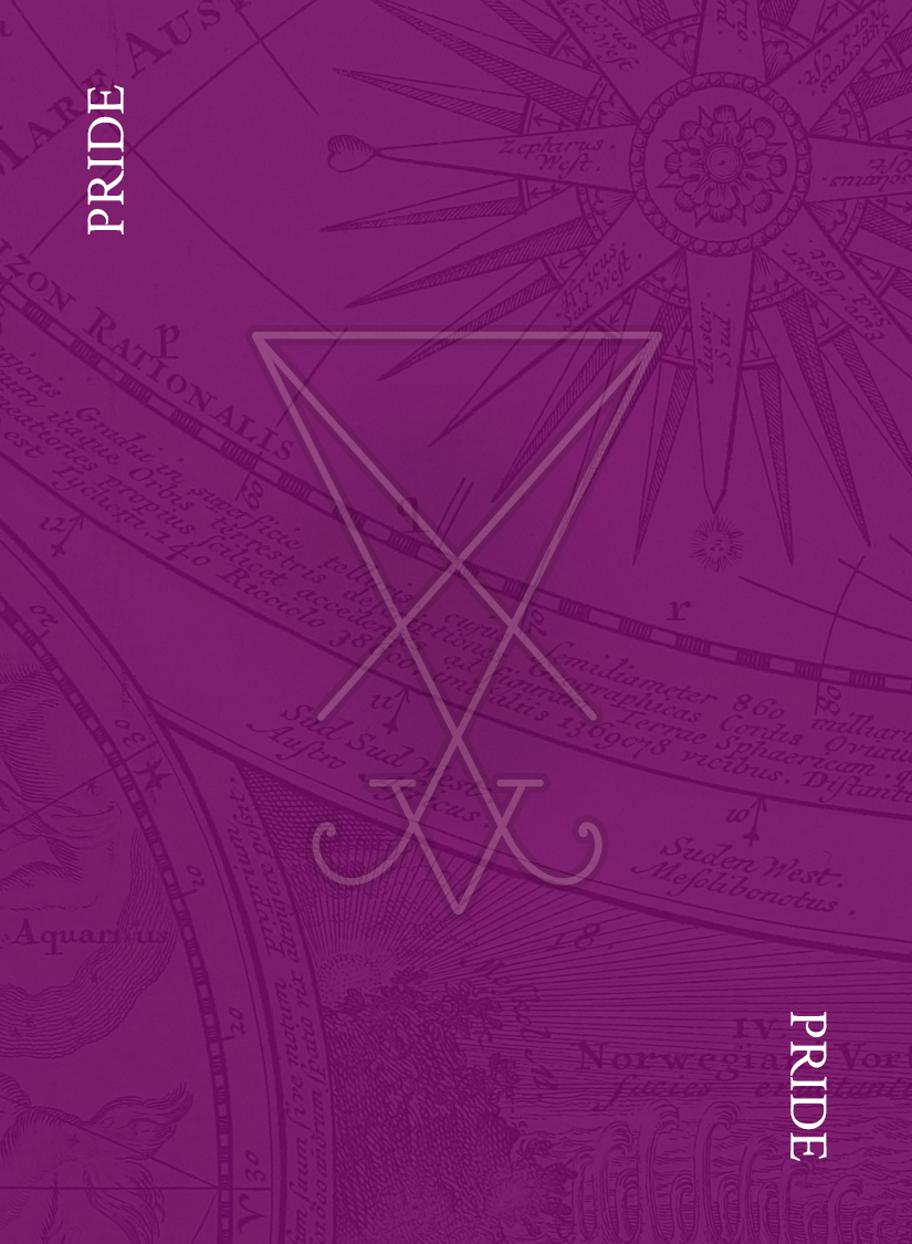
So, what I have so far is some card backs that I've done:

https://dl.dropbox.com/u/20183245/ageI.png
https://dl.dropbox.com/u/20183245/ageII.png
https://dl.dropbox.com/u/20183245/ageIII.png

and here you can see some preliminary work on the card fronts:

https://dl.dropbox.com/u/20183245/lust.png
https://dl.dropbox.com/u/20183245/sloth.png
https://dl.dropbox.com/u/20183245/wrath.png (this actually has some symbols on it)

I want the template to look like the original, but not too same. Here's the original layout:

Image

So, questions:

  • Any way to make my design look more professional? I can't for the love of me come up with a decent layout.
  • Is there a way of creating that ragged look around the pictures' edges?

generatemutate
Posts: 39
Joined: Thu Aug 23, 2012 5:48 am

Re: Retheming the 7 Wonders Boardgame

Postby generatemutate » Fri Oct 05, 2012 11:51 pm

An easy way would be to copy the design of the originals, including borders and icons etc. your examples have low contrast with one color dominating - was that on purpose?

Dictum Mortuum
Posts: 11
Joined: Fri Oct 05, 2012 2:17 am

Re: Retheming the 7 Wonders Boardgame

Postby Dictum Mortuum » Sat Oct 06, 2012 4:05 am

generatemutate wrote:An easy way would be to copy the design of the originals, including borders and icons etc. your examples have low contrast with one color dominating - was that on purpose?


I know about that, but my theme would be completely different. I've already some ideas on icons, but borders and background pictures is what I'm having trouble with.

About the colors - each sin is associated with a planet and a color. So I thought I could use colorized boxes set to a lower transparency to create that effect. Supposedly each sin will be related to a card type (there are seven of them). So to answer your question, yes, that was on purpose.

User avatar
brynn
Posts: 10309
Joined: Wed Sep 26, 2007 4:34 pm
Location: western USA
Contact:

Re: Retheming the 7 Wonders Boardgame

Postby brynn » Sat Oct 06, 2012 10:05 am

I'm not at all familiar with that game, so I'm at a loss for realistic suggestions. I think the designs already look professional....except that it's a little hard to see the images behind the partially transparent rectangles. So I might suggest increasing the transparency a little.

You can make that jagged look pretty easily with Inkscape, except that you won't be able to do it to raster imports (PNGs). I don't know if the final results will be PNG, or if you've just used it for posting the examples. If they are PNGs though, you could make the black border with Inkscape's vector tools. Leave the outside path alone (smooth). Select the inner path, and use Extensions menu > Modify Path > Add Nodes, and then Extensions menu > Modify Path > Jitter Nodes. You can adjust the settings in the Jitter Nodes dialog, to get different effects with it. Or if they are all vector, you could do the same technique on the background object.

What do you mean by "background pictures"? Is that your 2nd set of images (lust, wrath, sloth)? Because I think those look nice already. Or do you mean some kind of textured background? Since I'm not familiar with the game, I don't know if this would work. But what about using the symbol for each sin, and either make a textured, tiled clone background, (by textured, I mean something like embossed), or maybe just one large symbol, but with an effect that makes it look embossed? There are a couple of embossing filters, but it's not hard to do without a filter. Embossed, or the opposite of embossed (whatever that's called) (engraved?). Or if you wanted to use raster graphics, GIMP has a really lot of nice textures, which could be imported into Inkscape.

Dictum Mortuum
Posts: 11
Joined: Fri Oct 05, 2012 2:17 am

Re: Retheming the 7 Wonders Boardgame

Postby Dictum Mortuum » Sat Oct 06, 2012 11:18 pm

brynn wrote:I'm not at all familiar with that game, so I'm at a loss for realistic suggestions. I think the designs already look professional....except that it's a little hard to see the images behind the partially transparent rectangles. So I might suggest increasing the transparency a little.

You can make that jagged look pretty easily with Inkscape, except that you won't be able to do it to raster imports (PNGs). I don't know if the final results will be PNG, or if you've just used it for posting the examples. If they are PNGs though, you could make the black border with Inkscape's vector tools. Leave the outside path alone (smooth). Select the inner path, and use Extensions menu > Modify Path > Add Nodes, and then Extensions menu > Modify Path > Jitter Nodes. You can adjust the settings in the Jitter Nodes dialog, to get different effects with it. Or if they are all vector, you could do the same technique on the background object.

What do you mean by "background pictures"? Is that your 2nd set of images (lust, wrath, sloth)? Because I think those look nice already. Or do you mean some kind of textured background? Since I'm not familiar with the game, I don't know if this would work.


Well, at least that's conforting.

I actually used the png format because I thought it would be the best. If you have any suggestion about what files to generate in order to print the result, it's more than welcome. I'll also try using the jitter nodes function and post results/questions.

About "background pictures" check this out: https://dl.dropbox.com/u/20183245/wrath2.png I don't want to use that border or that image, but it shows what I have in mind - the image with the colored filter that's applied is, indeed, something of a textured background, or at least that's the "feel" I want it to have.

brynn wrote: But what about using the symbol for each sin, and either make a textured, tiled clone background, (by textured, I mean something like embossed), or maybe just one large symbol, but with an effect that makes it look embossed? There are a couple of embossing filters, but it's not hard to do without a filter. Embossed, or the opposite of embossed (whatever that's called) (engraved?). Or if you wanted to use raster graphics, GIMP has a really lot of nice textures, which could be imported into Inkscape.


Could you give me an example about that? I'm not sure that I understand what you're trying to say here.

User avatar
brynn
Posts: 10309
Joined: Wed Sep 26, 2007 4:34 pm
Location: western USA
Contact:

Re: Retheming the 7 Wonders Boardgame

Postby brynn » Sun Oct 07, 2012 11:13 am

Ooohh, now I see what you mean. The drawing behind the transparent color (colored filter) IS the textured background. I like that! (I thought the images behind were supposed to represent wrath, sloth, etc. And if they mattered, I thought they should be more visible.) What will go in place of the playing kittens? I'll make up a quick example of what I was trying to describe. But from what I now understand, it would replace "the image with the colored filter that's applied". Oorrr....perhaps could be added to the color filter. Let me do some quick clicking and try to make an example.

User avatar
brynn
Posts: 10309
Joined: Wed Sep 26, 2007 4:34 pm
Location: western USA
Contact:

Re: Retheming the 7 Wonders Boardgame

Postby brynn » Sun Oct 07, 2012 12:38 pm

Ok, here's an example. I just made a simple crescent shape, but I was thinking you could use your symbols. I have 3 crescents (black on bottom, then light/white, then a medium shade) slightly offset from each other, to make the engraved/embossed effect. The rectangle with the gradient represents the colored images that you already have. I was originally thinking of a solid color, but it might work even with your images. Then I used Tiled Clones to make an array of each of the 3 crescents. I grouped the clones with a solid colored rectangle (somewhere between the medium crescent's color and the dark crescent's color) then reduced the opacity of the group (50%).

Image

Or if you can imagine the same kind of effect with a single large symbol, rather than an array of tiled clones. Hhm...perhaps a bit more transparency is needed, now that I've looked at it for awhile??

Well anyway, that's the general idea :D

Dictum Mortuum
Posts: 11
Joined: Fri Oct 05, 2012 2:17 am

Re: Retheming the 7 Wonders Boardgame

Postby Dictum Mortuum » Mon Oct 08, 2012 4:39 am

brynn wrote:Ooohh, now I see what you mean. The drawing behind the transparent color (colored filter) IS the textured background. I like that! (I thought the images behind were supposed to represent wrath, sloth, etc. And if they mattered, I thought they should be more visible.) What will go in place of the playing kittens? I'll make up a quick example of what I was trying to describe. But from what I now understand, it would replace "the image with the colored filter that's applied". Oorrr....perhaps could be added to the color filter. Let me do some quick clicking and try to make an example.


I need to explain the theme a little more.

There are seven sins, each represented by certain colors. For instance, wrath is represented by the red colour.
There are three cycles and in each cycle the sins will be increasingly worse. For instance, the cycle I wrath sins might just be Anger, Punching someone, etc, whereas cycle II sins may be Murder, Rape, etc. Cycle III are really disturbing stuff, like Mass murder or a war.

The pictures are going to represent what the card's about, that's what goes in place of the kittens. Of course, that means that I need to find pictures that are artisticaly (? is that the correct term?) close, which might be extremely hard, since I myself, can't paint that well.

brynn wrote:Ok, here's an example. I just made a simple crescent shape, but I was thinking you could use your symbols. I have 3 crescents (black on bottom, then light/white, then a medium shade) slightly offset from each other, to make the engraved/embossed effect. The rectangle with the gradient represents the colored images that you already have. I was originally thinking of a solid color, but it might work even with your images. Then I used Tiled Clones to make an array of each of the 3 crescents. I grouped the clones with a solid colored rectangle (somewhere between the medium crescent's color and the dark crescent's color) then reduced the opacity of the group (50%).

Image

Or if you can imagine the same kind of effect with a single large symbol, rather than an array of tiled clones. Hhm...perhaps a bit more transparency is needed, now that I've looked at it for awhile??

Well anyway, that's the general idea :D


I like your example. It reminds me of magic the gathering foil cards. I believe that using a single large symbol might be a little better than tiled ones, because at first I got confused :p The texture reminded me of Lego bricks!
Are you suggesting to use something like that as a "background texture"?

User avatar
brynn
Posts: 10309
Joined: Wed Sep 26, 2007 4:34 pm
Location: western USA
Contact:

Re: Retheming the 7 Wonders Boardgame

Postby brynn » Mon Oct 08, 2012 12:18 pm

Are you suggesting to use something like that as a "background texture"?

Yes, that was my original thought, and on a solid color background. I thought your current background was the main content. But now that I understand it, I think your current plan looks better. But as an afterthought, I was wondering about using something like my example (either tiled clones or one single symbol) somewhat like a watermark -- just kind of a vague suggestion of the symbol. Although it could very well create too much visual confusion. And hey, I'm not a professional artist or anything like that. I just like how your work looks so far.

Oh yes, of course using your symbols, it would look less like Legos, lol :D Plus you could make any kind of array. They could be offset -- instead of a grid pattern, they could be alternating, or randomly scattered around, or even radial.

Also, have you looked through the Inkscape filters? While they can be tricky to use, they really can create some awesome effects! And you can find more at OCL (Open Clipart Library).

Dictum Mortuum
Posts: 11
Joined: Fri Oct 05, 2012 2:17 am

Re: Retheming the 7 Wonders Boardgame

Postby Dictum Mortuum » Sat Oct 20, 2012 9:29 am

Hello! Sorry for taking so long to answer. I think I'm going with a slightly different layout. Any ideas about these:

Image
Image

They are not my own design! Could anyone help me understand how to achieve something like that?

User avatar
ragstian
Posts: 1181
Joined: Thu Oct 11, 2012 2:44 am
Location: Stavanger-Norway

Re: Retheming the 7 Wonders Boardgame

Postby ragstian » Sat Oct 20, 2012 11:42 am

Hi.

Looks like a perfect project for NODEBOX. Unfortunately this software runs on Mac only!

Have a look at the Nodebox homepage. http://nodebox.net/code/index.php/Home
Follow the gallery link for examples.

Other parts of the map looks like Guilloches patterns. Also suitable for Nodebox. Have a look at this: http://ministryoftype.co.uk/words/article/guilloches/
You can get something similar by using Inkscape - Render - Parametric Curves.


Where did you find the old map images? Could you please post a link?

Another good page for maps & mapmaking: http://www.cartographersguild.com/content/


Good Luck

RGDS Ragnar
Good Luck!
( ͡° ͜ʖ ͡°)
RGDS
Ragnar

Dictum Mortuum
Posts: 11
Joined: Fri Oct 05, 2012 2:17 am

Re: Retheming the 7 Wonders Boardgame

Postby Dictum Mortuum » Sat Oct 20, 2012 4:43 pm

Unfortunately I can't share them, because I don't have them. As I said earlier it's not my work, although I'd appreciate if someone could identify the map (or at least what to search to find something similar). I've spend countless hours on google search :p

User avatar
ragstian
Posts: 1181
Joined: Thu Oct 11, 2012 2:44 am
Location: Stavanger-Norway

Re: Retheming the 7 Wonders Boardgame

Postby ragstian » Sat Oct 20, 2012 5:35 pm

Hi


Looks like my Google works better than yours:
http://www.fotosearch.com/VSL113/cmpas_02/

http://www.visuallanguage.com/cds/previ ... cd_id=VL04

Quite steep prices for those image!

What about some of the maps on this page: http://teletoples.wordpress.com/2012/08 ... solution/#

Click the "View in full size" link to get high-resolution.

RGDS Ragnar
Good Luck!
( ͡° ͜ʖ ͡°)
RGDS
Ragnar

User avatar
brynn
Posts: 10309
Joined: Wed Sep 26, 2007 4:34 pm
Location: western USA
Contact:

Re: Retheming the 7 Wonders Boardgame

Postby brynn » Sun Oct 21, 2012 2:44 am

Hhmmm, I thought I answered this last night....but I was getting sleepy, so perhaps I forgot to Submit :roll:

I wasn't clear if it was the background map that you were asking for, or how to make the symbols look like that. For the background map, you could try going to Google Images, and search "map" or maybe "Old World map", or something similar. (Or if you like to avoid google, you could use another search engine, and search "map images".) (Or maybe try Flickr or deviantArt). Although you will want to be very sure that the image license or copyright allows you to use it.

If I understand your project, it probably doesn't need to be a vector image (the map). But you could check Open Clipart Library (http://www.openclipart.org/) because they are....I think they are all available for free use. You should probably check the particulars on that, since I can't remember them at the moment. But at least mostly they are free to use.

OH! Or there are a few members in this forum who like to make fantasy maps in a style like that. I don't have links, and I don't know if they offer them to others, but you could investigate. I'm pretty sure they have links in their forum signatures. Look up "nils" and "RobA" (I think there are another 2 or 3 but their names don't come to mind at the moment -- apologies to them).

The symbols don't appear to use any special effects. It looks like they are just stroked objects (1 with a fill and 1 without) then the whole thing made partially transparent. There might be a tiny bit of blur on them, but it's hard to say.

The 2nd one has a special kind of color gradient that Inkscape is not yet capable of making. But I do know a way to fake it. Let me know and I could tell you how.

I like this map idea for the background texture! Also, what about using star maps or constellations? Just a thought :D

Dictum Mortuum
Posts: 11
Joined: Fri Oct 05, 2012 2:17 am

Re: Retheming the 7 Wonders Boardgame

Postby Dictum Mortuum » Sun Oct 21, 2012 10:28 pm

ragstian wrote:Hi


Looks like my Google works better than yours:
http://www.fotosearch.com/VSL113/cmpas_02/

http://www.visuallanguage.com/cds/previ ... cd_id=VL04

Quite steep prices for those image!

What about some of the maps on this page: http://teletoples.wordpress.com/2012/08 ... solution/#

Click the "View in full size" link to get high-resolution.

RGDS Ragnar


Wow, that indeed has a steep price :O
Thanks for finding it though! I searched "antique map" on google and got some pretty neat maps to try out :D

brynn wrote:Hhmmm, I thought I answered this last night....but I was getting sleepy, so perhaps I forgot to Submit :roll:

I wasn't clear if it was the background map that you were asking for, or how to make the symbols look like that. For the background map, you could try going to Google Images, and search "map" or maybe "Old World map", or something similar. (Or if you like to avoid google, you could use another search engine, and search "map images".) (Or maybe try Flickr or deviantArt). Although you will want to be very sure that the image license or copyright allows you to use it.

If I understand your project, it probably doesn't need to be a vector image (the map). But you could check Open Clipart Library (http://www.openclipart.org/) because they are....I think they are all available for free use. You should probably check the particulars on that, since I can't remember them at the moment. But at least mostly they are free to use.

OH! Or there are a few members in this forum who like to make fantasy maps in a style like that. I don't have links, and I don't know if they offer them to others, but you could investigate. I'm pretty sure they have links in their forum signatures. Look up "nils" and "RobA" (I think there are another 2 or 3 but their names don't come to mind at the moment -- apologies to them).

The symbols don't appear to use any special effects. It looks like they are just stroked objects (1 with a fill and 1 without) then the whole thing made partially transparent. There might be a tiny bit of blur on them, but it's hard to say.

The 2nd one has a special kind of color gradient that Inkscape is not yet capable of making. But I do know a way to fake it. Let me know and I could tell you how.

I like this map idea for the background texture! Also, what about using star maps or constellations? Just a thought :D


I'm not sure about licenses, as the end product will not be a commercial one. However, I'm a guy that likes sharing, so probably I wouldn't be able to share my work with other people if the images' copyright doesn't allow them to be used.

Indeed I don't require vector images. I tested some large images, but I think I'll have to get some high resolution images at least, because it was apparent that the images where somewhat pixelized. Thanks for the suggestions about the forum members, I'm going to look them up and even contact them if I like the art.

About the symbols: Well, nice idea, I didn't thought of that :/ I was trying to get it right by creating a larger stroke around the symbol I already had, but, since I don't understand the colors under object's fill and stroke, I couldn't get the fill and the stroke to have different transparencies. I'll try it again with two different objects, that might get it right.

About the background: Actually, although I'm interested in having that color gradient done (not exactly for this project, but for future ones, it looks pretty darn good!), I was sure you would know something about it, because it reminded me the cresent background you posted earlier. I'm more interested about colorizing specific images according to a color, as in the first image. I try to use the colorize filter, but, unfortunately it doesn't have any available parameters, which is kinda sad; I'd love to select a color and then apply the filter to it. My sister told me that it's very easy to do something like that in Gimp, so I might try to use that instead for applying color filters.

User avatar
brynn
Posts: 10309
Joined: Wed Sep 26, 2007 4:34 pm
Location: western USA
Contact:

Re: Retheming the 7 Wonders Boardgame

Postby brynn » Mon Oct 22, 2012 12:04 am

Since you're still in the planning stages, I'll wait until you're sure you want to use it, to write up the instructions. I'm talking about that color gradient on the 2nd, smaller image. But just reply when you're ready, and I'll work up the steps. It's fairly involved, and probably won't look quite as cool as that, but I do think something very similar is doable. Or actually, maybe start a new topic, because I think other members might have different ideas about how to create that effect. It would be an interesting challenge!

HA! It just occurred to me, that parts of that map look like parts of paper money. At least some of our money in the US. I'm not familiar with foreign currency. But if you're handy with photography, perhaps it could be a DIY (do it yourself)?

You can get different tranparencies on the fill and stroke of the same object, by using the A (alpha) bar in Fill and Stroke dialog, rather than the Opacity slider at the bottom. I guess I'm not clear if you put those symbols on there or it's already there. For the purple one....well, I guess it's hard to say just by looking, but I would guess that the fill and stroke (assuming the symbol is vector) has the same transparency. It looks like they're different, because the stroke is much darker than the fill. But I would guess they are the same on the purple one. I don't think the symbol on the smaller one has a fill, or at least it doesn't look that way to me (still assuming they are vectors, lol).

Have fun! :D

Dictum Mortuum
Posts: 11
Joined: Fri Oct 05, 2012 2:17 am

Re: Retheming the 7 Wonders Boardgame

Postby Dictum Mortuum » Mon Oct 22, 2012 7:20 pm

Alright, here's an idea. I like it, but I think that's too much information in a single card and it might be tiring.

I found a picture taken from here -> Image 
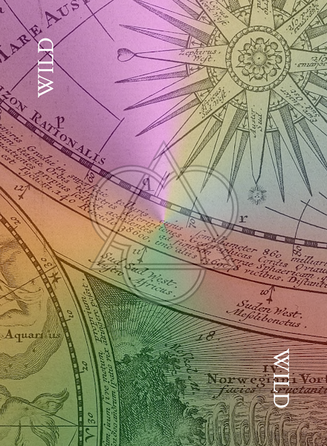
and I thought it would make for an awesome background.

After cropping and placing my symbols, I came up with this:

Image

I've increased the dpi of the image to make it bigger for the preview. It will normally be around 90 dpi (65x100 mm).
I've cut around the constelations in order to have them in the "window" the background creates. It makes for a nice effect, but on the other hand, if the picture is complicated, like the one above, it becomes a mess :p
Maybe less drop glow?

User avatar
brynn
Posts: 10309
Joined: Wed Sep 26, 2007 4:34 pm
Location: western USA
Contact:

Re: Retheming the 7 Wonders Boardgame

Postby brynn » Mon Oct 22, 2012 8:09 pm

Yes, I agree that the "war image" is hard to dicern all the details, when it's at the proper size. I like how you made it sort of a window with the graph lines though. What if you removed the points and plotted lines from over the image (perhaps they are stars or constellations?). Maybe removing those, so that you only see the image through the "window", it would be less confusing (and easier to id the image contents)? Maybe leave the grid lines, but remove the points and plots.

I think you really have a good sense of style. I like all the ideas that you've shown, although perhaps I like this one the best.

Dictum Mortuum
Posts: 11
Joined: Fri Oct 05, 2012 2:17 am

Re: Retheming the 7 Wonders Boardgame

Postby Dictum Mortuum » Tue Oct 23, 2012 2:18 am

Alright, I think I'm on to something. I used the trace bitmap function and got rid of the raster graphic background. Now only the picture isn't vectorized, but that's not a big problem. Here's the end result, after applying some distortion to it :

Image

I think that I use drop shadow/glow too much, maybe I should cut down on it a bit, but it makes text and symbols look a lot better. Any suggestions (in general)?

User avatar
ragstian
Posts: 1181
Joined: Thu Oct 11, 2012 2:44 am
Location: Stavanger-Norway

Re: Retheming the 7 Wonders Boardgame

Postby ragstian » Tue Oct 23, 2012 4:25 am

Hi.

The last one is very good.

I would make the edge on the border "jagged" as well to go with the "style" of the rest of the image.

When using drop shadows on the three symbols along the top I reckon the image will look better if you use the
same drop shadow on the "War" text along the bottom as well?
Could also add some depth to the hole in the map to make the image look like it's on a lower level and give the map some "thickness":
At least worth a try.

All in all - very good!
Good Luck!
( ͡° ͜ʖ ͡°)
RGDS
Ragnar

Dictum Mortuum
Posts: 11
Joined: Fri Oct 05, 2012 2:17 am

Re: Retheming the 7 Wonders Boardgame

Postby Dictum Mortuum » Wed Oct 24, 2012 4:37 am

Image

Smoothed the background's texture a bit more.
Added something of a jagged thingy on my border - I'm not that pleased with it, but it looks cooler, that's true (also, gives a bit of a "papyrous" feel to the rest of the background).
Turned down the white drop glows a bit.
Added the same drop shadow to the card's name, the same that the top symbols have. However, that creates a straight line under the letters - anyone knows how to fix that?

User avatar
ragstian
Posts: 1181
Joined: Thu Oct 11, 2012 2:44 am
Location: Stavanger-Norway

Re: Retheming the 7 Wonders Boardgame

Postby ragstian » Wed Oct 24, 2012 5:21 am

Hi.
Great improvements again!

Looks like the border is "masking" the drop-shadow, also looks like your border is "straight" with a jagged fill.
Make sure the drop-shadow is on a layer above the border. Looks like the border now is "masking" the drop-shadow.

BR
Good Luck!
( ͡° ͜ʖ ͡°)
RGDS
Ragnar

Dictum Mortuum
Posts: 11
Joined: Fri Oct 05, 2012 2:17 am

Re: Retheming the 7 Wonders Boardgame

Postby Dictum Mortuum » Wed Oct 24, 2012 6:00 am

ragstian wrote:Hi.
Great improvements again!

Looks like the border is "masking" the drop-shadow, also looks like your border is "straight" with a jagged fill.
Make sure the drop-shadow is on a layer above the border. Looks like the border now is "masking" the drop-shadow.

BR


Actually, I just tried doing that and it wouldn't work. I think there's a problem when applying the drop shadow effect to text.

Duplicating the text, blurring it and then positioning it manually thought seems to get it right.

User avatar
ragstian
Posts: 1181
Joined: Thu Oct 11, 2012 2:44 am
Location: Stavanger-Norway

Re: Retheming the 7 Wonders Boardgame

Postby ragstian » Wed Oct 24, 2012 9:09 am

Hi.

That's the way I have done my drop shadows for text. The shadow then "grows" in size to cover the whole blurred region. As an Inkscape beginner; what's the "proper" way to create drop-shadows?

BR
Good Luck!
( ͡° ͜ʖ ͡°)
RGDS
Ragnar

User avatar
Inkspots
Posts: 232
Joined: Sat Dec 03, 2011 3:16 am

Re: Retheming the 7 Wonders Boardgame

Postby Inkspots » Sun Dec 09, 2012 4:44 am

I've never seen the game seven wonders, so I've never replied to your topic before, but the images you've posted are really wonderful.
I know this post is a bit late,and by now you've probably learned all you wanted to know about drop shadows. ( there are lots of "right" ways to do them)

Did you get the text drop shadow to do what you wanted ? If not you could try filling it with a gradient. It looks like its being chopped off by the edge of the shadow object itself and not
the border...so adding blur wont fix it if you want the shadow to still be distinct. A gradient fill will fade it nicely at the edges and still leave the interior of the shadow bold and distinct.
experiment with radial and linear gradients to see if that helps. If you havent already done that, of course.


Return to “Work in progress”