InfusionFibers.com Branding - 10% off Coupon

Post unfinished work here for feedback and advise.
User avatar
VitalBodies
Posts: 112
Joined: Wed Feb 03, 2010 6:47 pm

InfusionFibers.com Branding - 10% off Coupon

Postby VitalBodies » Tue Mar 23, 2010 3:10 pm

VitalBodies.net is working on a job for InfusionFibers.com (maker of fun and beautiful hand made items) to create a 10% off coupon and branding for a combination business card/hang tag/coupon.

This is a "work in process" so ideas, suggestions, comments, likes, dislikes, etc are very welcome - don't hold back.

Image

Currently the main ideas are: (all subject to change)
A business card - standard 2" x 3.5".
A coupon.
Becomes a hang tag.

Printed on (100% post consumer) recycled paper - less is more...
-
The cards are laid out 10 to a page on a LETTER size (8.5x11 inches) card stock paper.
The cards are printed in house and cut by hand and punched with the common hand held paper punch - hand made.

My ideas are to make use of the scrap paper with the big bold red SALE! and combine the cards (with string) into one unit with the coupon fully visible, yet a surprise because of the BIG bold sale scrap.
The business card is a business card or a hang tag as needed.
Fonts, Inkscape program, OS are all open source - that is some of the fun : )
Last edited by VitalBodies on Thu Mar 25, 2010 3:49 am, edited 1 time in total.

User avatar
brynn
Posts: 10309
Joined: Wed Sep 26, 2007 4:34 pm
Location: western USA
Contact:

Re: InfusionFibers.com Branding - 10% off Coupon

Postby brynn » Wed Mar 24, 2010 6:53 am

I guess I could make some comments :mrgreen:

I like how you have the "nature" in green, while the rest is black. (Note that my monitor doesn't discriminate dark colors very well. It looks like black, but could be a very dark color.) I wonder how it would look to have each word on that line a different color? Probably would be too confusing...but just a thought.

The 1st thing that catches my attention is the veins in the leaf. For some reason, the "opposite" orientation of the veins (botanical language) doesn't seem to work for me. That's where the veins are opposite each other, along the central vein. I very well know that many plant genus' leaves are like that, in real life. But I'm wondering if "alternate" might work better? Either that, or maybe just reduce the width of the strokes that represent the veins...or maybe reduce the opacity......oh, or maybe make them a dark to medium green?

Also, I see that the leaf is very simple in design. And I do know that logos are supposed to convey concepts in the simplest way possible. But I'm wondering about the company and its products. Are they meant to be a "bargain" brand, or do they pride themselves as a "classy" product? If it's the bargain type, I think I might simplify the leaf even a little more. But if they want to convey a quality type of image, I think I might add a couple more details to the leaf -- like maybe a wavy edge and/or lighter green w/dark green veins and/or branch the veins to one more level and/or give the veins more detail by curving them slightly (combined with wavy edge could be very effective) and/or maybe a drop shadow and/or use a different type of leaf altogether (like I assume many of the fibers come from yucca, so maybe a single yucca leaf or maybe even a whole yucca plant). Certainly not all of those, but just some ideas for adding details.

Sorry, I can get carried away when brainstorming :lol:
One other thing is the text and grammar underneath the red "10% off your next purchase". I don't understand it, and if I saw it on a shirt in a store for example, it would take too long to read it. Maybe just say "ask the cashier for a coupon". Or just put a smaller version of the same leaf there, and instruct the cashiers to issue coupons when someone buys something with that tag? But at the very least, I would suggest not using the 1st person ("I can send you..."). Maybe just something like "get a revised invoice".

Other than that, I really like what you've done. It's a nice idea, and I think will be very effective. The hand cutting and hole punching process sounds like an ideal opportunity to employ developmentally disabled people, or even students (most high schools have a work-training program, which might enable your client to get the job done for free)(or there may be a workshop type organization in their area, work usually done by disabled adults).

Anyway, those are my 1st impressions :D

User avatar
VitalBodies
Posts: 112
Joined: Wed Feb 03, 2010 6:47 pm

Re: InfusionFibers.com Branding - 10% off Coupon

Postby VitalBodies » Wed Mar 24, 2010 1:13 pm

Thank you so much for commenting!
I will mention/ponder the ideas and see what takes.

I am using her logo and business card that we developed some time ago and mostly trying to create a coupon - she drew the logo with a little Inkscape guidance from me - I then revamped the logo/card so it is laid out correctly and easy to print and cut.

With the inkjet printer she is currently using the leaf veins do not show up like on screen (they are dulled/blurred out to a great degree and the leaf is darker) and are not much of a issue - I agree the veins could perhaps be improved - she wanted a simple/stylized leaf rather than a real leaf.

The product line is all TOTALLY hand made by her and worth a look for sure - not really bargain or high end but HAND MADE ART. She uses, hemp, wool, organic cotton and vintage fabrics mostly and DESIGNS each and every item.

About the coupon text: She does personally respond and there is no clerk, as the items are sold mostly on Etsy.com so the customer has to know how to use the coupon - Etsy does not really support coupons during check out but the sellers can offer coupons - so the customer has to know what to do and WHEN. The coupon is given to someone that buys an item (coupon is sent with the item) to use next time they buy.

You know, I tried to think of what to say in this post to give people clear information they need to respond - see how much I forgot (did not know) to mention! Ha, I even tried to through. You definitely did not say to much - part of the fun is sharing...
Last edited by VitalBodies on Thu Mar 25, 2010 2:41 am, edited 1 time in total.

User avatar
VitalBodies
Posts: 112
Joined: Wed Feb 03, 2010 6:47 pm

Re: InfusionFibers.com Branding - 10% off Coupon

Postby VitalBodies » Wed Mar 24, 2010 4:40 pm

Here is a slightly modified version using green behind the word SALE. The paper has been changed to reflect a truer match to the real recycled paper.
UPDATE: I changed the graphic quite a bit including changing SALE to SAVE.

Image

Not sure if classic SALE red is better, green or both (some of each) or?
Last edited by VitalBodies on Thu Mar 25, 2010 4:50 am, edited 1 time in total.

User avatar
brynn
Posts: 10309
Joined: Wed Sep 26, 2007 4:34 pm
Location: western USA
Contact:

Re: InfusionFibers.com Branding - 10% off Coupon

Postby brynn » Thu Mar 25, 2010 4:00 am

With the inkjet printer she is currently using the leaf veins do not show up like on screen

Yeah, I don't understand why, but my printer, and from what I undertand, a lot of printers, don't render colors properly. I find that I have to alter the colors on my screen to get them how I want when printed. I recently saw instructions for fixing it, but can't remember where :roll:

About the coupon text: She does personally respond and there is no clerk, as the items are sold mostly on Etsy.com so the customer has to know how to use the coupon

Aah, yes then, that makes more sense now. I was thinking 'retail store'.

Also, yes, now that I understand the products are truly hand made (unfortunately, that phrase is often used to sell items, when it's really quite a stretch....for example, clothing can be described as hand made, because it's made on a sewing machine -- to me, that's a stretch); anyway, now the leaf design makes more sense. As I said, I was thinking 'retail store'.

I like the green SALE better, given the truly handmade nature, and sales process. It still stands out, and outside of the typical retail store, I don't think the red is necessary. But I'm still leaning toward a lighter green for the leaf (you said her printer renders it darker green)

Anyway, that's a good job on both your parts! Now that I understand the business, I can't think of any improvements. (besides a lighter green leaf)(which really is subjective) It's really nice work!

User avatar
VitalBodies
Posts: 112
Joined: Wed Feb 03, 2010 6:47 pm

Re: InfusionFibers.com Branding - 10% off Coupon

Postby VitalBodies » Thu Mar 25, 2010 5:10 am

UPDATE: I changed both the graphics (above) quite a bit including changing SALE to SAVE on the green version.
I also added some subtle effects to make the cards look a bit more photo-realistic.

Will have to do a few print tests to fine tune the green for the printer. Additionally, some leaves will be different colors.

So far every likes green behind the word SALE or SAVE and they like SAVE better than SALE.

And added a bit of FUN : )

User avatar
RM.
Posts: 249
Joined: Mon Jan 05, 2009 10:33 am
Location: Italy, Sardegna

Re: InfusionFibers.com Branding - 10% off Coupon

Postby RM. » Thu Mar 25, 2010 3:09 pm

My impressions are:
1. Too many fonts.
2. Too many colors.
I know that probably you want to catch attention, but i think two colors are enough. Green and gray/black would be perfect.
Also i like more the green save. And for the leaf I agreed with Brynn. Have you tried to make it without veins?
I'm just someone who likes to create.

Logopond - CGsociety

User avatar
VitalBodies
Posts: 112
Joined: Wed Feb 03, 2010 6:47 pm

Re: InfusionFibers.com Branding - 10% off Coupon

Postby VitalBodies » Thu Mar 25, 2010 3:50 pm

RM Thank you for taking the time to comment.
The font and the leaf are not of my design but I can and will mention all the feed back I get - and I do mention it is from this forum.
One interesting thing is that there is only one FONT.
I did manage to make that one font OPEN SOURCE though.
But there are a number of um, what do they call that, variations(?), of the FONT - like bold, and ultra light and and.
And perhaps too many (somethings) for some peoples tastes - any one else think I over did it on the fonts - do say, do say?
I used to think that two was the limit on different fonts and more than that was - well, just too many.
I do not up hold that RULE as a rule any more, but often enough it is still valid.

Too many colors?
Well, that is an interesting comment.
Would be fun to see this with only Green, gray and black - coming soon.

And ya, that leaf, she likes that leaf - we will see...

I am also up against some odd "Inkscape behavior", like words shifting to the side, like the word NATURE has moved to left a number of times?

I had the INFAMOUS Inkscape will not print thing happen today (many times). I figured I would print a sample, take a photo and show you all so you can see the DREAM vs REALITY...
Hit print and it gets ready to print and then, then, then, nothing - like it is done or something - the print Queue disappears? Only happens in Inkscape.
Even later tried a PDF and had the INFAMOUS print a whole page ALL black syndrome happen - that is a lot of ink even for a CISS.

Printing advice and links welcome also.

User avatar
VitalBodies
Posts: 112
Joined: Wed Feb 03, 2010 6:47 pm

Re: InfusionFibers.com Branding - 10% off Coupon

Postby VitalBodies » Thu Mar 25, 2010 6:03 pm

Less color:

Image

User avatar
VitalBodies
Posts: 112
Joined: Wed Feb 03, 2010 6:47 pm

Re: InfusionFibers.com Branding - 10% off Coupon

Postby VitalBodies » Fri Mar 26, 2010 11:41 am

So what ended up looking the best in the printed version?
All green no red.
Lighter greens.
Not using bold on the smaller letters as bold tended to bleed and look crappy.

Image

I can not say I liked these screaming bright greens better for the screen version however - but they they printed much darker - about like the image further above that is darker green.

ON A SIDE NOTE:
I have been doing some fun artwork (shown above) for this forum to the side of the cards ("the real artwork") I planned on printing.
Oddly that fun art work needed to be deleted for the real art work to print?
The fun artwork did not over lap the printable page and was at least 1" over (on the left) AWAY from the page.
Any of you had that happen before?

...And, how does one create a realistic spider web in Inkscape?

User avatar
RM.
Posts: 249
Joined: Mon Jan 05, 2009 10:33 am
Location: Italy, Sardegna

Re: InfusionFibers.com Branding - 10% off Coupon

Postby RM. » Fri Mar 26, 2010 2:41 pm

When i said font i mean bold/light/etc. :)
Unfortunately i don't know nothing about prints, so sorry.
For colors: http://www.colourlovers.com/
For heathenx tutorial spider web: http://www.youtube.com/watch?v=iQgHT1EEv6I
I'm just someone who likes to create.

Logopond - CGsociety

User avatar
VitalBodies
Posts: 112
Joined: Wed Feb 03, 2010 6:47 pm

Re: InfusionFibers.com Branding - 10% off Coupon

Postby VitalBodies » Fri Mar 26, 2010 3:02 pm

I am attempting to draw a single strand of a spiders web, the kind spiders leave a trail of when they walk around and explore.
I tried a double strand of dark and light using a paths but it looks too much like string even when quite transparent.

User avatar
VitalBodies
Posts: 112
Joined: Wed Feb 03, 2010 6:47 pm

Re: InfusionFibers.com Branding - 10% off Coupon

Postby VitalBodies » Fri Mar 26, 2010 3:09 pm

Attempting realism on the overall drawing.

Image

I have attempted to add quite a bit of subtle elements to help with that.

Suggestions welcome.

For example: What makes or breaks the effect of realism for each of you?

User avatar
brynn
Posts: 10309
Joined: Wed Sep 26, 2007 4:34 pm
Location: western USA
Contact:

Re: InfusionFibers.com Branding - 10% off Coupon

Postby brynn » Fri Mar 26, 2010 3:20 pm

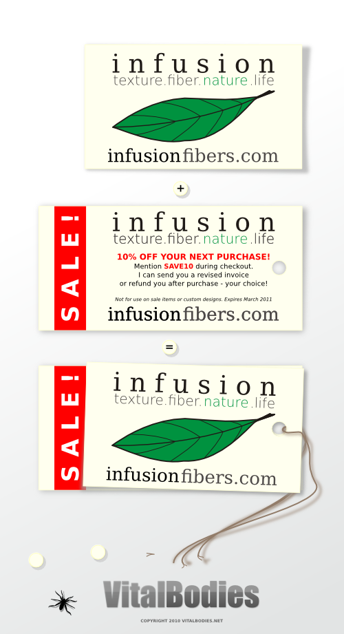
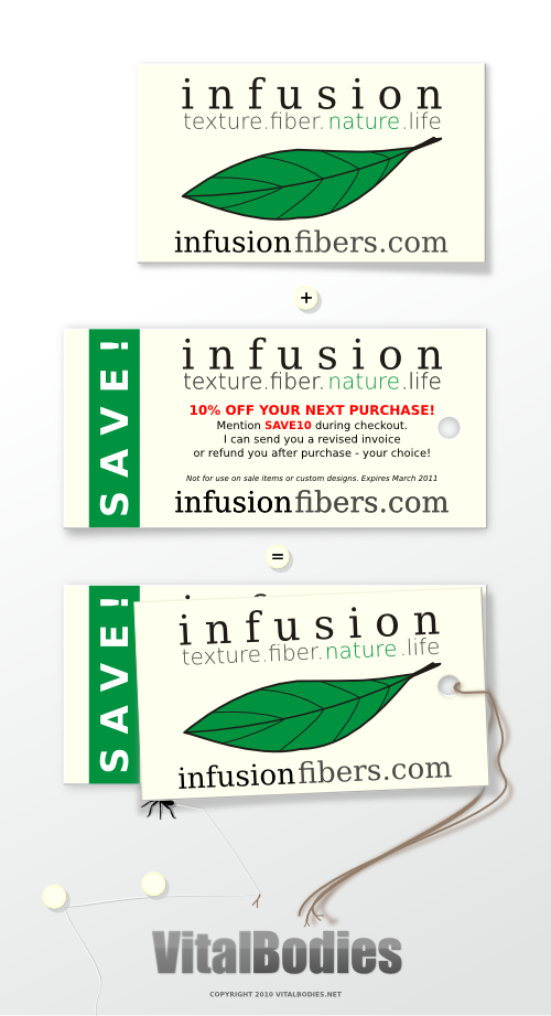
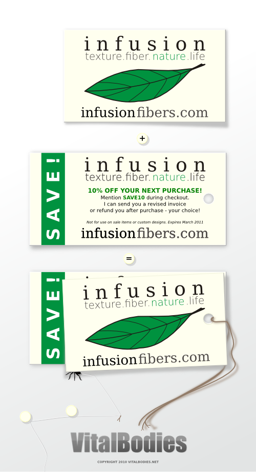
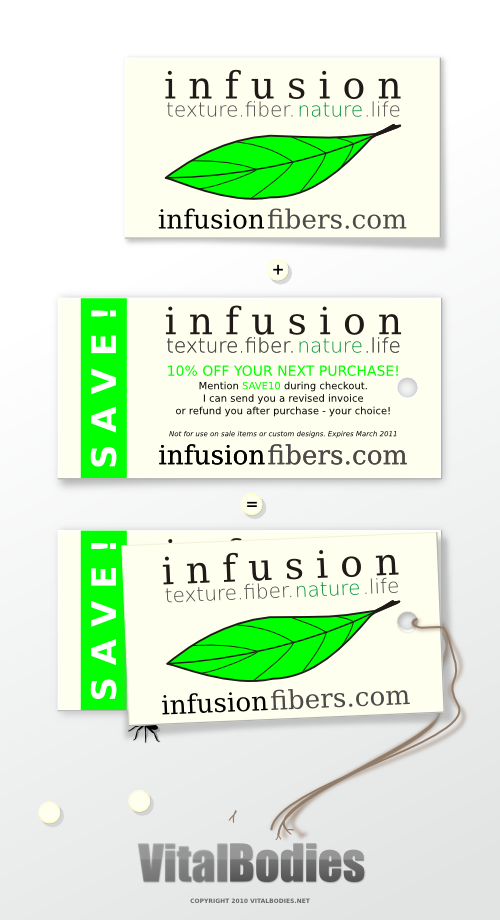
I don't think it has too many colors or fonts. The one where green replaces red is ok I guess, but I still prefer the small red font with green Save/Sale.

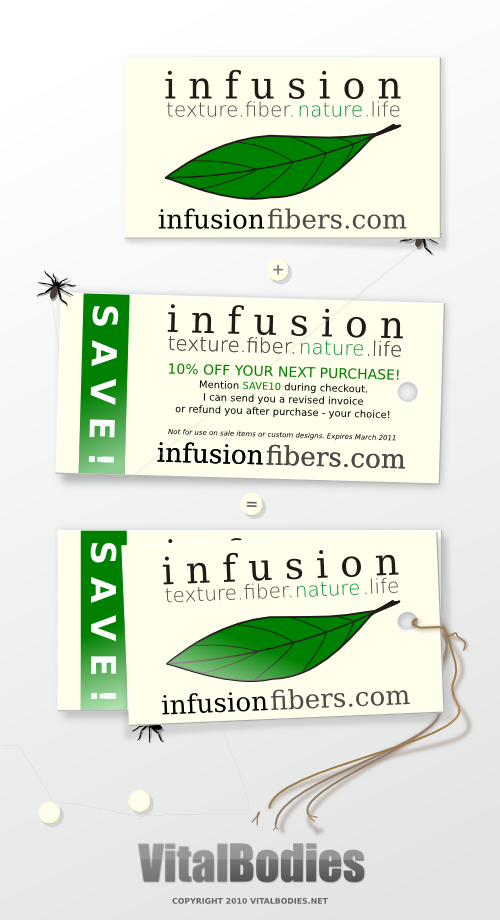
Did that spider lose a leg there above the B in VitalBodies? :P

Spider Web

1 - Use the Star shape and make a however-many-sided-web-you-want polygon.
2 - Then deform it slightly using Shift + drag tangential. It only takes a tiny drag to the right. This makes the polygons sides go concave, like a spider web. (Too far and you get loops.)
3 - Object to path.
4 - Adjust stroke width as needed.
5 - Duplicate.
6 - Scale slightly smaller. I would not use Inset, as you'll lose the sharp angles at the "spokes" (the supporting strands of silk that the spider attaches to things).
7 - Repeat duplicating and scaling until you have as many as you want.
8 - Draw the "spokes". I would use the Pen tool, but whatever works for you.

This will make a very graphic looking web -- too perfect to be real. But you could tweak it here and there to add a random appearance (like select random groups of nodes and drag slightly or maybe use Tweak tool; break a few "strands" here and there using Node tool; and stuff like that). Or to make it more stylized, you'd want to tweak it in different ways, which would have to be entirely up to you.

This would take some research, but it might be possible to do it using a radially tiled clone???? Or maybe you could use a Spiral with loads of Turns, Add nodes, drag certain nodes along radial lines or spokes.....this one might end up being too resource gobbling....????

I don't know if you want it to kind of span a corner of the canvas or something, I guess you'd have to do a Clip.

However, if you're looking for more of a cobweb type of web....I'd have to give that some thought....maybe use the Spiral and....geez, I can't remember how I did it, but somehow I deformed a spiral severely while trying to make something else, that ended up looking more like a cobweb than whatever I was attempting :lol:

Last thought -- I've seen spider web wingdings or dingbat fonts.

[Edit] Geez, 3 new posts while I was typing :roll: (I do type slow!)
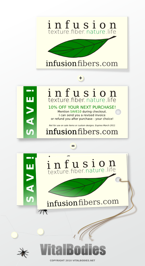
Realism....well that's the thing I don't get....I haven't been quite sure about the spiders and VitalBodies "tm" and drop shadows. It's clear that the whole thing is the image, but in my comments, I've just been focusing on the business card/tag/coupon part. It seems like the spiders/spider webs could imply that the card/tag/coupon is old, unused, or even trash. If that's the goal, maybe you could add some tattered corners and yellowing? But I'm not sure that's the goal....

User avatar
VitalBodies
Posts: 112
Joined: Wed Feb 03, 2010 6:47 pm

Re: InfusionFibers.com Branding - 10% off Coupon

Postby VitalBodies » Fri Mar 26, 2010 3:30 pm

Take a look at the spider web that shows up in one of the versions. Not much of WEB just a STRAND really. Does it look real or like string - to me it does not look real?
Real webs tend to be shiny, clear and well they look like spiders webbing....
It is actually the quality of a single strand that I am after.

At some point the CARDS will be done and I would like to add something (this graphic) to my portfolio related to the job, I thought I might add the graphic I have been working on along the way - the one with the spider that I have been sharing in this forum/thread.
For this graphic I wanted to add as much realism as I could muster with the time I have. So I am somewhat shifting gears midstream...

The spiders LEG is actually a clipped off piece of string - threads from the end of one of the strings. : )

User avatar
brynn
Posts: 10309
Joined: Wed Sep 26, 2007 4:34 pm
Location: western USA
Contact:

Re: InfusionFibers.com Branding - 10% off Coupon

Postby brynn » Fri Mar 26, 2010 4:35 pm

Take a look at the spider web that shows up in one of the versions. Not much of WEB just a STRAND really. Does it look real or like string - to me it does not look real?
Real webs tend to be shiny, clear and well they look like spiders webbing....

Aah, well, whenever I've seen just the single strand kind, I gues it would have some kind of curve to it. Because even the slightest breath of air movement will blow the single strand around. And I'm thinking not curve the entire line, because that would look more like wind. But just a subtle curviness to it, maybe a little curved one way, and in another place curved another way. And maybe even Add nodes and Jitter nodes a little bit, because I'm thinking that I only see a perfectly smooth spider web when there's some wind.

About the shinyness, I think you have done a good job with it. I usually only see a shiny web outdoors or in strong light, so I don't know if more shiny would work....unless it's supposed to look like it's under a strong light? For some reason, I think of spiders living and working in dark and shadowy areas. But of course I've seen plenty of spider webs outdoors...maybe it's the indoor kind of spiders that look for shadowy areas??? Anyway, you might experiment with gray and maybe even a little (very, very little) blur?

You know, I'm thinking about paper, and for example if these card/tag/coupons were attached to a piece of paper with....you know how you can roll a piece of scotch tap into a circle for (what they'd call "quick and dirty" these days...or maybe just old school :lol: ) two-sided tape. Anyway, so that the edges of the card aren't exactly touching the paper. I don't know that I'd expect to see a single strand of web zig-zagging from place to place. It would be more likely, I think, to see where the spider is attemping to sort of fill in an area with it's web. Something approaching a closed area, or what would be that if you looked at it later.

I may be getting too technical, but you wanted realism :mrgreen: I don't think that size of spider would be interested in such a small area. I suspect that size of spider might make a web of around a square foot or something. Not that I'm an expert or anything :P , just observant. Anyway, I'm thinking of a spider maybe half that size. Also, spiders are rarely all black, at least in my experience, they are all kinds of shades of brown, gray and black. Maybe you could look at some pictures of spiders, for a really authentic effect?

User avatar
VitalBodies
Posts: 112
Joined: Wed Feb 03, 2010 6:47 pm

Re: InfusionFibers.com Branding - 10% off Coupon

Postby VitalBodies » Fri Mar 26, 2010 5:00 pm

The single strand is a tough one so far. I tried it a couple of times. If you watch spiders walk around and explore, they leave a trail of web. That web is stuck down in various places - not randomly but it can seem that way. If a wind comes and blows them off the edge of something, they are usually "roped in" so they rarely fall and hit the ground. They do not do all that well if they do fall -ouch. If you ever see an ant fall off a roof onto the cement, it is as if nothing happened, no big deal. If a spider falls and hits the cement (without any web for support or slowing their fall), they do not get up for a long time if they do at all.

I had not really tried blur on a web that might be just what it takes.
Thought if i had two strands side by side one gray one white it might look like a stand that has some glistening quality.
Transparent helped but still looked like string.
Blur might just do it.

User avatar
VitalBodies
Posts: 112
Joined: Wed Feb 03, 2010 6:47 pm

Re: InfusionFibers.com Branding - 10% off Coupon

Postby VitalBodies » Fri Mar 26, 2010 5:20 pm

I updated the last image with a few more details and a web or two.
The web is three paths.
I added reflexion to one of the leafs of the cards and added a bit of brown to the lower spider plus a slight highlight to the string etc.


Image

The spiders are about life - rather than spooky, these are not harmful spiders.

User avatar
VitalBodies
Posts: 112
Joined: Wed Feb 03, 2010 6:47 pm

Re: InfusionFibers.com Branding - 10% off Coupon

Postby VitalBodies » Sat Mar 27, 2010 3:22 pm

As a work in process I like the way this has developed and ripened.
Comments welcome on any aspect of the image.
The client loved the cards and coupons and they have generated business already!
The next, slightly refined coupons should look even more pro and the business cards are easier to hand cut and punch.
Exciting.
Thanks for all the comments and suggestions so far.

anderw225
Posts: 1
Joined: Thu Dec 09, 2010 7:45 pm

Re: InfusionFibers.com Branding - 10% off Coupon

Postby anderw225 » Thu Dec 09, 2010 7:54 pm

thank you for sharing, It is a great post.

and Tiquiage

Re: InfusionFibers.com Branding - 10% off Coupon

Postby and Tiquiage » Wed Jan 19, 2011 3:35 pm

hope the spider art work never gets into the sale/save coupons, as they could be a turn off for some. would you believe some people are even scared of butterflies.
anyways, there seems to be a strongly concentrated spotlight involved, which could cast a faint enlarging king shadows of the spiders on the surfaces? the spiders would then also have some visible highlight as well for a more realistic appearance.
my head is not in the right space at the moment regards photography/painting/drawing/digital-art and "realism" being all rather subjective.
in theory if you color callibrate your system and the receiving system and printer are also color callibrated, then it should all look very similar. unfortunatelly inkjets vary a lot in color reproduction (especially when not callibrated) and tend to bleed. does inkscape produce color separations for professional print?

User avatar
VitalBodies
Posts: 112
Joined: Wed Feb 03, 2010 6:47 pm

Re: InfusionFibers.com Branding - 10% off Coupon

Postby VitalBodies » Thu Jan 20, 2011 7:31 pm

Thank you both for your comments and suggestions.
The spiders never were in the final, just my own art work. I hear you on people being spooked by insects even the most gentle kind.

The spiders have shadows that are such, that the closer to the ground they are, (like a foot touching the ground) the less offset the shadow is from the object casting the shadow.
The spiders are small enough that much of that detail is lost in the conversion to PNG at this resolution.
Some effort was made to make the low shadows darker also.
Some spiders are shiny and others are not. I was thinking the non shiny spiders at the time.
But still, they might have needed some indication of highlight as you mentioned even if they are so called, matte finished : ).

For the printer, this printer, to print more accurate color one needs paper that is more set up for that. This paper tends to bleed quite a bit with this type of ink (CISS).

kristendalton07
Posts: 7
Joined: Mon May 07, 2012 1:30 am

Re: InfusionFibers.com Branding - 10% off Coupon

Postby kristendalton07 » Sun May 20, 2012 4:07 am

The spider is one of the best thing for crawling. It crawl the web and collects data of different thing. We should come forward to do something for the nature of the nature.


Return to “Work in progress”