Been using Inkscape for a few years but use it very infrequently so still a step above novice.
Making a t-shirt design for a team and want to do a retro or distressed look. Found a great font no problem, but want to do a dark oval with white lettering in it, but want the background of the oval to also look distressed. Googled it and searched the forum but haven't had much luck in figuring it out.
I've played with the effects and the extensions, but don't seem to find one that does something along those lines. Any suggestions? It would seem like a fairly common topic with the number of "vintage but new" style t's I see.
How to make object background appear distressed?
Re: How to make object background appear distressed?
Okay, don't know if this is the best way of doing it, but it seems to have worked fairly well. Hopefully, the coach will agree.
Looked at the shapes of the distressed areas of the font and first tried to copy sections out with the crtl-A command on a second project and transferred the sections to the real project. However, for whatever reason, I couldn't control the levels with it, I think because I had pathed the oval so I could modify it.
So, just made about 8 random tiny shapes, some with the smart tools, some just by drawing the shapes myself, modeling after the noise in the distressed font, and then reduced their strike lines to 0.000 with a white fill. I had them on a dark block I deleted later just to keep track of them. Then I selected them all at once and then used the spray can object to distress the background of the oval. Think it will do.
Last edited by spuck20 on Mon Aug 04, 2014 12:34 pm, edited 1 time in total.
Re: How to make object background appear distressed?
Hi.
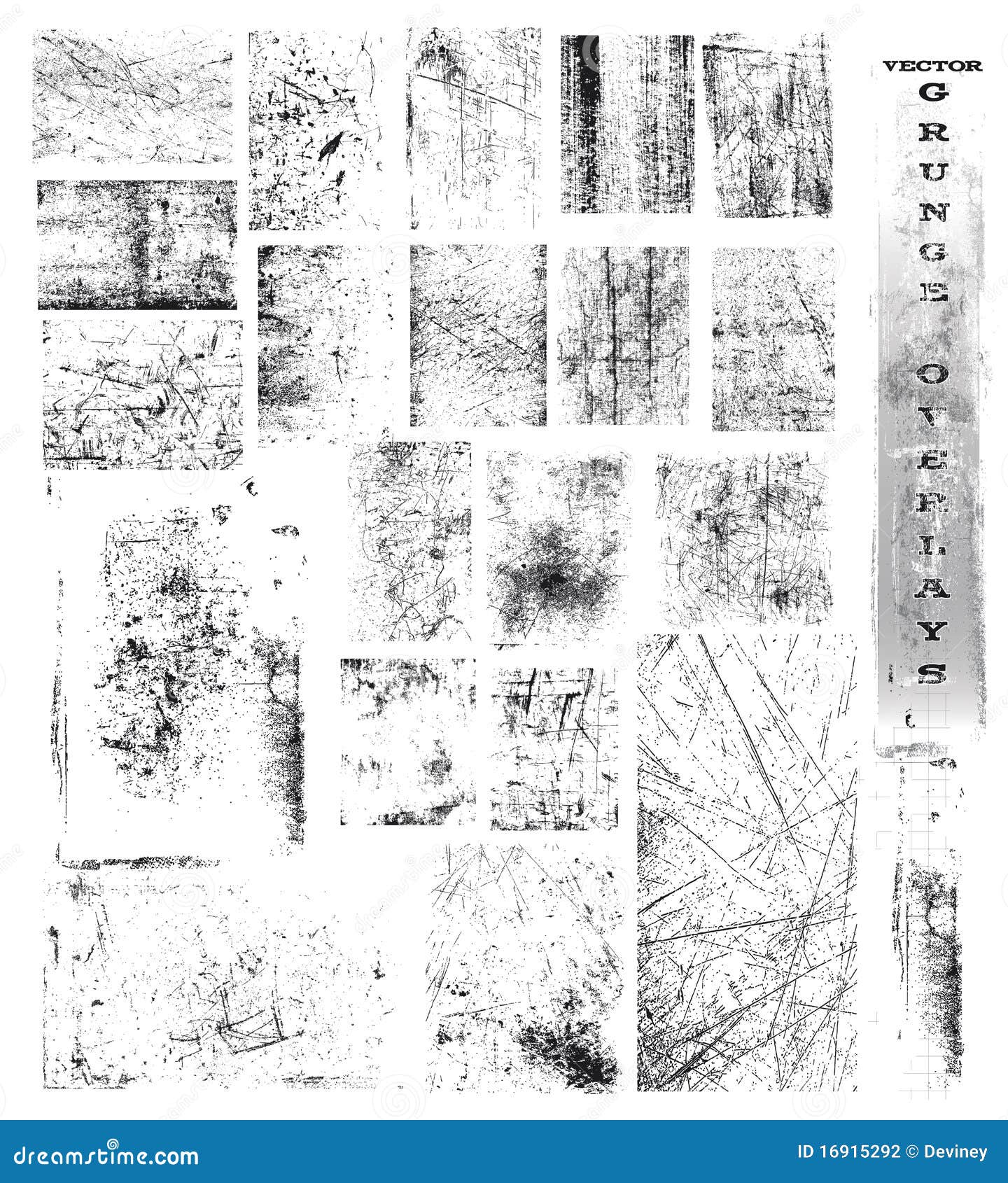
There are alot of ways to making seemingly random grunge/distressed pattern shapes as vectors.
The only limitation is the performance. With some effects you can end up with 20000+ nodes on a path, that can crawl your machine.
Do you have an exact image as a graphical direction?
There are alot of ways to making seemingly random grunge/distressed pattern shapes as vectors.
The only limitation is the performance. With some effects you can end up with 20000+ nodes on a path, that can crawl your machine.
Do you have an exact image as a graphical direction?
Re: How to make object background appear distressed?
Sorry, Lazur, not even sure what you mean by "an exact image as a graphical direction." The object I'm trying to distress is a flattened oval, kind of like a Tylenol pill. I'm putting the font over that, but want to distress the background of it to look similar to the distressed font. I think I've got it done good enough for the 30 some t-shirts we'll be doing, but I'm always interested in learning the best way to do things.
Re: How to make object background appear distressed?
Just a reference image, or a link to the font used.
Something similar worn in look?
Or much simpler, like:
http://www.inkscapeforum.com/viewtopic.php?f=5&t=15619
http://www.inkscapeforum.com/viewtopic.php?f=5&t=16339
also a bit related:
http://www.inkscapeforum.com/viewtopic.php?f=24&t=17346
Something similar worn in look?
Or much simpler, like:
http://www.inkscapeforum.com/viewtopic.php?f=5&t=15619
http://www.inkscapeforum.com/viewtopic.php?f=5&t=16339
also a bit related:
http://www.inkscapeforum.com/viewtopic.php?f=24&t=17346

Re: How to make object background appear distressed?
You are making a T shirt design. Going to be printed at around 50 - 125PPI(screen) even on a high end 2000 DPI direct to fabric printer (effectively). (That's 800 DPI/16 = 50 PPI, and 2000 DPI/16= 125 PPI. since you just asked, 'where are you pulling those numbers from?' I heard you.) Give yourself a break, just use a raster image for the background. No very fine (grayscale/full color) detail is possible. Finer detail possible for one bit images (B/W only). You need to know exactly what their printer prints at, and from, in that case.
Your mind is what you think it is.
Re: How to make object background appear distressed?
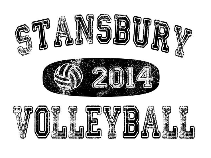
Here's what I've done thus far. The middle oval with the ball and the year are what I'm trying to distress to make it look comparable to the font. Font is called Colleged. Was thinking I had it done adequately, but then I realized I've just added a bunch of white objects and really need to now delete them so I have voids in the shape so I can use it on something else other than just white. I'm sure my screen print guy could just print it as is, and just single color it, but I'm trying to actually figure out how to do it. I've tried the various filters and thought the raster noise would be what I needed, but I couldn't get it to do anything. Finally figured out that's because the object was created in Inkscape and apparently the raster only work on imported bitmaps, so I'll give that a shot to see what that gives me. Thanks.
- Attachments
-
- inkscape help clip.JPG (94.83 KiB) Viewed 6001 times
Last edited by spuck20 on Wed Aug 06, 2014 1:18 pm, edited 2 times in total.
Re: How to make object background appear distressed?
Yeah, I obviously have no clue what I'm doing. Tried the export and import of bitmap and the raster still doesn't do anything, so I loaded some random jpgs and still can't get anything in the raster menu to do anything to them. Digging through Youtube for a tutorial but whatever I'm doing wrong, haven't figured it out yet. Did all of you start out as clueless as I am or is it just a particular skill I have?
Just took the original SVG (jpg of it in the post above) and used the filter>Transparency utilities>light eraser and it appears to have done what was needed on the project, assuming my homemade noise is good enough to pass the "glance" test. Maybe someday I'll figure out how to use the raster extensions for my noise generation instead of my manual spray can approach of home-made shapes.
Just took the original SVG (jpg of it in the post above) and used the filter>Transparency utilities>light eraser and it appears to have done what was needed on the project, assuming my homemade noise is good enough to pass the "glance" test. Maybe someday I'll figure out how to use the raster extensions for my noise generation instead of my manual spray can approach of home-made shapes.
Re: How to make object background appear distressed?
At the "L"-s it can be seen that the pattern repeats, and some letters have too much contrast in between.
Makes it look like the lettering didn't got worn as a whole.
In that manner it would produce a much more consistent look if the grunge pattern was added to all the objects at once.
As far as I know silk screening mold is set up from a grayscale image, so then it would be only to produce a conveying look -some mockup on a colour T-shirt for example?
If you export it to a png with black and white fills only, in gimp you can convert the white shade to alpha in one easy step.
Now if you really want to make it as a vector, the easiest way in my humble opinion would be to have a right raster image with the pattern, that you auto-trace with the trace bitmap option,
then subtract it from the path below.
A quick way of generating such image in gimp can be achieved in seven steps.
That source image can produce something random and consistent at the same time for the trace bitmap,
and can freeze inkscape if it's too large.
A simple 770/160 px sized raster image alike can produce 10000+ nodes.
Another way to generate such pattern as a single path can be achieved with live path effects.
Or again instant freeze.
Like, draw a rectangle,
add hatching lpe, set it to be dense with the effect's handles,
then add a sketch lpe, set max tremble and tremble frequency higher,
and to finish use a small circle for a pattern along path lpe on that object.
It's a bit try and error, so if -at all- I would go for that raster image method.
Such vectors better be avoided.
Makes it look like the lettering didn't got worn as a whole.
In that manner it would produce a much more consistent look if the grunge pattern was added to all the objects at once.
As far as I know silk screening mold is set up from a grayscale image, so then it would be only to produce a conveying look -some mockup on a colour T-shirt for example?
If you export it to a png with black and white fills only, in gimp you can convert the white shade to alpha in one easy step.

- transparent.png (201.15 KiB) Viewed 5990 times
Now if you really want to make it as a vector, the easiest way in my humble opinion would be to have a right raster image with the pattern, that you auto-trace with the trace bitmap option,
then subtract it from the path below.
A quick way of generating such image in gimp can be achieved in seven steps.
- render plazma clouds
- desaturate
- add layer mask to it -made from a grayscale copy of the layer
- delete the image on the layer -by hitting delete, once switched back from the layer mask-, and bucket fill it with black
- create a new white layer and put it behind the masked one
- change layer mode to dissolve and lover the visibility a bit
- merge it with the white layer and export it to png
That source image can produce something random and consistent at the same time for the trace bitmap,
and can freeze inkscape if it's too large.
A simple 770/160 px sized raster image alike can produce 10000+ nodes.
Another way to generate such pattern as a single path can be achieved with live path effects.
Or again instant freeze.
Like, draw a rectangle,
add hatching lpe, set it to be dense with the effect's handles,
then add a sketch lpe, set max tremble and tremble frequency higher,
and to finish use a small circle for a pattern along path lpe on that object.
It's a bit try and error, so if -at all- I would go for that raster image method.
Such vectors better be avoided.