You don't make it easy to not to give you the
easy answer, do you?
So this is what you have for a start:
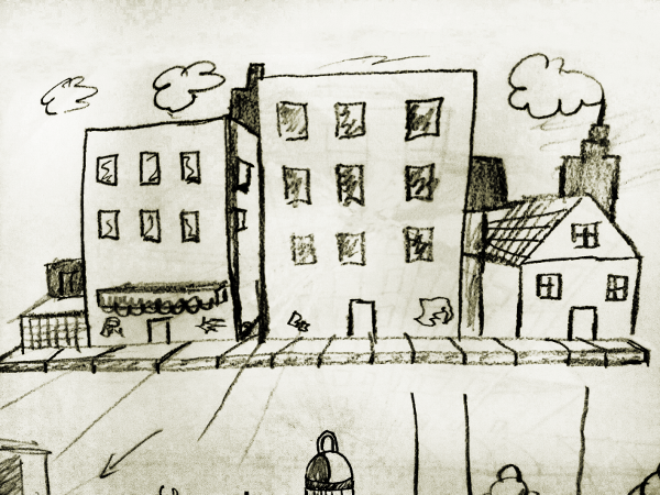
- hlp155II.png (495.86 KiB) Viewed 4839 times
What is the proportion of the game screen?
How the panning will be made?
Usual side scroller games have only some layers for a 2,5 D view, thus if the background would be made of several 1 point perspective images, it could look way off.
Where is the viewpoint at?
In your image, you have your viewpoint at the second floor. Not so conveying for the street level.
Nonetheless as I pointed out before, perspective and vanishing points may better be left out anyway.
What is the size of the characters, what is their size compared to the background?
What are the proportions of the elements you are using?
The previous example image have it's proportions off.
Pear the size of a car's wheel? First floor height half of the entrance door?
Car width the size of half an elevation's?
The spirals and bright colours may make it pop but that's not a good background in my humble opinion.
At least it does show no sides whatsoever of the objects.
Yet another one, to start the colouring once you have these things right.
You will need to decide wether you see an active element, a sprite of the characters, or the background.
One of the worst mistakes in when they are not separated right visually.
So try out your characters immediately if the backdrop suit them well.
The example image above may be too incoherent with a character and would make distinguishing harder.
Usual scenario: the character is in the front, covered in darker shades. Thus, the background needs to be lighter, and contrasting enough in colour.
Like again, in the previous example image the windows reflecting the sky doesn't help it.
There are a ton of examples out there, did you take a large research?
And sort them out in a focused way, which one of the imagery do you like, and what makes them look better?


