Oh the Dilemma…

Post unfinished work here for feedback and advise.
4hn
Posts: 18
Joined: Fri Jan 18, 2013 12:00 am
Location: Poland

Oh the Dilemma…

Postby 4hn » Sun Mar 17, 2013 9:11 pm

Image

This time I am trying something like this.
I started by sketching a bird on paper, then scanned it and redrew in GIMP using tablet.
Now I imported the drawing to Inkscape and am currently having fun with various colors and shapes. That'll take a while.
I wonder what should I do next — try to vectorize the bird and lose some of the detail or just color it, leaving as it is.
Maybe I should try both ways? I'm really not sure, so opinions are welcome :)

User avatar
brynn
Posts: 10309
Joined: Wed Sep 26, 2007 4:34 pm
Location: western USA
Contact:

Re: Oh the Dilemma…

Postby brynn » Mon Mar 18, 2013 9:40 am

Instead of redrawing in GIMP using tablet, you could redraw in Inkscape using tablet, and have the bird vector from the start! Assuming it's an imported raster, you could color it already (without tracing) using the Paint Bucket tool. Although it's hard to tell from the screenshot, whether it would lend itself to that very well. It's hard to see whether you have closed spaces within which to apply the Paint Bucket color, or if there are a bunch of open strokes. Although it's possible to adjust the Threshold on the tool control bar, and still be able to fill somewhat open areas.

For me personally, I don't find the drawing very inspiring, so it's hard to envision what might be done with it. The way the hand holds the bird is somewhat disturbing to me. So the way you have all the bright colors is really a stark contrast to what the "bird in hand" drawing implies to me. Maybe if the hand had a more gentle pose, or more gentle grasp on the bird, the bright colors would make more sense. Please note that is only my opinion :)

4hn
Posts: 18
Joined: Fri Jan 18, 2013 12:00 am
Location: Poland

Re: Oh the Dilemma…

Postby 4hn » Tue Mar 19, 2013 3:24 am

Hi Brynn, thanks for the comment! Your opinion is welcome and necessary :)

I see your point about the grasp. The photo I used for reference was taken during bird ringing (Just looking all dramatic, the bird was not hurt at all by this), and maybe I went a little overboard with the connotations. Rings. White doves. Pink. Cheesy, yes. Well, I try to do something with the colors.
I guess bucket tool won't do - lines are way too chaotic but I've tried tracing and the results were not that bad.

As for the tablet - Inkscape doesn't respond when I try using it. Maybe something with drivers.

I also encountered a problem while exporting. Part of the vectorized bird just vanished (the lower part of it). Not idea what could cause this.
But hey, still trying.

Image

Lazur
Posts: 4717
Joined: Tue Jun 14, 2016 10:38 am

Re: Oh the Dilemma…

Postby Lazur » Tue Mar 19, 2013 8:11 am

That drawing would look better on a grungy paper-like background.
The vectorized bird vanished because of inkscape couldn't render that much detail at once.
It can be tricky to export that in its complete size, probably taking in consideration the final image's size at the planning would be good.
Some may say to try some filters on that, but I personally would use only gimp to add effects to such image.
Inkscape filters are raster based too, and can slow things down very much.

User avatar
brynn
Posts: 10309
Joined: Wed Sep 26, 2007 4:34 pm
Location: western USA
Contact:

Re: Oh the Dilemma…

Postby brynn » Wed Mar 20, 2013 11:23 am

Oohh, well I feel better for the bird then! I was kind of confused, because it's clearly a small bird, but I never thought "wild". I thought the head looks very...well, un-parakeetish....possibly starling, although I don't know why anyone would want to study or track starlings (although I guess there could be good reasons). But the chest area looks a little flickerish. Well, what can I say? Give me a tree, and I can tell more than you'd ever want to know about it. Birds are a whole 'nother thing, lol. Anyway, I'm glad for the bird :D

I think I like the first version better. I'm not sure if it's the dark orange, or the missing part of the drawing, or both, but a lot of nice details are lost in the 2nd version. What if you put the drawing on top of the colors, rather than underneath them?

4hn
Posts: 18
Joined: Fri Jan 18, 2013 12:00 am
Location: Poland

Re: Oh the Dilemma…

Postby 4hn » Wed Mar 20, 2013 6:37 pm

@LazurURH - Thanks for your comment on the matter :)
As for the Inkscape filters, you're right - they totally slow my computer down. I often try them out, out of curiosity, but in the end I never use them.
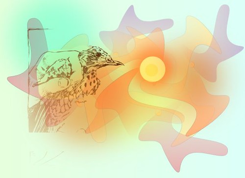
The background still isn't there, as you can see, but thanks to you I had another idea. You suggested a paperlike background and I thought I could try to make the bird stand out not by coloring it, but making it into a papercut.
Something like this:

Image

@Brynn - The bird COULD be a young fieldfare but I'm not sure, as I've already returned the book with the photo. (Why would anyone want to ring a fieldfare? It's so common) About visibility of the bird - I guess making it into a papercut somewhat helps (I'll add some shadows when I decide on the background at last); thanks to that I was able to put in the original version, not the vectorized one. Still I need to polish all the rough-wip-edges. Background. Did I mention it? Oh yeah.

This particular piece is really taking ages. That's what happens when you don't know what you want from the start, when you can just alter the main idea in the process if something's obviously wrong.

User avatar
brynn
Posts: 10309
Joined: Wed Sep 26, 2007 4:34 pm
Location: western USA
Contact:

Re: Oh the Dilemma…

Postby brynn » Wed Mar 20, 2013 6:45 pm

Oh yes, I like this last one much better! I also like the current background colors :D

Lazur
Posts: 4717
Joined: Tue Jun 14, 2016 10:38 am

Re: Oh the Dilemma…

Postby Lazur » Thu Mar 21, 2013 12:19 am

I was thinking something like this for the background: http://www.myfreetextures.com/wp-content/uploads/2011/06/paper38f.jpg
There are too many things going on the background right now, which is distracting the attention of the viewer from the main object.
Also, the previous drawing had more depth, this version is a bit too flat even though it has more detail in my opinion.

User avatar
flamingolady
Posts: 687
Joined: Wed Jun 10, 2009 1:40 pm

Re: Oh the Dilemma…

Postby flamingolady » Thu Mar 21, 2013 9:00 am

hi
fyi - the link above doesn't take my anywhere.

Personally, I think the yellow /bright circle to the right of the bird is taking away from the bird. And there's something about the back part of the bird's head, it's like a piece is cut out, where the finger overlaps it, but it's making the bird's head appear flat.

gotta run, good luck

User avatar
brynn
Posts: 10309
Joined: Wed Sep 26, 2007 4:34 pm
Location: western USA
Contact:

Re: Oh the Dilemma…

Postby brynn » Thu Mar 21, 2013 10:13 am


Lazur
Posts: 4717
Joined: Tue Jun 14, 2016 10:38 am

Re: Oh the Dilemma…

Postby Lazur » Thu Mar 21, 2013 10:25 am

Sorry about that, here are some others:
http://www.myfreetextures.com/worn-parchment-paper/
Image
http://www.myfreetextures.com/worn-parchment-paper-4/
Image
http://www.myfreetextures.com/worn-parchment-paper-2/
Image

Also, similar textures can be drawn from scratch with gimp easily.

User avatar
ha1flosse
Posts: 154
Joined: Wed Oct 21, 2009 8:12 pm
Contact:

Re: Oh the Dilemma…

Postby ha1flosse » Fri Mar 22, 2013 5:39 am

looks like a broken egg on the right side. nice sketch, but scared bird + holding hand indeed evokes strange feelings ..

4hn
Posts: 18
Joined: Fri Jan 18, 2013 12:00 am
Location: Poland

Re: Oh the Dilemma…

Postby 4hn » Sat Mar 23, 2013 6:42 am

Ah, I feel my weary soul will find some rest soon. :lol: Thank you all for the feedback! I really appreciate it.

@Lazur URH – I went after your suggestion and found one of my own scanned textures. It's cardboard paper, and has less grungy feel to it, but I kind of like the outcome. The creamy color around the image I'll try to transform into something similiar to framing mat.

@flamingolady – I'll try to alter the head. The flat outline is part of a path I drew to make the bird stand out more. I guess now the circle (as from now on – the Sun) isn't so distracting. What do you think?

@ha1flosse – What can I say, the bird is scared but eventually shall be set free and fly into the eggset… Um, I mean sunset. ;)

Image

4hn
Posts: 18
Joined: Fri Jan 18, 2013 12:00 am
Location: Poland

Re: Oh the Dilemma…

Postby 4hn » Fri Apr 05, 2013 2:19 am


Return to “Work in progress”