tree-like letters?

Post questions on how to use or achieve an effect in Inkscape.
sloth
Posts: 10
Joined: Mon Jun 13, 2011 12:50 am

tree-like letters?

Postby sloth » Mon Jun 13, 2011 5:17 am

Hi, I know very little of this kind of program (but I'm quite good with paint!) and I'm hoping someone can help me, please! I am just starting my own business and can't spare the expense graphic designers have quoted me for a simple logo design so thought ud give it a go. I know what I want, but not how to do it, even after going through the tutorials.
My business name is I am trying to have a basic, but wavy, 'S-D (in green, as the trees canopy) with 'ARB' (in brown) written vertically below it as the trunk.
I hope that makes sense, and will try to post a sketch soon to make my intentions more clear.
I feel this must be pretty simple even for a complete novice like me! Any help will be greatly appreciated, thank you 8-)
Last edited by sloth on Wed Sep 14, 2011 1:28 am, edited 1 time in total.

User avatar
brynn
Posts: 10309
Joined: Wed Sep 26, 2007 4:34 pm
Location: western USA
Contact:

Re: tree-like letters?

Postby brynn » Mon Jun 13, 2011 6:48 am

Image
Welcome to InkscapeForum!

Yes, that should be easily "doable" with Inkscape.
Before I get too involved with suggestions/instructions, I have a couple of questions. Oh, and before I even ask questions, you might want to learn about the difference between raster (paint programs) and vector graphics. It's something I still have a hard time really understanding from the technical perspective, but it results in some quite unexpected problems, if you haven't realized how very differently some things are done with vector vs raster. Here's the Wikipedia article on Vector Graphics, as a starting place.

So questions :D Do you want actually the image of a tree to lie behind the text? If so, an existing image, or one that you want to draw? Or will it be only text that is deformed in a tree shape? If text only, do you want some texture applied to the text to give the appearance of bark and leaves?

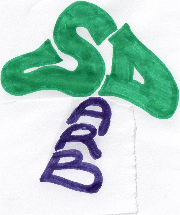
Well at least I think I could get you started with the "ARB"/trunk.
1 - Using the Text tool :tool_text: , type the letters.
2 - Next look along the top of the canvas, just above the ruler, to see the tool control bar (this will change for each tool used). There you can select the font that you want, and the size of the text (and several other settings that you probably won't need).
3 - If you can't find a font (there are many free ones to be found on the internet) that will give you the proper proportions for the tree trunk, it will be easy to adjust it manually. Select the text with the Selection tool :tool_selector: . You can drag those arrows to make the text larger, smaller, wider, taller, shorter, etc. (If you want some curves to the trunk, I'm thinking the Tweak tool :tool_tweak: will work, but let's see how it goes, and what develops, since I haven't seen the sketch yet.)
4 - Once you have it like you want, you should probably convert it from Text to Path (because usually a printer will want it that way). This is done from the Path menu > Object to Path. But note that after you do that, you will no longer be able to use the Text tool to edit it. Now you will only be able to edit with the Node too (or still the Selection tool). Since this is not a reversible step (except via Undo) I would suggest saving a copy of the original text (it can later be hidden or deleted, when you're sure you don't need it anymore). It's kind of handy to just drag it outside the image border (which is the rectangle that's showing when you first open Inkscape) while you work.

So give that a try! I realize there will be many "what ifs" and "how did that happen" once you get started, and we'll be glad to help with those -- one step at a time, as they come up :D
Also, if you can produce a sketch that is pretty close to what you want, you might instead scan it into your hard drive, and import it to Inkscape. Once there, you could trace it manually with the Pen :tool_pen: , Pencil :tool_pencil: , or maybe even Calligraphy :tool_calligraphic: tools. (Although the Calligraphy tool may be a bit difficult for a beginner, it sounds like you already have some skills, and perhaps could pick it up quickly?)

Or else an alternative to tracing manually would be to use Path menu > Trace Bitmap. This automatically converts whatever raster format you assigned it when you scanned it (usually BMP) to vector. Then you could simply use Inkscape to color it! Whether manual tracing or using Trace Bitmap would be best, depends on your sketch and your goals. (If you need a centerline trace, Inkscape's tool can't do that, but there's another one on the internet that can. But as I said, one step at a time, lol!)

Yes, a screenshot of your sketch would be so very helpful to us, to offer suggestions :D
Also, if you haven't already found it, Help menu > Inkscape Manual (requires internet connection) will probably have instructions for everything you want to do in this project, unless you need something really fancy (like a custom filter, for example). Plus, Help menu > Tutorials are all very well written for beginners (even the one titled "Advanced", lol!). (I know you've said that you've already looked at some tuts, but if it's the middle of the night and the forum's quiet :lol: they're a godsend.)

I actually have a degree in forestry, and worked in urban forestry/arboriculture for several years. I'm not sure about everyone, but I think many people who work in that field fantasize about starting our own business. So I'll be interested to see your sketch. (My fantasy logo was gonna have a ladybug in it Image. Well, that's not the image I drew, it was before I had a PC. This is me now, lol Image)

sloth
Posts: 10
Joined: Mon Jun 13, 2011 12:50 am

Re: tree-like letters?

Postby sloth » Mon Jun 13, 2011 6:24 pm

Thanks for the quick response :) surprised to see another tree hugger/cutter on here, pleasantly surprised! Will give those a go and try post a sketch as well. I'll put it up here for all to see when done, even if its a disaster ;) thank you...

sloth
Posts: 10
Joined: Mon Jun 13, 2011 12:50 am

Re: tree-like letters?

Postby sloth » Wed Jun 15, 2011 11:59 pm

something like this...
Attachments
img002.jpg
img002.jpg (178 KiB) Viewed 4932 times

sloth
Posts: 10
Joined: Mon Jun 13, 2011 12:50 am

Re: tree-like letters?

Postby sloth » Thu Jun 16, 2011 12:06 am

or this...
so, if i can free hand draw on paper the logo i want, i can then get inkscape to automatically 'trace' the outline for me, and convert it to a vector format. then colour and resize etc...? sounds good if so, as i cant seem to adjust the text in inkscape to the shape i want, have tried the tweak, and all it does is move the letters?! have tried adjusting the nodes (i think thats what they are) and i cant get the edges to flow smoothly. thanks again, sloth
Attachments
img003.jpg
img003.jpg (181.03 KiB) Viewed 4932 times

User avatar
BobSongs
Posts: 324
Joined: Fri Sep 14, 2007 2:18 pm
Location: Montreal, Canada

Re: tree-like letters?

Postby BobSongs » Thu Jun 16, 2011 3:16 am

Well, judging by this scanned work it will be a challenge to render the S and the D tree-ish enough to have them look like letters and yet look like something so random as a tree. I may not be much of a help here, but I will keep an eye on this thread and see what comments I can add as the tree and trunk develops.

Getting the work to be come tangible is one thing. Having the skill to do the work, ahhh, that's another thing. Depending on how stylized the letters are it might be a good idea to find some images of a tree on which you might like to create said logo.

This way you can lean toward either the shape of the letters or the shape of the tree. Or you could use a bit more of both.

Ahhh, art! :D

User avatar
brynn
Posts: 10309
Joined: Wed Sep 26, 2007 4:34 pm
Location: western USA
Contact:

Re: tree-like letters?

Postby brynn » Thu Jun 16, 2011 5:34 am

Oooohh! I was thinking you wanted the ARB side by side, and stretched really tall. So my original instructions won't work at all :roll:

This may be a bit challenging for a newish user, but if you're game, I have nearly endless patience :mrgreen:
That said, I think Trace Bitmap should work for you, without too much of a learning curve.

I don't know if the sketches you've done, with what looks like markers (or "sharpies"), will give a very good result. Inkscape might try to draw the rough edges (if you look closely, you can see where the markers' ink has bled into the paper). But you can do some quick test traces, and decide whether you might want to draw with a pen or very sharp pencil (or use markers on a smoother paper?). Or if the roughness in the resulting trace is mild, that might be easily fixed with Inkscape as well (without much learning curve).

So open Inkscape, and then File menu > Import, to bring your sketch into Inkscape. Select it with the Selection tool :tool_selector: and then Path menu > Trace Bitmap. (Here's the chapter on this tool in the Guide: http://tavmjong.free.fr/INKSCAPE/MANUAL/html/index.php)

I would suggest using one of the Single scan options. Personally I've had the best results from Edge Detection, but that might be the one the picks up the rough edges more readily. However, with the Threshold value, you should be able to smooth it out some. Note the Preview area on the right side. At the bottom is a bar that says Update. After you select the sketch and open Trace Bitmap, you'll have to click Update to see the preview. And each time you change a setting, click Update again, to see what those changes will look like.

[One problem, the Brightness Cutoff option has a bug so that you can't see a preview. What you can do instead, is actually perform the trace (click OK) to see what it looks like, then Undo, change Threshold, Ok, Undo, etc. It's cumbersome, but at least that option can still be used. And the preview does work for all the other options.]

So just do some experimenting, and let us know what problems you might run into. If you end up using one of the color options, you might not even have to apply color later! Also, don't forget the Options tab, especially Suppress Speckles (if you end up using those sketches).

Have fun!

sloth
Posts: 10
Joined: Mon Jun 13, 2011 12:50 am

Re: tree-like letters?

Postby sloth » Thu Jun 16, 2011 11:50 pm

Yeah they were done quickly with markers :) so if I do it properly on smoother paper with sharper lines, I can trace it, and fill it with colour/smooth the lines etc? Sounds too easy!

User avatar
RobA
Posts: 335
Joined: Fri Aug 10, 2007 1:22 am

Re: tree-like letters?

Postby RobA » Fri Jun 17, 2011 1:10 am

sloth wrote:or this...
so, if i can free hand draw on paper the logo i want, i can then get inkscape to automatically 'trace' the outline for me, and convert it to a vector format. then colour and resize etc...? sounds good if so, as i cant seem to adjust the text in inkscape to the shape i want, have tried the tweak, and all it does is move the letters?! have tried adjusting the nodes (i think thats what they are) and i cant get the edges to flow smoothly. thanks again, sloth


Sure - attached is your image, traced. I traced it as B&W and then split it into two objects, the foliage and the trunk.

-Rob A>
Attachments
sd.svg
(6.7 KiB) Downloaded 206 times

User avatar
brynn
Posts: 10309
Joined: Wed Sep 26, 2007 4:34 pm
Location: western USA
Contact:

Re: tree-like letters?

Postby brynn » Fri Jun 17, 2011 7:13 am

Yeah, as RobA said, and I also indicated, it might work with what you've got there. I'm just not sure what level of crispness and precision you need.

Sounds too easy!

Inkscape is great!

That said, you still might run into an issue here and there. It's hard to predict what an individual might understand or not understand or can figure out on their own. But we're here, just let us know :D

sloth
Posts: 10
Joined: Mon Jun 13, 2011 12:50 am

Re: tree-like letters?

Postby sloth » Sun Jun 19, 2011 1:44 am

Somebody please help!!!! My patience has worn to a mere slither of previous size, and I'm on the edge of pulling out my hair!
I have been at this now for about 4 hours, and am getting nowhere fast. attached is as close as I can get, but not what I am after (thank you Brynn for the arb on the trunk being side by side idea 8-) )
I would like the ARB to have thicker lines, and be more narrow at the top; and maybe to 'butt up' against the 'SD'
Also, is it possible to have a mottled green effect on the SD 'canopy' and a striated brown (ie. bark like) effect on the ARB 'trunk'?
I feel it cant be that hard if you know where to start, damn my computer illiteracy! Please help!
Many, many thanks in advance
Attachments
SD-ARB_logo.svg
(19.6 KiB) Downloaded 200 times

User avatar
RobA
Posts: 335
Joined: Fri Aug 10, 2007 1:22 am

Re: tree-like letters?

Postby RobA » Sun Jun 19, 2011 7:51 am

sloth wrote:Somebody please help!!!! My patience has worn to a mere slither of previous size, and I'm on the edge of pulling out my hair!
I have been at this now for about 4 hours, and am getting nowhere fast. attached is as close as I can get, but not what I am after (thank you Brynn for the arb on the trunk being side by side idea 8-) )
I would like the ARB to have thicker lines, and be more narrow at the top; and maybe to 'butt up' against the 'SD'
Also, is it possible to have a mottled green effect on the SD 'canopy' and a striated brown (ie. bark like) effect on the ARB 'trunk'?
I feel it cant be that hard if you know where to start, damn my computer illiteracy! Please help!
Many, many thanks in advance


Attached is a quick go.

I ungrouped the ARB and unioned it to get one path, then used outset to enlarge it. I then converted the outset back to a path using object to path, then applied the envelope deformation path effect to narrow the top.

The bark is a filter effect (texture->bark) and the foliage was made by duplicating the SD then applying the filter Scatter->Leaves to the duplicate.

Just something more for you to play with...

-Rob A>
Attachments
sd_arb2.svg
(28.63 KiB) Downloaded 202 times

sloth
Posts: 10
Joined: Mon Jun 13, 2011 12:50 am

Re: tree-like letters?

Postby sloth » Sun Jun 19, 2011 9:09 am

Thank you! I haven't actually looked at this yet because I can't download it onto my phone, but I will be sure to when I'm back at my pc. Time for another play after some z's and a fresh pot of coffee :) thank you again, I shall definitely be recommending inkscape and this forum to anyone needing graphics software or help, you are all very kind :)

User avatar
brynn
Posts: 10309
Joined: Wed Sep 26, 2007 4:34 pm
Location: western USA
Contact:

Re: tree-like letters?

Postby brynn » Sun Jun 19, 2011 9:59 am

Hi sloth,
I haven't looked at RobA's effort yet, but I will shortly.

So did you end up scanning a sketch with Trace Bitmap? I can see that at least the SD came from your original sketch posted above. But you've changed the ARB. I can't tell if you used the Text tool and then deformed it yourself, or scanned it. I'm guessing you scanned that part as well?

Well, no worries -- take a break, go for a hike, and come back to it fresh! I can see that you figured out how to use one of the Filters....unless it was unintentional. (because the info area tells me you used the Clean Edge filter) Out of curiosity, I removed the filter, but the letters without the filter don't look like they need smoothing (or to be more clean). And it does make the ARB a little thicker by removing it.

When you say
I would like the ARB to have thicker lines, and be more narrow at the top

do you mean the overall shape of the ARB more narrow, or do you mean that you want the lines of the individual letters thinner at the top? There will be different ways of accomplishing each, so I won't offer suggestions until I understand better. RobA covered the first, i.e. - Envelope Deformation (not sure what he used, but I would used the LPE rather than the extension.

and maybe to 'butt up' against the 'SD'

Do you mean that you want the ARB just to touch the SD, or to look like the letters are a little bit smashed or deformed where they touch the SD. Maybe another quick sketch would help? And for that matter, if you can draw it like you want, you could scan it and trace it, like before.

Also, is it possible to have a mottled green effect on the SD 'canopy' and a striated brown (ie. bark like) effect on the ARB 'trunk'?

Yes, I think there's actually a tree bark filter, lol! But if I recall, it's more of a close-up look. However though, I've found that I can use filters for uses that don't fit with the name of the filter. So I would suggest just drawing a quick rectangle, give it the color you want, and just go through the filters and apply them to the rectangle (Undo between each trial). You might see one that gives the effect you want, and then you can get rid of the rectangle and apply it to the letters. (I just use a rectangle to avoid accidentally messing up my work.) And same with the canopy (possibly Overlays > Growing Cells? or maybe even better Scatter > Leaves?). Although there may be other ways to handle the canopy as well.

Hang in there, you'll get there!

sloth
Posts: 10
Joined: Mon Jun 13, 2011 12:50 am

Re: tree-like letters?

Postby sloth » Sat Jul 09, 2011 4:14 am

Ok, Ive redone and repositioned ARB how Id like it so it fits neatly against the bottom of the 'canopy'. But I cant for the life of me get the bark effect to look anything like the effect that Rob kindly put on for me. I have tried everything I can think of, and even copied all the settings that show up when I select the one Rob did, but it just looks a state!
So, how do I get the same look from the one that Rob did, on the black repostioned one which Ive done? Please help, as Im at the end of my tether with this once again! (insert smilie of banging ones head against a wall!)
Thanks in advance...

um, i tried to upload it, but it says board attachment quota has been reached?

User avatar
brynn
Posts: 10309
Joined: Wed Sep 26, 2007 4:34 pm
Location: western USA
Contact:

Re: tree-like letters?

Postby brynn » Sun Jul 10, 2011 12:13 am

We're working on the attachment problem. Meanwhile, http://www.imgh.us accepts SVG uploads. (just upload, and copy the URL/direct link, and paste here)

I haven't actually looked at Rob's, so I'll have a look, in the meantime. Don't worry, it's probably a simple fix :D

sloth
Posts: 10
Joined: Mon Jun 13, 2011 12:50 am

Re: tree-like letters?

Postby sloth » Tue Jul 12, 2011 2:00 am

http://imgh.us/arb-logo2.svg

hope that works! hope fuly its a simple fix 8-)
good luck getting the problem sorted...

User avatar
brynn
Posts: 10309
Joined: Wed Sep 26, 2007 4:34 pm
Location: western USA
Contact:

Re: tree-like letters?

Postby brynn » Tue Jul 12, 2011 3:19 am

You know what, I think you might have had the wrong text selected when you made all the settings the same.

But just to be sure we're on the same page, it's the black ARB that you want to look like the other ARB, right?

The first thing I notice is that each of your black letters is a Group. In RobA's he has Ungrouped, and then Combined the paths. So first step, select all 3 letters, then Object menu > Ungroup, then Path menu > Combine. Now, it looks like you've lost some nodes, during the course of making the new text touch the canopy. RobA's shows 180 nodes, and yours 153. I don't think that will cause much trouble though, if any (I just tend to be quite detail oriented, lol).

Next, RobA's example has a Stroke of 8.030 (I'm not sure why that value, but it may have come from the time when you were playing around with the original text and trying to get it the right size). Your black text has no stroke. So next, Fill and Stroke dialog > Stroke Paint tab > Flat color button. And while you're there, make the Stroke and Fill both the same color as RobA's (552200ff). Then go to Stroke Style tab and enter 8.030 in the Width.

So now the new text should be the right size and color, and the last step is applying the filter, Filters menu > Textures > Bark.
That should do it :D

Do you want me to attach the finished file? The attachment quota problem has been fixed, btw.

sloth
Posts: 10
Joined: Mon Jun 13, 2011 12:50 am

Re: tree-like letters?

Postby sloth » Thu Jul 21, 2011 9:46 pm

Thank you all, I have have it how I like it now. Not quite what I had in mind when I set out, but the design of anything should be open to positive change!
I have attached the finished file for anyone who may be curious.
One (hopefuly) final question: when sending the image to business card printers, do i send them the svg and they will size it correctly? Or do I need to save and send it as something else, a bitmap or jpeg etc? If so, how do I resize when saving it as a diferent file type? Many thanks again!!! :D
arb-logo2.svg
(29.15 KiB) Downloaded 217 times

User avatar
brynn
Posts: 10309
Joined: Wed Sep 26, 2007 4:34 pm
Location: western USA
Contact:

Re: tree-like letters?

Postby brynn » Mon Jul 25, 2011 9:06 pm

Ah, very nice!
I'm glad you were able to make it like you wanted, or at least something you like.

I don't have any experience with printers. But from what I've read on the forums, each printer has his/her own preferences about file formats, and should make that clear to you in a contract, or at least before money changes hands. Usually they want a vector format, although I seem to recall one where SVG was not acceptable (and I can't remember the other vector format they wanted).

If they ask for a different format, you should resize it as SVG and save as SVG, before saving in another format. This will be especially important if they want a raster format!! Resize while it's still vector, I'll repeat, if the printer wants any raster format! Although I think the likelihood of them wanting a raster format is pretty low.

You would resize it by Scaling the image, either using Transform dialog, or the Selection handles (be sure to tick proportional scaling)(tiny padlock icon/button). Next, go to Document Properties > Page tab > Page Size > Custom Size > Resize page to content. This will make the page fit the image perfectly.

All best :D


Return to “Help with using Inkscape”