Hello,
Can you please review these graphics and provide any feedback to improve them.
Top
Need feedback - v0.91 Laptop Keyboard Layout - Gray Scale & Colored
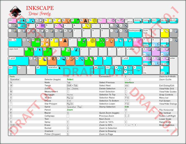
Re: Need feedback - v0.91 Laptop Keyboard Layout - Gray Scale & Colored
Hi.
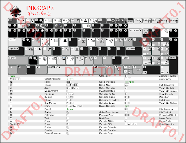
In my humble opinion your 2013 layout was more distinguishable with that darker backdrop.
On a side note openclipart only hosts as public domain so the creative commons licensing information there presented is inappropriate.
(Same with the logo but I had also uploaded it with the about screen contest image previously... maybe we would need a public domain logo first?)
As for the colouring, I can't see the logic on the different hue values. Reminds me of correct finger positioning images.
It is often said that the tool icons are largely outdated and unpleasant for professional use. Looking like cliparts from the late 90's.
Maybe a public domain icon set would be nice...
and here is a lot more serious problem of inkscape sticking with gtk icons where it is possible.
Because it doesn't seem to have an even support and development and thus inkscape cannot have a control over on their interface looking similar on every platform. And ensure no icons are broken.
No matter how good the rest of your key shortcut scheme looks graphically, those icons will be off.
Bit more on the appearance.
Gradients & blured shadows are not a good choice for the purpose. Those are not helping the eye capturing the information in the shortest way.
If this is going to be hosted as an svg then maybe it could use benefits of css.
Like if there is no highlight of any key at first, only they appear when you hower over the cursor.
Maybe the bottom list could be changed to a more finger-wise ordering (QAY instead of NWZ).
It would also be nice if the bottom list had a hoover over, especially if some key combinations would be present -like Ctl+Shift+F or Ctrl+Shift+A).
Speaking of the shortcuts there are other problems on the usefulness.
Doubt if anyone was looking for the shortcut key for the spiral tool with "I". Instead Ctrl+numpad 5, Ctrl++, Ctrl+-, Ctrl+*, Ctrl+K, Ctrl+G, Ctrl+Shift+K, Ctrl+Shift+G are some of the most useful ones.
- an option would be having the logo behind the graphic as gimp does
- off the graphic, should be clarified by the hosting i.e. wikipedia's disclaimers
- no dotted lines, hower-over would be nice
- one "E" would do it (though I never use that shortkey)
Re: Need feedback - v0.91 Laptop Keyboard Layout - Gray Scale & Colored
Are there so many changes in key shortcuts that you needed to change the overall format of the image? Because I agree with Lazur that the medium to dark gray background, and the pastel colors on the keys, is not only more attractive, but also easier to use.
(fyi, trying to browse to your blog I've received a security alert for "untrusted certificate" for your server, totalgta.net, from my security program which is ESET. I could provide further details, if you need.) I was hoping to find a little larger version of the images, because they're smaller than the previous gray one. Will these end up being the same size as the original version?
1 and 2 - I would put the title "Shortcut Keys for Inkscape version 0.91" or whatever, at the top or top-right. I would put the license either just below the title, or at the bottom of the page. Including your name as the artist/author, if you're inclined that way.
3 - Not dotted lines! The alternating row background color is much easier to read
4 - Text + icon whenever possible. I really do like the general color theme and format for the 0.48 gray version!
5 - I would try to fit both on the E key. Maybe can make the text and icons a little smaller. But it's hard to say without being able to see what it looks like. Show us an example? Otoh, if one of them is fairly obscure, little used tool, maybe could just omit?
Also fyi, attachments are not allowed in this board. I don't know why it tells you that the extension isn't allowed, but it really means that attachments aren't allowed here. (Only the Help board a couple of others, which I can never remember, will accept attachments.) But Lazur brought the images in, so problem solved
I like Lazur's idea of info popping up on hover, or maybe a key color change on hover. something.... Probably a lot more work though, to code it. Here is loads of info on ways to do that -- https://inkscape.org/en/learn/animation/ I want to try something like that, one of these days.
I disagree with Lazur about the icons. I think they're fine. And better to show those default icons, instead of a custom set, because newbies can recognize them easier.
I didn't check each shortcut for accuracy, because it's too small for me to comfortably read. But I think we have an up to date shortcut guide on the website, if you haven't already seen it -- https://inkscape.org/en/doc/keys091.html
I would love to put it on the website when you're finished, if you like (and assuming the rest of the website team agrees).
(I'm thinking in the Learn menu, and probably linked to the FAQ page. Or it could be in your InkSpace, using Tutorial category. Thought I saw someone uploaded the 0.48 version to the gallery the other day, but I could be thinking of something else.)
Basics - Help menu > Tutorials
Manual - Inkscape: Guide to a Vector Drawing Program
Inkscape Community - Inkscape FAQ - Gallery
Inkscape for Cutting Design
Manual - Inkscape: Guide to a Vector Drawing Program
Inkscape Community - Inkscape FAQ - Gallery
Inkscape for Cutting Design
Re: Need feedback - v0.91 Laptop Keyboard Layout - Gray Scale & Colored
Hello Lazur,
Thank you very much for helping me out with your feedback;
Lazur-danger
<<In my humble opinion your 2013 layout was more distinguishable with that darker backdrop>>
> I will fallback to the 0.48 file's medium gray for the 'colored version-color printer friendly file. I may have to take a fresh look athe grayscale version- this version is intended for school and public library black/white printers
<<As for the colouring, I can't see the logic on the different hue values. Reminds me of correct finger positioning images.>>
> Can we park this feedback, and re-evaluate it once draft0.2 is available? I have some background information (highlighters & lesson versions) on the key color selections.
<<It is often said that the tool icons are largely outdated and unpleasant for professional use. Looking like cliparts from the late 90's.
Maybe a public domain icon set would be nice...
and here is a lot more serious problem of inkscape sticking with gtk icons where it is possible.
Because it doesn't seem to have an even support and development and thus inkscape cannot have a control over on their interface looking similar on every platform. And ensure no icons are broken.
No matter how good the rest of your key shortcut scheme looks graphically, those icons will be off.>>
> I here you on the icons, there is a cell phone movement of dumping the 3d effect edits from Interface icons. But for parity for a graphic rookie or a 12 yr-old, I have to ensure that the icons match the v0.91 Inkscape GUI. Not matching the software icon will also create visual recognition problems with about 4.5% of the global population having one of the three levels of color blindness.
<<Gradients & blured shadows are not a good choice for the purpose. Those are not helping the eye capturing the information in the shortest way.>>
>the blurs will be history, no gradients in draft 0,1 (minus the icons)
<<Speaking of the shortcuts there are other problems on the usefulness.
Doubt if anyone was looking for the shortcut key for the spiral tool with "I". Instead Ctrl+numpad 5, Ctrl++, Ctrl+-, Ctrl+*, Ctrl+K, Ctrl+G, Ctrl+Shift+K, Ctrl+Shift+G are some of the most useful ones.>>
>I understand but this workup is targeting rookie-Inkies, 12 yr-olds and middle school teacher lesson plans, But having a combined novice/top half and advanced/bottom half (table eliminated) might be a roadmap item. Maybe a a stand alone advanced keyboard shortcuts file; top-keyboard layout, bottom-table?
1. an option would be having the logo behind the graphic as gimp does
>The logo has to be prominent and be the first thing a reader sees, top-left or top center are the options, branding is priority 1.
2. off the graphic, should be clarified by the hosting i.e. wikipedia's disclaimers
>hehe ooh no, it is going on the graphic I 've already had a CC issue with the v0.48 version.
3. no dotted lines, hower-over would be nice
>hower-over or you meant hover-over/mouse-over/rollover/cursor-over? If so I will have to roadmap this cool editing, the main purpose of this version is for 'printed' academics resource for da' wookies, young vuns and reachers.
4. one "E" would do it (though I never use that shortkey)
>I might remove the Eraser tool from the Layout graphic and leave its shortcut in the table, this is the Erasers first release and from a marketing perspective the Ecllipse tool is alot more fun for da kinders.
----------------------------------------------------------feedback on this item if you have time please------------------------------
4) Should I add text onto each key with an icon, example the the 3D box, (X) key add the text [3D box] to the bottom of the key or should I leave them all blank, or just make two versions (key text/no key text) for each file ?
Thanks again Lazur,
-vwanweb
Re: Need feedback - v0.91 Laptop Keyboard Layout - Gray Scale & Colored
Hi brynn
Brynn-win
<<Are there so many changes in key shortcuts that you needed to change the overall format of the image? Because I agree with Lazur that the medium to dark gray background, and the pastel colors on the keys, is not only more attractive, but also easier to use.>>
>Falling back to the medium gray for the colored version. Grayscale version needs a reset.
<<I was hoping to find a little larger version of the images, because they're smaller than the previous gray one. Will these end up being the same size as the original version?>>
>This version is based on a 'Laptop' keyboard layout which is not as wide as a 'Full' keyboard. It's scaled to print on US Letter 8.5x11 paper. But making a wider US Legal 8.5x14 print version for a 'Full' keyboard is now on the roadmap. This leap to a Full keyboard is close to a starting at square one.
<<1 and 2 - I would put the title "Shortcut Keys for Inkscape version 0.91" or whatever, at the top or top-right. I would put the license either just below the title, or at the bottom of the page. Including your name as the artist/author, if you're inclined that way.>>
>I think I will mimic the logo placement from the inkscape.org website (top left) and move the title "Inkscape v0.91 Laptop Shortcut Keys" to the top right. CC will land bottom-right.
<<3 - Not dotted lines! The alternating row background color is much easier to read>>
> /rocks head back/ ok, ok, I got ya - Not Dotted lines!
<<4 - Text + icon whenever possible. I really do like the general color theme and format for the 0.48 gray version!>>
>Ok thanks, I will try to make two versions of each color theme.. so the color version will have (a) Icons+Text and (b) Icons only
<<5 - I would try to fit both on the E key. Maybe can make the text and icons a little smaller. But it's hard to say without being able to see what it looks like. Show us an example? Otoh, if one of them is fairly obscure, little used tool, maybe could just omit?>>
> I think I will drop the Eraser icon, while leaving its shortcut in the table.
<<I like Lazur's idea of info popping up on hover, or maybe a key color change on hover. something.... Probably a lot more work though, to code it. Here is loads of info on ways to do that -- https://inkscape.org/en/learn/animation/ I want to try something like that, one of these days.>>
>These versions are targeting InK rooKies, middle schoolers and teachers. They are targeting both color and blk/white printers.
<<I disagree with Lazur about the icons. I think they're fine. And better to show those default icons, instead of a custom set, because newbies can recognize them easier.>>
>Yuppers, icons will match the software product
<<I didn't check each shortcut for accuracy, because it's too small for me to comfortably read. But I think we have an up to date shortcut guide on the website, if you haven't already seen it -- https://inkscape.org/en/doc/keys091.html>>
>Yup, I am a shortcut nerd, I'll double check the table's font size if it is below 11-pt I will try to bump it up to 13-pt
<<I would love to put it on the website when you're finished, if you like (and assuming the rest of the website team agrees).
(I'm thinking in the Learn menu, and probably linked to the FAQ page. Or it could be in your InkSpace, using Tutorial category. Thought I saw someone uploaded the 0.48 version to the gallery the other day, but I could be thinking of something else.)>>>
>I hope it gets on the site, it should compliment any ease of use marketing efforts. For-profit editors charge $ for their shortcuts tables
Thanks for the help!
-vwanweb
Re: Need feedback - v0.91 Laptop Keyboard Layout - Gray Scale & Colored
No text on the keys other then the letters should do I'd say.
(Could post the Red sea splitting image in the reply.)
Since inkscape is all about being the no1. dedicated svg editor, AND that svg format is all about web useage & cross platform, WHY to rely on gtk and not having an own approach?
Like every argument should take verbs and the rest would be just a gui to hide the geek stuff for the regular "12 year old users".*
So the whole interface could be an actual svg, with the opportunity to reorganise elements (like in blender), with the possibility of zooming in (like in blender) change the theme easily AND
adding other key features like a shortkey graphic coming up for F1 where if you hover over the cursor a key on the graphic keyboard, the tool's icon gets highlighted in the window (and vice-versa). Or even resized and moved to a focus area. Where you could also have access to both the tools's settings AND the corresponding part of the manual.
Which manual would bring up animated examples of the tools in the making, cursors moving, mouse click and shortkeys listed, parts zoomed in...
Maybe it would really cut it for usability and learning curve.
It wouldn't be impossible to record the process and replay the drawing then.
*That way we could take more advantage of scripting.
As regular users. With another node based interface. Where we could link the process to a few input parameters/sliders.
For example "draw a square" -option inputs -size, positioning, transformation, style attributes;
"draw a circle" -option inputs the similarly, but like center the circle to the corner node of the square.
And if you change the size of the square the circle would get repositioned live. Something like grasshopper.
Then at some point the compositing could be upgraded from the svg's linear ordering.
Drawing chainlinks interlocking shouldn't be a challenge and would need no trick.
Once if it had a node based editor it wouldn't be that hard having a proper gui for filter editing or lpe editing.
Speaking of gui-s, then a gui editor would also be nice, as we could assign certain actions for parts of an svg.
And design webpages/applications in the same program.
(With configurable coordinate system and a way to apply all transformations of course.)
What more oportunities are we missing? Still animation is out inkscape's range, and presentations could step up ("open prezi").
Oh font editing. Live svg font useage.
Printing -full featured colour management AND svg support by the printers would also be nice, the ability to substitute the outdated postscript-pdf.
If printers could process filters and you wouldn't need rasterizing them.
And so on.
Off topic:
But since it's dangerous thoughts, why not going completely irregular from the routines. (Could post the Red sea splitting image in the reply.)
Since inkscape is all about being the no1. dedicated svg editor, AND that svg format is all about web useage & cross platform, WHY to rely on gtk and not having an own approach?
Like every argument should take verbs and the rest would be just a gui to hide the geek stuff for the regular "12 year old users".*
So the whole interface could be an actual svg, with the opportunity to reorganise elements (like in blender), with the possibility of zooming in (like in blender) change the theme easily AND
adding other key features like a shortkey graphic coming up for F1 where if you hover over the cursor a key on the graphic keyboard, the tool's icon gets highlighted in the window (and vice-versa). Or even resized and moved to a focus area. Where you could also have access to both the tools's settings AND the corresponding part of the manual.
Which manual would bring up animated examples of the tools in the making, cursors moving, mouse click and shortkeys listed, parts zoomed in...
Maybe it would really cut it for usability and learning curve.
It wouldn't be impossible to record the process and replay the drawing then.
*That way we could take more advantage of scripting.
As regular users. With another node based interface. Where we could link the process to a few input parameters/sliders.
For example "draw a square" -option inputs -size, positioning, transformation, style attributes;
"draw a circle" -option inputs the similarly, but like center the circle to the corner node of the square.
And if you change the size of the square the circle would get repositioned live. Something like grasshopper.
Then at some point the compositing could be upgraded from the svg's linear ordering.
Drawing chainlinks interlocking shouldn't be a challenge and would need no trick.
Once if it had a node based editor it wouldn't be that hard having a proper gui for filter editing or lpe editing.
Speaking of gui-s, then a gui editor would also be nice, as we could assign certain actions for parts of an svg.
And design webpages/applications in the same program.
(With configurable coordinate system and a way to apply all transformations of course.)
What more oportunities are we missing? Still animation is out inkscape's range, and presentations could step up ("open prezi").
Oh font editing. Live svg font useage.
Printing -full featured colour management AND svg support by the printers would also be nice, the ability to substitute the outdated postscript-pdf.
If printers could process filters and you wouldn't need rasterizing them.
And so on.
Re: Need feedback - v0.91 Laptop Keyboard Layout - Gray Scale & Colored
Hello,
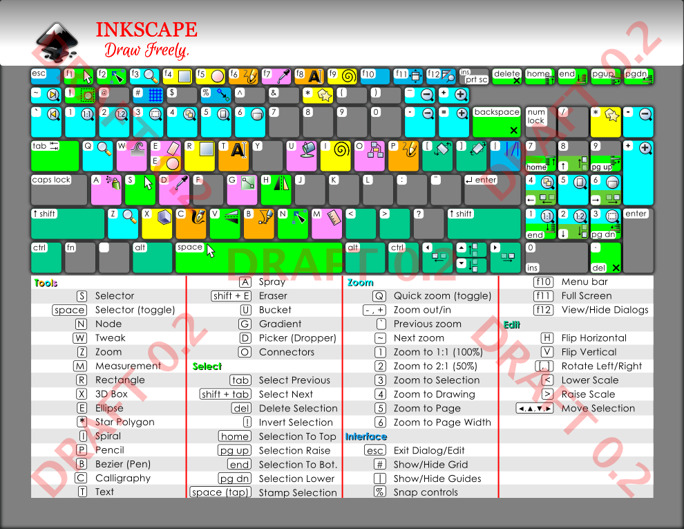
Link to graphic/;
http://vwanweb.blogspot.com/p/tutorials.html, Inkscape v0.91 Keyboard Layout Colored, draft 0.2 (edits noted below)
Draft 02 edits:
1. Dark gray color assigned to background.
2. Increased table font size to 11pt, previous font below 9.5 pt.
3. Changed table and key font fom Arial to Century Gothic.
4. Due to edit #3, the table is now at 4 columns (3 columns previously used in draft 01).
5. Due to no key labelling, slightly increased key icons from ~16px to ~20px.
6. Changed table headers from green to match key colors of the respective set of shortcuts (i.e., Zoom header colored aqua to match Zoom shortcut key coloring).
7. Keys with no icons set to dark gray, matching background.
8. 'E' key stayed with 2 icons on same key, 'E' Ellipse tool, 'Shift+E' eraser tool
Edits pending addition (Draft 03):
1. Placement of document title, top right
2. Creative commons annotation
 Any additional feedback would be greatly appreciated.
Note: 1) I am targetting Inkscape beginners and 'actual' printer based graphics, not sure any additional shortcuts are appropriate for the target community. Please note Inkscape literally has hundreds of shortcuts, the intent of the graphic is to serve as an 'introduction' to Inkscape shortcuts.
Thanks,
vwanweb
Link to graphic/;
http://vwanweb.blogspot.com/p/tutorials.html, Inkscape v0.91 Keyboard Layout Colored, draft 0.2 (edits noted below)
Draft 02 edits:
1. Dark gray color assigned to background.
2. Increased table font size to 11pt, previous font below 9.5 pt.
3. Changed table and key font fom Arial to Century Gothic.
4. Due to edit #3, the table is now at 4 columns (3 columns previously used in draft 01).
5. Due to no key labelling, slightly increased key icons from ~16px to ~20px.
6. Changed table headers from green to match key colors of the respective set of shortcuts (i.e., Zoom header colored aqua to match Zoom shortcut key coloring).
7. Keys with no icons set to dark gray, matching background.
8. 'E' key stayed with 2 icons on same key, 'E' Ellipse tool, 'Shift+E' eraser tool
Edits pending addition (Draft 03):
1. Placement of document title, top right
2. Creative commons annotation
Note: 1) I am targetting Inkscape beginners and 'actual' printer based graphics, not sure any additional shortcuts are appropriate for the target community. Please note Inkscape literally has hundreds of shortcuts, the intent of the graphic is to serve as an 'introduction' to Inkscape shortcuts.
Thanks,
vwanweb
Re: Need feedback - v0.91 Laptop Keyboard Layout - Gray Scale & Colored
Why does the alt key have a color, but isn't mentioned?
% is more 'toggle snapping' than 'snap controls' - for that, I'd expect to get a dialog.
(personally, I really don't like Cyan, and I find the color stands out too much here. But that's a matter of choice, I guess )
)
Food for further future development: Would adding a mouse image make it more complete? Many shortcuts relate to mouse movements, and some of those are very important, at least in my workflows.
% is more 'toggle snapping' than 'snap controls' - for that, I'd expect to get a dialog.
(personally, I really don't like Cyan, and I find the color stands out too much here. But that's a matter of choice, I guess
Food for further future development: Would adding a mouse image make it more complete? Many shortcuts relate to mouse movements, and some of those are very important, at least in my workflows.
Something doesn't work? - Keeping an eye on the status bar can save you a lot of time!
Inkscape FAQ - Learning Resources - Website with tutorials (German and English)
Inkscape FAQ - Learning Resources - Website with tutorials (German and English)
Re: Need feedback - v0.91 Laptop Keyboard Layout - Gray Scale & Colored
Hi Mioni
Thanks for the feedback, added a couple of your recommendations
Edits pending addition (Draft 03):
1. Placement of document title, top right
2. Creative commons annotation
3. Text addition to 'Edit" sub-heading [* Transform keys work alone (steps) and in combination with SAC; Shift+_, Alt+_, Ctrl+_]
4. Toggle added to % shortcut description [Snap controls (toggle)]
5. Increase icons to 20x20 for half keys (i.e., function keys) and full keys between 24x24 and 28x28
Mouse addition, I hear you on this. Inkscape has over 600 shortcuts and while it is very tempting to place as many shortcuts as possible the balance comes from vision friendly documentation. If I were to add 3-5 shortcuts, the font size would have to be reduced and lowering fonts below 11 pts is not visually healthy. Maybe having a sister graphic with the title being "Mouse shortcuts'"?
Thanks for the help,
vwanweb
Any other ideas feedback?
Last edited by vwanweb on Tue Nov 01, 2016 7:14 pm, edited 1 time in total.
Re: Need feedback - v0.91 Laptop Keyboard Layout - Gray Scale & Colored
Some personal notes.
The 0.48 version seemed more balanced.
The 0.48 version seemed more balanced.
- The blurred shadow looks messy where there is more space at the corners, wouldn't recommend it. Instead a solid backdrop would be better.
- The colour's impact is not balanced as mentioned by Moini. The more pastell colours worked better. Now the "Shift" key's tone doesn't stand out as much as the rest.
On a side note this would hardly work for colourblinds. - Speaking of disabilities, some find it extra annoying if a text is in colour -or in mixed colours.
- The key labels white background is too much in contrast with the keys beneath. A lowered opacity may work better.
- Instead of the red dividing lines some coloured highlighting of the key colours may work better on the columns.
- The previously suggested darker theme fits better the on-screen use -but if its for printing, black and white is the way to go.
Grey tones produce lousy edges.
Re: Need feedback - v0.91 Laptop Keyboard Layout - Gray Scale & Colored
Hello,
Thank you very much for all the help with improving this graphic, here is Draft 03, more comments encouraged:
https://goo.gl/toby2K. Link to graphic: http://vwanweb.blogspot.com/p/tutorials.html - scroll down to draft 03.
Edits included, Draft 03:
1. Placement of document title, top right
2. Creative commons annotation, top right
3. Text addition to 'Edit" sub-heading [*Keys work in steps
and in combination with SAC; Shift+_, Alt+_, Ctrl+_]
4. Toggle added to % description [Toggle Snap Controls]
5. Increase icons to 20x20 px for half keys (i.e., function keys)
and full keys to 24x24 and 28x28
6. Reworked keyboard shadow, dropped blur, added offset
7. Reworked key colors
8. Added Statusbar graphic w/shortcut and tool-tip notes (2)
9. Unused keys highlight frome white to gray
Action Item(s):
a. Create a sister graphic using color blind pallete and dyslexia font
Thanks,
vw