Hi,
Yesterday I was working on a logo.
Now I was asked to make it look like is has some sort of depth.
Preferred was like a blue print of kind of dept, you know with the dotted lines.
How could I pull this off with Inkscape?
Also I created a 3D model, but to my taste that does not look appropriate for a logo design, it is in no way timeless.
Sure there are other ways to make something look like it has depth.
And since there are many great artists on this forum, I figured I could best ask here.
Are there any other ways to make this logo look like it has some sort of depth.
Kind regards,
Virt
Making it look 3D / some sort of Depth Perspective..
Making it look 3D / some sort of Depth Perspective..
- Attachments
-

- house_logo.png (36.17 KiB) Viewed 5599 times
Re: Making it look 3D / some sort of Depth Perspective..
Hi.
Try to persuade the client that 3D is a no-go.
Why?
You have the light shape forming two hands and the Sun,
on another shape forming a house.
More importantly there is a torso formed between the two hands, with the sun as his head,
or, more so an angel with white wings.
With any 3D sence added, the symbolism would disappear.
Try to show the client that most notable logos are all flat.
You can search for logos with double meanings too.
For example the bear on toblerone's, or this.
Re: Making it look 3D / some sort of Depth Perspective..
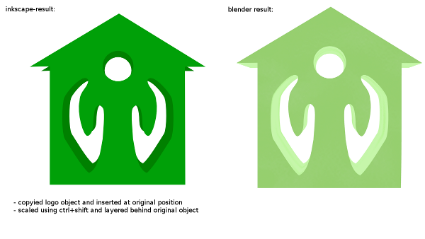
adding 3d/depth is easy in inkscape. as you see in following example, just by copying and pasting the logo and scaling the result. just a 3d edge at the corners is missing which can be added manually. the logo looks interesting, but the hands are not matching perfectly - seems you created them by drawing one by one? you could also draw one hand and then duplicate and mirror it. i also didnt recognize the logo as a house at first look. without knowing the context, it looks like an arrow but maybe you want it like that.
- Attachments
-
- house_logo.png (68.02 KiB) Viewed 5585 times

Re: Making it look 3D / some sort of Depth Perspective..
Lazur URH wrote:Hi.
Try to persuade the client that 3D is a no-go.
Why?
You have the light shape forming two hands and the Sun,
on another shape forming a house.
More importantly there is a torso formed between the two hands, with the sun as his head,
or, more so an angel with white wings.
With any 3D sence added, the symbolism would disappear.
Try to show the client that most notable logos are all flat.
You can search for logos with double meanings too.
For example the bear on toblerone's, or this.
Thanks for your helpful reply, could you point me perhaps a few things to spice up the logo in a diffrent way?
Re: Making it look 3D / some sort of Depth Perspective..
ha1flosse wrote:adding 3d/depth is easy in inkscape. as you see in following example, just by copying and pasting the logo and scaling the result. just a 3d edge at the corners is missing which can be added manually. the logo looks interesting, but the hands are not matching perfectly - seems you created them by drawing one by one? you could also draw one hand and then duplicate and mirror it. i also didnt recognize the logo as a house at first look. without knowing the context, it looks like an arrow but maybe you want it like that.
Thanks for your nice reply, the blender one does look awesome.
And you are right, the hands are not exactly the same, thanks for pointing out, I will apply the mirror trick as you told me.
Perhaps I should add a chimney to the roof for better instant and unconscious recognition of what it is meant to be.
Do you have any tips on how to spice up the logo a little?
* Offtopic:
Could you perhaps PM me how you did the blender trick? You would make me a very happy chap.
Re: Making it look 3D / some sort of Depth Perspective..

The original green shade looked too much of a road sign's.
Re: Making it look 3D / some sort of Depth Perspective..
Lazur URH wrote:
The original green shade looked too much of a road sign's.
You are right, the company though wants to imply the green ways of there work.
Any other things I could add to the logo to make it look more distinct?
I really apriciate all the time everyone takes for me.
Kind regards,
Virt
Re: Making it look 3D / some sort of Depth Perspective..
A-ha!
Now it makes all more sense.
Another reason to tie to 2D.
I can't recall any huge changes that could make it more distinct.
It's try and error.
If they don't like it, maybe the basic conception doesn't work for them.
Now it makes all more sense.
Another reason to tie to 2D.
I can't recall any huge changes that could make it more distinct.
It's try and error.
If they don't like it, maybe the basic conception doesn't work for them.
Re: Making it look 3D / some sort of Depth Perspective..
there's no trick, rendered your logo with blender (http://www.blender.org) for a reference picture. you can import your svg-file into blender, convert the object to a mesh and extrude the 3d-block but you need some basic knowledge about blender (see blender wiki @ blender.org). as far as i see, inkscape is the better choice for this task.
sub-information of the logo is suitable (like Lazur URH wrote: ...sun, angel; also the arrow pointing up, green color that all fits the need for a "housekeeping?" logo).
for improvement, the focus on working out the angel while e.g. enhancing the hands could be promising.
as seen in the later examples, the form of the roof is crucial. without corners it looks a bit like a church, corners too high reminds of an arrow. a chimney could be cool, tested it and i find it apllicable. you could also add some depth for the inner part of the logo but not for the outer edges to create a transition from 3d to 2d. with a good company lettering it would be a passable attempt for a logo.
-
tylerdurden
- Posts: 2344
- Joined: Sun Apr 14, 2013 12:04 pm
- Location: Michigan, USA
Re: Making it look 3D / some sort of Depth Perspective..
I generally agree that additional features may strengthen the message.
If related to housing,
Lots of inspiration/examples with google image-search: "housing logo"...
If related to housing,
- Chimney is used often with good results
Ground-plane or lawn
Sun, tree, flower
Oblique angle to show depth
Lots of inspiration/examples with google image-search: "housing logo"...
Have a nice day.
I'm using Inkscape 0.92.2 (5c3e80d, 2017-08-06), 64 bit win8.1
The Inkscape manual has lots of helpful info! http://tavmjong.free.fr/INKSCAPE/MANUAL/html/
I'm using Inkscape 0.92.2 (5c3e80d, 2017-08-06), 64 bit win8.1
The Inkscape manual has lots of helpful info! http://tavmjong.free.fr/INKSCAPE/MANUAL/html/
Re: Making it look 3D / some sort of Depth Perspective..
Lazur URH wrote:A-ha!
Now it makes all more sense.
Another reason to tie to 2D.
I can't recall any huge changes that could make it more distinct.
It's try and error.
If they don't like it, maybe the basic conception doesn't work for them.
Thanks for your reply.
I have an idea about making the corners of the house rounded.
Thanks for all the help.
Regards,
Virt
Re: Making it look 3D / some sort of Depth Perspective..
ha1flosse wrote:there's no trick, rendered your logo with blender (http://www.blender.org) for a reference picture. you can import your svg-file into blender, convert the object to a mesh and extrude the 3d-block but you need some basic knowledge about blender (see blender wiki @ blender.org). as far as i see, inkscape is the better choice for this task.
sub-information of the logo is suitable (like Lazur URH wrote: ...sun, angel; also the arrow pointing up, green color that all fits the need for a "housekeeping?" logo).
for improvement, the focus on working out the angel while e.g. enhancing the hands could be promising.
as seen in the later examples, the form of the roof is crucial. without corners it looks a bit like a church, corners too high reminds of an arrow. a chimney could be cool, tested it and i find it apllicable. you could also add some depth for the inner part of the logo but not for the outer edges to create a transition from 3d to 2d. with a good company lettering it would be a passable attempt for a logo.
Thanks for your time and help, really helped me out!
The logo is for an building optimization company.
It is not suppose to depict an angel but, tho hands protecting someone.
Yeah lettering is very important, thanks!
Thanks for your post and time!
Regards,
Virt
Re: Making it look 3D / some sort of Depth Perspective..
tylerdurden wrote:I generally agree that additional features may strengthen the message.
If related to housing,Chimney is used often with good results
Ground-plane or lawn
Sun, tree, flower
Oblique angle to show depth
Lots of inspiration/examples with google image-search: "housing logo"...
Thanks for the reply.
I have showed my client an chimney, but wants nothing to do with it. ^^
same for ground plane, sun or other props.
The hands are transparent yeah.
Thanks for your time!
Regards,
Virt
Re: Making it look 3D / some sort of Depth Perspective..
Thank you all for your time and effort.
I really applicate such a friendly and helpful community.
+1 Rep to all of you!
Regards,
Virt
I really applicate such a friendly and helpful community.
+1 Rep to all of you!
Regards,
Virt