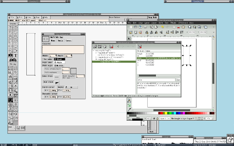
Open xfig, draw a box, then edit it's properties.
Open inkscape, draw a box, then edit it's properties.
full size (1680 x 1050)
Is there a nicer way to edit properties in inkscape? Because an awkward interface to raw XML just isn't fun. For my uses, xfig is a viable alternative to inkscape. It lets me draw scalable images that can be converted to a variety of raster formats. Inkscape is just so much harder to use.
xfig vs inkscape, why so hard?
Re: xfig vs inkscape, why so hard?
Most of the properties that Xfig exposes in that dialogue are available via the Fill & Stroke dialogue in the Object menu. The dimensions and other shape-specific settings are available in a toolbar at the top of the screen when the appropriate tool is selected: in this case.
The XML Editor is not expected to be a user-friendly interface for setting properties, it's an advanced tool for people who need to go beyond the UI options Inkscape offers for whatever reason.
If you prefer Xfig, or find it suits your requirements a bit better, then why not just continue to use that? If you genuinely want to learn how to use Inkscape then I recommend reading at least the basic sections of the Inkscape Guide.
Re: xfig vs inkscape, why so hard?
Look at all that wasted space at the bottom of the xfig window! Makes you appreciate the efficient design of the inkscape workspace and how much can be done without opening ANY dialog boxes at all!
Your mind is what you think it is.
Re: xfig vs inkscape, why so hard?
Welcome Eli the Bearded to our humble forum.
Just a few thoughts...
First, I am kinda "old school" when it comes to software, meaning, I have no issues with the idea of several software packages doing roughly the same thing on my computer. I can format a Newsletter in LibreOffice, in Scribus or in Inkscape. Each one offers its strengths and weaknesses.
Second, I appreciate more than one editor that manages the same type of files: GIMP & KolourPaint.
No one software works exactly the way I want it to. And an arsenal of packages means I can choose Package A to do these tasks while using Package B for others.
So, thanks for pointing out this software. I'm downloading & installing it as I type. I'm looking forward to see what cool new tools are at my disposal.
Re: xfig vs inkscape, why so hard?
druban wrote:Look at all that wasted space at the bottom of the xfig window! Makes you appreciate the efficient design of the inkscape workspace and how much can be done without opening ANY dialog boxes at all!
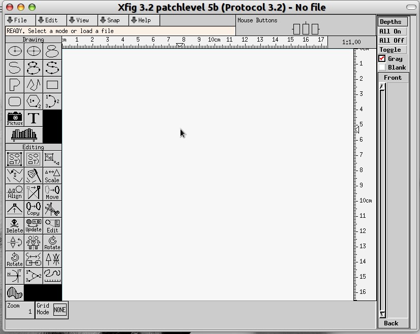
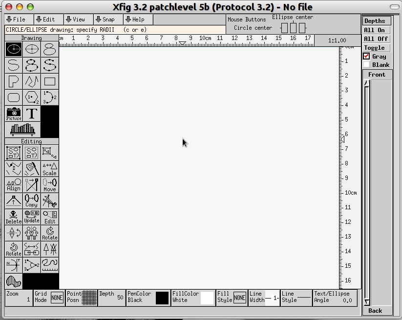
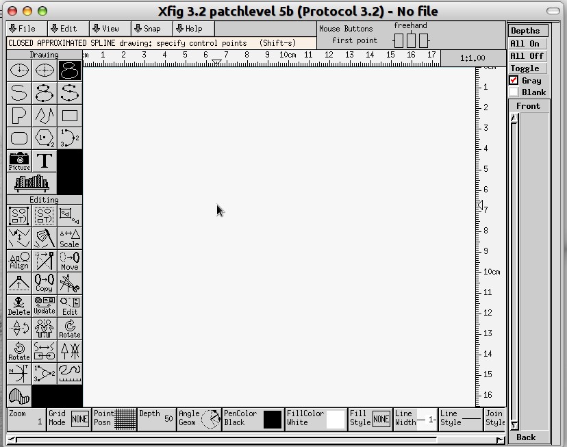
Just thought I'd say, in Xfig's defence, that clicking on a tool fills the bottom "wasted space" with a set of icons.
Attached printscreens for your review.
Inkscape places the icons at the top, Xfig on the bottom. Win7 puts the search icon on the bottom left, Apple on the top right. Same notion.
- Attachments
-
- Default view has very few rectangular icons at the bottom (true, they're not pretty, but we can argue aesthetics another day. =)
- 1.jpg (101.51 KiB) Viewed 4211 times
-
- With Circle/Ellipse selected the bottom empty area fills in.
- 2.jpg (113.41 KiB) Viewed 4211 times
-
- Here the icons are so many there's a scroll bar to select the hidden ones.
- 3.jpg (118.23 KiB) Viewed 4211 times
Re: xfig vs inkscape, why so hard?
Admittedly Xfig's interface extends back to early X Windows days (in terms of MS Windows, that would be around Windows 3.1).
But to be fair, the icons we use aren't our focus as users of this software. We simply need a quick reference. And I can well imagine someone using this for many years could complain that Inkscape's icons are too pretty for such a hard working program as Xfig. I think I could get used to the interface -- old as it is -- if I found this tool to be a worthy competitor to Inkscape.
Re: xfig vs inkscape, why so hard?
Thanks for the screen shots Bob, they are quite informative, they made me curious - I wonder if there are some tools there that are not in Inkscape yet..
Your mind is what you think it is.
Re: xfig vs inkscape, why so hard?
Some more info:
The oldest copyright date in the About > Help is 2007
The Xfig user manual is dated December 2002
The software is very interesting. It seems to have a specific purpose: it would appear this is more of a draftman's tool than a general graphics system that Inkscape is.I haven't found a way to import a bitmap, but I think the notion wasn't ever in the plans for Xfig. Ah! I found a way to add an image. So, yes: even adding images is possible. Sweet.
The export extension list is extensive and impressive.
The interface isn't beautiful. But neither is a well-used hammer. But even a rusty hammer will get a nail into the wood.
The load time, compared to Inkscape, is incredibly fast.
I wouldn't call this project "abandoned". I think rather that the developer(s) put into it all they wanted. It does what they needed and more would be superfluous.
It will never supplant Inkscape in my daily use. But it's a nice handy tool to have in my tool belt.
The oldest copyright date in the About > Help is 2007
The Xfig user manual is dated December 2002
The software is very interesting. It seems to have a specific purpose: it would appear this is more of a draftman's tool than a general graphics system that Inkscape is.
The export extension list is extensive and impressive.
The interface isn't beautiful. But neither is a well-used hammer. But even a rusty hammer will get a nail into the wood.
The load time, compared to Inkscape, is incredibly fast.
I wouldn't call this project "abandoned". I think rather that the developer(s) put into it all they wanted. It does what they needed and more would be superfluous.
It will never supplant Inkscape in my daily use. But it's a nice handy tool to have in my tool belt.