tiled clones always give me a headache
every time i want to create something, it takes me hours of trying to wrap my head around what each option does
heres what i want to achieve:
1. i want a horizontal line cloned over the y-axis of a canvas (=from the top to the bottom)
2. i want this line to get thicker with each new row
3. the distance between all lines must stay the same !
sounds simple but i cant get it right
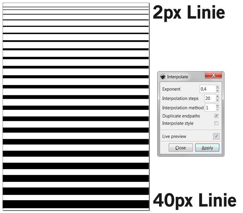
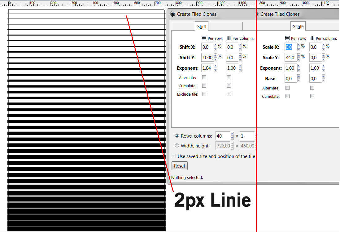
here are two examples i made, which are kind of the right direction but not excactly what i want
Op-art problem (thicken lines linearly, distribute equally)
- Espermaschine
- Posts: 892
- Joined: Thu Jun 05, 2014 9:10 pm
Op-art problem (thicken lines linearly, distribute equally)
Last edited by Espermaschine on Sat Dec 13, 2014 12:10 pm, edited 1 time in total.
Re: Op-artish tiled clones problem
Hi.
Though tiled clones option is promising, I would suggest the following.
Solution 1.:
Draw the line at the top,
duplicate it, and transform move and/or scale the duplicant to be the bottom line.
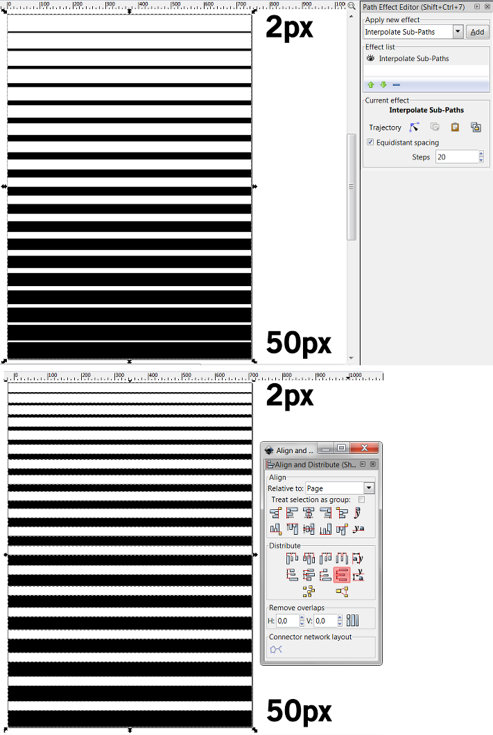
Combine them together, and add an interpolate subpaths live path effect.
Or use the same extension.
Solution 2.:
Use the tiled clones, but after the align and distribute panel too,
to make the spaces in between even.
Solution 3.:
A bit theoretical (haven't check) but the interpolate attribute between subpaths may work.
As there is a scale tab there.
Having these said, the interpolate subpaths lpe would make the lines thicken linearly, instead of the exponent in your example.
Well by my personal experience I would probably draw those by manually typing in the desired values for the sizes or use somekind of snapping feature in a construction if it was for high accuracy.
- Espermaschine
- Posts: 892
- Joined: Thu Jun 05, 2014 9:10 pm
Re: Op-artish tiled clones problem
Lazur URH wrote:Hi.
thanks Lazur, i was hoping you'd know a solution
i really think there should be a quick and easy way of doing this
and i found combining S1 with S2 satisfying
so i combined a 2px line with a 50px, applied Stitch Subpaths
then converted to a path and 'Break apart'
selected all the lines and distribute them equally with the Alignment tool
Well by my personal experience I would probably draw those by manually typing in the desired values for the sizes or use somekind of snapping feature in a construction if it was for high accuracy.
i have a tendency to do the same, but it seems too much work for such a simple effect
Re: Op-artish tiled clones problem
Espermaschine wrote:i have a tendency to do the same, but it seems too much work for such a simple effect
Depends on the needs.
Like, 0,2 px cannot be rendered sharp.
So it would be more of a print material then, with mm units.
And, the lines to represent a certain 3D flow, therefore probably some sin or elliptical formula on the proportions of the black and white spaces would look best.
Theoretically.
Because when it comes to printing, if "art print" on canvas is considered the top notch quality, these real life units doesn't work.
Knowing the 1200/2400 resolution doesn't gouarantee that the printer not leaving out lines if the mechanics not function fluently.
1% inaccuracy can be present even if the canvas is not stretched on a frame; stretching can add another percent.
- Espermaschine
- Posts: 892
- Joined: Thu Jun 05, 2014 9:10 pm
Re: Op-artish tiled clones problem
Lazur URH wrote:Espermaschine wrote:And, the lines to represent a certain 3D flow, therefore probably some sin or elliptical formula on the proportions of the black and white spaces would look best.
and how would you do that ??
Re: Op-art problem (thicken lines linearly, distribute equal
Similarly to these reconstructions.
Both of which has a simple geometry -they do have a constructed structure, while the first one's original looks different.
The first one is built up from squares. By the vertical direction it is easy to measure that their size differs in equal steps.
The wrap is the only result of horizontal translation of them.
Note the trace of the squares corners. I chose that to be a parabola at the right side, which results in the uneven, but ordered steps at the sides.
Actually that results the left curves to be the exact same parabolas, while the original's curve looks more of a chain curve.
The one with the circles is not that obvious by first glance, as there is no sign of trace that would show a geometric pattern.
Which it should, if the duplicant's nodes are connected. I chose a sin curve to be traced by the topmost and bottom most extreme points of the shapes.
(Again, all of the circles had even steps in their size.)
So in general, it would be like drawing a nice curve, project parallel lines on it in even distances, then use the intersection points to get to nice proportions.
Like drawing the shape's sideview -cylinder represented by lines at it's meridians-, and using it's vertical proportion to lay out a base of the gradient made from lines.
Also, the sideview can help to make a gradient that could represent the "bump map" of the cylinder, and then it could be used to calculate/construct the line's width in right proportions.
(For that matter, trying to come find out a system, how the colours were generated on those images originally is a large guessing game.)
The final impression can always be used to improve the method.
- Espermaschine
- Posts: 892
- Joined: Thu Jun 05, 2014 9:10 pm
Re: Op-art problem (thicken lines linearly, distribute equal
ok, i guess i understand what you are talking about
i get the idea, but its way out of my capabilities
i see myself as a beginner
here's the funny thing:
i started this thread because im doing research (well, i try to learn)
it started with studying Shepard Fairey's OBEY stuff
and then i remembered: all the decorative flowery stuff is a bit like what you see in the movie 'Yellow Submarine'
so i rewatched it for ideas (which was again funny, because this movie is a childhood memory of mine and now that i do stuff in Inkscape, i see it with totally different eyes)
i was especially impressed by the Sea of Science scene
and there you have it:
proto stencil art and tons of ideas for making OBEY-esque propaganda poster stuff
full circle

 This is a read-only archive of the inkscapeforum.com site. You can search for info here or post new questions and comments at


