I am new. But I have read tutorials and numerous posts to gain a better understanding, along with 8+ hours of trial and error.
Background: Started with a pencil drawing, scanned and pasted in the canvas (unable to attach because file is too big ); started by drawing the image in Inkscape and adjusting with the node tool; adjusted hairlines to a single segment to facilitate paint bucket( unable to attach because file is too big). For a beginner I was pleased with the line drawing I achieved; a little tedious with a touch-pad but doable (if anyone has suggestions for making the drawing phase easier, please let me know; a stylus type instrument that mimics the paper and pencil process would be easier for me).
Goal: Have a finished product that looks just like the original pencil drawing with a single color for the hair; otherwise black and white cartoon drawing (all lines appear the same as the original); drawing is a cartoon head with glasses...classic geek with big glasses.
My questions are:
(1) For the angular lines in the hairline, should this be a different layer because I wish for the hair color to be in the background? i.e. I want the angular hairlines to appear
(2) How should I approach filling in the area for the glasses? (Its late so I haven't checked to see if I have closed paths; I doubt I do since I did not draw with this in mind; I do find it easier to go back and change at my novice stage) Other than paint bucket, is there a more efficient approach to fill-in the area for the glasses?
(3) How do I fill in the eyes?
In advance, thank you for everyone's assistance.
Applying Color and Filling In Areas
-
tylerdurden
- Posts: 2344
- Joined: Sun Apr 14, 2013 12:04 pm
- Location: Michigan, USA
Re: Applying Color and Filling In Areas
You might try taking the scanned bitmap out of the inkscape file and see if the filesize becomes more manageable for uploading/sharing.
Have a nice day.
I'm using Inkscape 0.92.2 (5c3e80d, 2017-08-06), 64 bit win8.1
The Inkscape manual has lots of helpful info! http://tavmjong.free.fr/INKSCAPE/MANUAL/html/
I'm using Inkscape 0.92.2 (5c3e80d, 2017-08-06), 64 bit win8.1
The Inkscape manual has lots of helpful info! http://tavmjong.free.fr/INKSCAPE/MANUAL/html/
Re: Applying Color and Filling In Areas
Welcome aboard!
You can use dropbox and share the file with an url.
You can use dropbox and share the file with an url.
- Depends on how you want to organise your work.
I'm usually not using layers, as selecting parts of a layer and moving them up to another one,
when they are grouped with other objects, and layers in between the old and the new one are locked and invisible can be a too complicated act.
If you want the hair part to be locked and turn the visibility off for your workflow, then create a new layer for it. - Probably the easiest way is to retrace that part. If we could see we could tell if there was an easier way around.
- Check out this topic: http://www.inkscapeforum.com/viewtopic.php?f=8&t=11591
-
YellowJacket
- Posts: 11
- Joined: Wed Aug 28, 2013 1:09 pm
Re: Applying Color and Filling In Areas
Thank you for both replies.
I converted the original pencil drawing to a PDF which meets the size limitations. Secondly I need suggestions of how to send the "outline" image of my Inkscape output. I converted it to a PNG but it did not remain in the outline mode; as well the file size was still slightly too big.
Again, thank you.
Matthew
- Attachments
-
- Geek Icon_.pdf
- (216.1 KiB) Downloaded 231 times
Re: Applying Color and Filling In Areas
I thought you were after a more photo-realistic image.
Pencil images can be very hard with all the grey shades but yours have a look of a pen drawing.
Attached is a bit enhanced version of that raster image and an auto-traced path of it.
Not so sure about it on the "artistic" level.
Could add colours to any parts, but it's like Bart from the Simpsons.
Where did the forehead go, where does the hair start?
- Attachments
-
- hlp71.svg
- (63.48 KiB) Downloaded 214 times
-
YellowJacket
- Posts: 11
- Joined: Wed Aug 28, 2013 1:09 pm
Re: Applying Color and Filling In Areas
Thank you.
Would you tell me the steps that you took to auto-trace? I tried that method but was not satisfied with the results, so I decided to trace.
You are correct about the original image. It is a pencil drawing which I went over with a pen in anticipation of clarity issues.
When I first open the file you provided it has two images stacked on top of one another, can you explain why? Next when I open the file in the "outline" mode the top image is an red lined "X", why?
The hairline is what ever looks okay, with very little forehead. The image is for an icon, so its size will be relatively small. I looked at the link you provided. Based on that I would approach using either of the tools cited in the link versus a "bucket fill" for the hair. However I would assume that the eye glasses and eyes could be "filled" versus individual strokes. If I sought to make the eyes look ore real, I could use the approach that the link cited. But the intent is to keep it cartoon in nature...like you stated Bart Simpson like. Do you agree or have other suggestions.
Two additional questions: (1) I am using a HP with a touch pad (3 year old laptop); Is there a stylus that can work on a laptop touch pad or do I have to have a touch screen device? Use of a stylus is based upon the assumption that a stylus will be more productive than the touch pad. (2) Do I need to create multiple character image perspectives to facilitate an animated character in Synfig?; Synfig recommends creating a character image in Inkscape; animation objectives require limited movement mostly facial expressions and simulated speaking (not lip synced); I have a pencil drawing that I created for the animation character, re-traced with a pen to obtain the maximum contrast.
Thank you very much for your continued assistance and patience.
Matthew
Re: Applying Color and Filling In Areas
The most important step was to replace your raster image.
On the top there is the enhanced raster image embedded, thus in outlines only display mode that red x shows up.
Below is the auto-traced one, with a bit of editing.
Reconsider size again.
How big the icon will be, what kind of app will use it?
There are many details that would look ugly at a 64*64 pixel size for example.
This attached svg has it all you were looking for.
While it's technically decent, I wouldn't recommend to use it as an icon.
The trends are the icon sells the application, doubt it could work.
Use the node editor tool to select parts of it and the fill and stroke panel (Shift+Ctrl+F) to change the colours.
To draw images in that style, a mouse is a better choice in my opinion.
With synfig I have no experience.
Doesn't it use sprites for animations?
If so, yes, you will have to draw each sprite.
- Attachments
-
- hlp71II.svg
- (37.76 KiB) Downloaded 201 times
Re: Applying Color and Filling In Areas
Hello:
About Synfig. In my opinion, It's better if you use the Inkscape ver 0.49 ( developer version) which you can find it in the download page of the inkscape main site. It has a better support for exporting from svg to synfig.
You just export your drawing, but without any complex effect. No blurs, and for precaution, no opacity change, or gradients.
Synfig takes charge of the transformations of the image. The big picture is: you have the drawing, add a first frame, then modify the drawing, add in other frame, and
Synfig interpolate the frames in-between. So you only need the vector drawing.
But you have to read the tutorials, because sometimes the workflow may be complicated.
So just export your vectorized drawing.
If you have problems:
1.- Post a sample (or samples) of your file please.
2.- Please check here:
http://tavmjong.free.fr/INKSCAPE/MANUAL/html/index.html
3.- If you manage to solve your problem, please post here your solution.
1.- Post a sample (or samples) of your file please.
2.- Please check here:
http://tavmjong.free.fr/INKSCAPE/MANUAL/html/index.html
3.- If you manage to solve your problem, please post here your solution.
-
YellowJacket
- Posts: 11
- Joined: Wed Aug 28, 2013 1:09 pm
Re: Applying Color and Filling In Areas
Lazur:
Can you explain the step "replaced the raster image"? Did you change the image to a bitmap under the Edit function? Maybe that's why I has problem with the Trace function because I attempted to trace a raster image. What mode settings did you employ during the Trace function? Did you alter the default Threshold and Color settings? Did you alter the default settings for Multiple scans?
You are absolutely correct about the size. I expect the icon to be 32X32 or 48X48. I thought it would be easier to start with a larger image. Should I reduce the size of the image to 48X48 or 32X32 before auto-tracing? How is this accomplished? The finished product is to be used for web-based output.
If you would provide more explanation regarding your comment about Icon trends and what is acceptable and unacceptable?
Again, thank you for your expertise.
Hulf2012:
You are correct, I have the original image. I have just begun reading Synfig tutorials and I see your point as to just providing a drawing since Synfig has the capabilities to further enhance the drawing. I must confirm that Synfig will perform properly via a web-browser for both PCs and Macs.
Thank you for your insights.
Matthew
Re: Applying Color and Filling In Areas
Opened the pdf and after unclipping, used the extract one image extension,
then edited it until it became what was in the first attachment.
Did the raster editing in gimp -tone level corrections by curve, and used the brush tool a bit.
At this topic on creating icons I collected most of the things I know of them.
I suggest to check first the ios developer section on icons
https://developer.apple.com/library/ios/documentation/userexperience/conceptual/mobilehig/IconsImages/IconsImages.html
and then some designs of the designers mentioned here.
Legibility and consistent look are two of the main elements I guess that are always OK.
A sketchy look could work fine in 1024X1024, but I don't think it would be a good thing to keep at 32X32 pixels.
Last edited by Lazur URH on Mon Sep 02, 2013 10:24 pm, edited 2 times in total.
-
YellowJacket
- Posts: 11
- Joined: Wed Aug 28, 2013 1:09 pm
Re: Applying Color and Filling In Areas
Lazur:
Thank you for your reply. Since I had the original image the first few steps you took I wouldn't have. However, to fully understand those steps, I looked at the PDF file and I do not have any functions that seem to correspond to your descriptions of "unclipping" and "extract one image extension". The only functions that might correspond are "copy file to clipboard" and "take a snapshot". Would you explain?
With regard to the image, why did you use GIMP versus Inkscape? In theory Inkscape's trace functionality should arrive at a similar output. After you converted the image in GIMP, did you simply copy/paste it into Inkscape? Did you perform any image editing in Inkscape or simply import?
Thank you for elaborating on the topic of "creating icons" and providing the links.
Again, thank you.
Matthew
Re: Applying Color and Filling In Areas
I opened the pdf you attached.
Those steps are unnecessary for you as you had the original scan as a raster image.
That original you can open up in gimp, no need of playing with the pdf.
Pdf-s use a jpeg compressed copy of the original raster image,
so the original you have has a better quality anyway.
It wasn't unnecessary for me as I could only see the pdf, that I wanted to get the raster part from.
Thus used the extract one image extension.
With a snapshot, the resolution might have differed.
Silly example but why to use the window as an exit when you can walk out through the door.
Did use gimp to clean up that image itself, as it is a raster editing program -inkscape cannot do that.
Clipped the image to the actual area of the face part of the image.
Those that got clipped were unnecessary for auto-tracing.
Also the other mentioned cleaning up actions were necessary because the sketch's outlines weren't filled evenly,
with holes inside them, parts vanishing.
That without the correction would produce a much worse result at auto-trace.
After that, I imported as an embedded raster image in inkscape.
At the auto-trace I used two colour scans, with all the smoothing, then manually edited some parts, like sharp corners.
-
YellowJacket
- Posts: 11
- Joined: Wed Aug 28, 2013 1:09 pm
Re: Applying Color and Filling In Areas
Lazur:
Thanks for the explanation. I'm undecided as to which software to use to produce a professional looking icon. I understand your points regarding icons. I intend to use my Geek drawing just seek to have professional results. Do you have any thoughts on the subject?
Regrads,
Matthew
Thanks for the explanation. I'm undecided as to which software to use to produce a professional looking icon. I understand your points regarding icons. I intend to use my Geek drawing just seek to have professional results. Do you have any thoughts on the subject?
Regrads,
Matthew
Re: Applying Color and Filling In Areas
It all depends on your target audience's preferences.
What they find standing out, like more, will look at it first.
It's a bit similar to logo designing, corporate branding.
A main difference between them is that in logo designing it is not always a good idea to depict an element of the business,
in icon designing it's a common strategy.
Like the drawing you have maybe is too childlike for the 25-35 year old audience, and doesn't tell them what they are looking at.
Colour is the same factor too. Each generation has it's own preferences.
For example put gilette branding next to mcdonald's.
It's not always what tools you use but how you use them.
Inkscape has it's limitations in layer compositing, and gradients.
Shiny circular metallic buttons are mostly designed with conic gradients, which you cannot draw in an svg in the near future.
I would suggest to draw in inkscape for the larger icon variants,
and editing the smaller ones in a raster program -like sharpening them a bit.
-
YellowJacket
- Posts: 11
- Joined: Wed Aug 28, 2013 1:09 pm
Re: Applying Color and Filling In Areas
Lazur:
Thanks.
More questions. When I look at the image you generated in Icon Preview, for the 48X48 size, the actual looks fine but when I click on it, it is placed in a "magnified" box, becoming distorted. I'm confused. Can the original image on the canvas (1024.00X1024.00) serve for all default icon sizes e.g. 128X128; 48X48; 32X32; 24X24; and 16X16? Or does one have to perform some tasks or commence with a particular sized image? All of the various icons displayed in the Icon Preview "Actual Size" all look fine but magnified visual is distorted except for the 128X128.
I experimented with no success in attempting to take the image and creating a spherical button. Can you help?
Regards,
Matthew
Re: Applying Color and Filling In Areas
I didn't know about there was an icon preview program.
Actually if you keep your icons in a raster format, it should look pixelated -or blurred; depends on if there is any interpolation given.
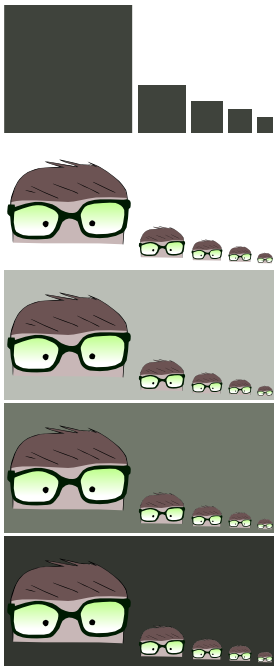
Like here is a raster export of the icon in the desired sizes,
-changed the size a bit and the colour of the glasses-
and here is the vector version:
 .
.
You can zoom in the browser to see the differences.
It's not really a problem, you cannot zoom icons yet; they look fine in raster format viewed at their original formats.
Give an example on that spherical button, and I will try to.
Actually if you keep your icons in a raster format, it should look pixelated -or blurred; depends on if there is any interpolation given.
Like here is a raster export of the icon in the desired sizes,
-changed the size a bit and the colour of the glasses-
- hlp71IIII.png (51.94 KiB) Viewed 4776 times
and here is the vector version:
.You can zoom in the browser to see the differences.
It's not really a problem, you cannot zoom icons yet; they look fine in raster format viewed at their original formats.
Give an example on that spherical button, and I will try to.
-
YellowJacket
- Posts: 11
- Joined: Wed Aug 28, 2013 1:09 pm
Re: Applying Color and Filling In Areas
Lazur:
I looked at another post that talked about resizing. I am able to easily resize the canvas image by holding the control and shift keys and pulling the handle will change the size. However it has no impact on the images in the Icon Preview (View function). I still do not understand. In the Icon Preview it shows all the default icon actual sizes. But is the canvas image saved and available in all those default sizes?
An example of a spherical icons is attached.
Thanks,
Matthew
- Attachments
-
- Spherical Icon Examples.pdf
- (91.22 KiB) Downloaded 225 times
Re: Applying Color and Filling In Areas
You can resize the page borders in the document's preferences panel (Shift+Ctrl+D) to any values.
There is an option of resizing page to selection -that way you can set them around your resized objects.
I have no idea how that preview program works, maybe those sizes are set in there to be displayed?
Those icons are so basic that I can only suggest you to learn using inkscape a bit.
Easier to create them than to describe how.
Check out this page for a good collection of tutorials:
http://forum.inkscapecommunity.com/index.php
-
YellowJacket
- Posts: 11
- Joined: Wed Aug 28, 2013 1:09 pm
Re: Applying Color and Filling In Areas
Lazur:
Thank you for the collection of tutorials. I successfully used several methods to resize the canvas image; although my purpose was to facilitate saving the image in the default icon sizes that proved to have no effect according to the Icon Preview.
I have searched and experimented, still have not been successful in achieving the icon sizes that you provided in a previous post. When I looked at the options under "File" the only one that seems applicable is Export Bitmap which generates a single PNG image. How did you create the various 128X128; 48X48; 36X36; 24X24 and 16X16 pixel size options?
Any luck with creating a spherical version? So far I have not been successful...still experimenting.
Regards,
Matthew
-
YellowJacket
- Posts: 11
- Joined: Wed Aug 28, 2013 1:09 pm
Re: Applying Color and Filling In Areas
Lazur:
I figured out how to resize the image. Under the Object function, Transform allows one to adjust various parameters. I simply change the default "%" to "px" and then typed in the values for height and width while maintaining the 1:1 ratio as the original canvas image. Then clicked apply and saved.
Still experimenting with altering the image to a spherical shape...still unsuccessful.
Regards,
Matthew
Re: Applying Color and Filling In Areas
The transform objects panel is not necessary for the resizing.
At the tool control's row there are fields where you can type in the bounding box's size in pixels.
http://tavmjong.free.fr/INKSCAPE/MANUAL/html/Anatomy.html
Created a clone of the big icon on the left (Alt+D), and duplicated it for each icon, and resized them through typing in the top box.
Resulting there was no need of stiching each exported icon to one preview image, as they could be exported all at once -at 90 dpi.
Adding circular borders and light effects by gradients won't improve the look of that icon, but it would add a more silly look.
"Less is more", so they say. Well at 16X16 size, it's definitely true.
-
YellowJacket
- Posts: 11
- Joined: Wed Aug 28, 2013 1:09 pm
Re: Applying Color and Filling In Areas
Lazur:
I tried the bounding box approach and experienced unsatisfactory results. Objects, then Transform works.
Thanks for explaining how you created multiple images. With respect to multiple images and editing colors, fill areas, etc., I have searched previous posts and it seems that Inkscape is not able to deliver. For example, if I have two images and I seek to combine the two into seamless image, it does not appear the Inkscape can deliver satisfactory results. Even if you try editing colors etc., it looks like a cut 'n paste image. Probably Photoshop or GIMP would better serve image manipulation. Do you have any thoughts?
Lastly, I agree with your comments on attempting to make a icon look 3D. Especially given the relatively small size of icons typically, the color shading, use of color gradients is limited given the size. At the 16X16 size its so small that virtually any color effects are lost. I'm generally seeking to create 48X48 or 80X80 size icons in which some degree of color shading and/or color gradient does help to create a more appealing result.
Thank you for your thoughts and expertise. I shall continue reading tutorials and forum posts and keep experimenting.
Matthew