My second attempt at illustrating

Post unfinished work here for feedback and advise.
vedran
Posts: 4
Joined: Tue Jan 20, 2015 8:03 pm

My second attempt at illustrating

Postby vedran » Tue Jan 20, 2015 9:11 pm

Hello to everyone here!

I'm very new to Inkscape and this whole illustration world in general.

I've decided to ask for some opinions from you experienced folks about some of the stuff I made in Inkscape in the last couple of days.

This is my second attempt at illustrating, well, anything 'artistic' really.
Some space thing:

Image

I felt good about this one at first, until I asked for an opinion from a person I know has experience in photoshop and things like that, and got simply that "It sucks.".
So, I guess I need a more elaborate version of 'It sucks' :) A pair of experienced eyes to get me on the right track.

Also, any good tutorials for this kind of thing? I found none yet.

Thanks to anyone who can share some clues!

Lazur
Posts: 4717
Joined: Tue Jun 14, 2016 10:38 am

Re: My second attempt at illustrating

Postby Lazur » Tue Jan 20, 2015 9:56 pm

Welcome aboard!

It's pretty good considering it was done with inkscape, and that is your second attempt at it.

Maybe a bit of a common sence would be good on the lighting.
There is an eclipse with the planet on the right, then what would make the other ones "glow"?
What is that white lightsource at the middle?
How are the planets shaded?

Does a telescope produce a len's flare?
Or someone taking this picture from a steadicam in a spaceship travelling fast?
(((Maybe a star filter on a camera would look more realistic.)))

On a bit more artistic level, the lightspot at the top left is not working. Sadly inkscape doesn't have the right blending modes as per se, so the transparent white over a dark colour produces a gray mess.

vedran
Posts: 4
Joined: Tue Jan 20, 2015 8:03 pm

Re: My second attempt at illustrating

Postby vedran » Tue Jan 20, 2015 10:56 pm

Lazur URH wrote:Welcome aboard!

Hi. Thanks!

Lazur URH wrote:What is that white lightsource at the middle?

Just some abstract light source, I don't even know. You think I should place something more definite there?

Lazur URH wrote:How are the planets shaded?

I'm not sure what you mean. Are you literally asking what I used or are you pointing to the fact that they are not realistic in relation to the light source?

Lazur URH wrote:Does a telescope produce a len's flare?
Or someone taking this picture from a steadicam in a spaceship travelling fast?
(((Maybe a star filter on a camera would look more realistic.)))

I''m really not sure about the location of the observer. I guess I was thinking in a direction maybe too abstract. Yeah, I was considering that, I'll see...

Lazur URH wrote:On a bit more artistic level, the lightspot at the top left is not working. Sadly inkscape doesn't have the right blending modes as per se, so the transparent white over a dark colour produces a gray mess.

Yes, when I 'stand back' a little bit I definitelly see it. That spot was supposed to hold a logo for some website (as this was supposed to be fan art), but I decided not to send it so I forgot to remove that thing when I removed the logo. I'm gonna do that now.

Now, I'm also thinking that for some reason the red planet (on it's dark side) doesn't look good. Maybe too much contrast with the background? Somehow it gives it a more cartoon-ish look if you know what I mean :)

Btw, do you think Inkscape is a good place to start with this sort of thing? I see that Gimp can do a lot of cool stuff with it's filters. But I still care about the 'hand made' source materials, since as I understand Gimp is a raster oriented software?

Lazur
Posts: 4717
Joined: Tue Jun 14, 2016 10:38 am

Re: My second attempt at illustrating

Postby Lazur » Wed Jan 21, 2015 12:14 am

I meant the shadows are "off" or in that case, the lightsources too.
I'm not much into this kind of artistic stuff, but geometrically it doesn't make sence.
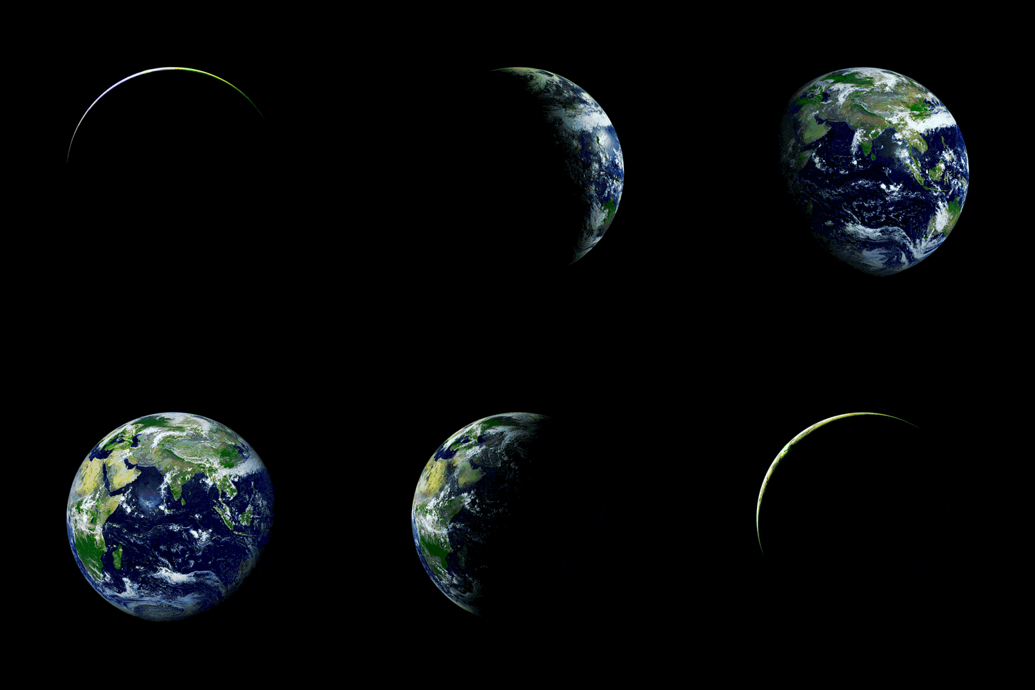
Like the Earth would look somewhat similar to this viewed from space:
Image

I'm not sure if inkscape is the best choice for drawing such image entirelly.
Laying down the shapes in it can be a good start. Gimp can import svg-s, which then you can turn to layer masks with a bit of work.
Inkscape filters are also raster based. If you save a filtered image as a pdf for printing, it could look equal as coming from a raster program.
Probably I would switch to gimp adding the dust.
Though if you have nerves of steel, inkscape filters can produce almost everything.

vedran
Posts: 4
Joined: Tue Jan 20, 2015 8:03 pm

Re: My second attempt at illustrating

Postby vedran » Wed Jan 21, 2015 12:53 am

Regarding geometry - yeah, there is some artistic freedom involved, but there are also some oversights, no doubt.

Regarding filters - Well, one tends to be more creative when under limitations and harder conditions. It does feel more rewarding in the end :) I'll stick with Is, at least for now. It's a great and highly intuitive little tool.

Thank you for your replies.

hulf2012
Posts: 716
Joined: Sat Nov 24, 2012 12:37 pm

Re: My second attempt at illustrating

Postby hulf2012 » Wed Jan 21, 2015 1:23 am

vedran wrote:I felt good about this one at first, until I asked for an opinion from a person I know has experience in photoshop and things like that, and got simply that "It sucks.".
So, I guess I need a more elaborate version of 'It sucks' :) A pair of experienced eyes to get me on the right track.


Maybe is just envy??

At first sight, I don't note big flaws. But trying to being critic:

the bigest planet at the bottom left... some one could say that looks more like a disk, because the zone of light is all around its perimeter.

As mentioned, the shadows seems to be plain. A shadow over a planet generally has a curved form

Other than that, the dust of clouds of the bakcground seems fine.

Maybe putting thunders and rays near the point of light will help in the idea of a planet's collision .

Talking about phisics and astronomy, it's diifcult for me to say what will happen if two or three big planets get close to each other. I suppose that even before getting that close, they will explode, or will lose that spherical form. Or maybe I'm wrong, I will to take a look to the distances and lenghts of planets and their moons. But we are talking of art here, so I don't think the "it sucks" is related to.
If you have problems:
1.- Post a sample (or samples) of your file please.
2.- Please check here:
http://tavmjong.free.fr/INKSCAPE/MANUAL/html/index.html
3.- If you manage to solve your problem, please post here your solution.

vedran
Posts: 4
Joined: Tue Jan 20, 2015 8:03 pm

Re: My second attempt at illustrating

Postby vedran » Wed Jan 21, 2015 7:29 am

hulf2012 wrote:
vedran wrote:I felt good about this one at first, until I asked for an opinion from a person I know has experience in photoshop and things like that, and got simply that "It sucks.".
So, I guess I need a more elaborate version of 'It sucks' :) A pair of experienced eyes to get me on the right track.


the bigest planet at the bottom left... some one could say that looks more like a disk, because the zone of light is all around its perimeter.

As mentioned, the shadows seems to be plain. A shadow over a planet generally has a curved form


I did the full edge like that on purpose, but I wasn't considering that it might look more like a disc to someone. I might change that now.
Yes, that shadow needs to be corrected.
hulf2012 wrote:
Maybe putting thunders and rays near the point of light will help in the idea of a planet's collision .


It wasn't meant to represent a collision, but I'll try that anyway and see what it looks like :)


Return to “Work in progress”